Park / [NEDC2 #4] Frozen Heights
-
 14-January 13
- Views 4,577
- Downloads 797
- Fans 1
- Comments 31
![Park_2619 [NEDC2 #4] Frozen Heights](https://www.nedesigns.com/uploads/parks/2619/aerialm2319.png)
-
 64.23%(required: 65%)
 Design Submission

Wanted 80% Airtime 75% Liampie 75% zburns999 75% Arjan v l 70% Austin55 70% disneylhand 70% turbin3 65% chorkiel 60% Dimi 60% Maverix 60% Jonny93 55% Casimir 50% pierrot 50% prodigy 50% 64.23% -
1 fan
 Fans of this park
-
 Download Park
797
-
 Objects
215
-
 Tags
Tags
![park_3339 [H2H7 R2] Battle for New Elementia](https://www.nedesigns.com/uploads/parks/3339/aerialt2941.png)
![park_2614 [NEDC2 #1] Winter is Coming](https://www.nedesigns.com/uploads/parks/2614/aerialt2316.png)

![park_2849 [PT4 R5] Fox Glacier National Park](https://www.nedesigns.com/uploads/parks/2849/aerialt2502.png)

![park_2616 [NEDC2 #2] Marrons Chauds](https://www.nedesigns.com/uploads/parks/2616/aerialt2322.png)
If you're ever up for that coaster layouts/landscaping opportunity I'm more than down, I hate building coasters
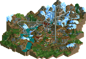
The landscaping felt half-assed? Where? Are we looking at the same park? The landscaping was very whole-assed. It also breaks the land-height limit because I can. If you meant the foliage then I think I could see that... there isn't much of a variety and that was pretty rushed... But you liked the station?
YOU LIKED THE STATION TOO!?!
I'm REALLY surprised anyone likes the station. That's one of the parts I was very frustrated with but didn't have the time to completely redo it. It was actually one of the last things to go in so literally down the the wire. I like the "idea" of it but it just didn't work out that well in my book.
Ride6
ps- the score is actually 965/15 = 193/3 = 64.33, NOT 64.23.
*shrugs*
3 out of 5 (that's not enough). 6 out of 10, better luck next time
besides the layout.
Btw, why do other participants in this contest get to judge their competition?! That's a bit skewed imo..
Personally, i didn't vote with feelings, just honest.
And yes Ride6, that station building is very nice and different.
It's not so standard, wich may be the reason why it's so attractive.
Excluding the participants from voting required an unproportional amount of work, if not coding and shit - it's just not possible with how NE4 works. We just had to rely on the panelists' integrity. I believe we have integer panelists.
It's not. You drop the top and bottom results, so it's actually 835/13 = 64.23076923 = 64.23
NE4 works it out on it's own, you can't beat a machine
No, Chuck Norris and I can do!
Airtime Offline
This should of made design like Maverix's entry. It looked a little unfinished around the braking run but nothing to take too much away from it.
The station was great! I loved the ice sticking up out the roof, lovely touch. Seriously though it was an awesome station like Nin said!
The mountainous landscaping seemed a little chaotic but still good. I didn't quite get the point of the train though.
Please stick to your style and build more. I love your stuff, so enjoyable.
Ride6
Airtime Offline
Bloc Party<3
But fair point on the train.
Yeah, the foliage was my main gripe, I think. I've always thought that with mountains in RCT, you either have to go all out and cover the whole damn thing, or leave it bare. I suppose even having a defined "tree line" where the foliage stops and the steepest part of the mountain begins would work well. Another thing, which I guess is personal preference, is that I dislike the chaotic look created by 1x1 tile land spikes pitched in different directions. It just breaks the flow.
But yeah, considering I was one of the highest scores here, I really don't think the appearance of the mountain influenced my decision at all. The coaster was all but perfect, and I've always thought that your architecture is great. It serves its purpose and always seems to accent the surroundings.