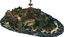
Park / [NEDC2 #3] The Cult of Santis Clausim
-
 15-January 13
- Views 8,689
- Downloads 828
- Fans 1
- Comments 20
-
![Park_2606_[NEDC2 #3] The Cult of Santis Clausim](https://www.nedesigns.com/uploads/parks/2606/logot.png)
-
 66.15%(required: 65%)
 Design

5dave 85% Airtime 85% Casimir 85% RMM 75% Jonny93 70% Liampie 70% Fizzix 65% Goliath123 65% Loopy 60% nin 60% Roomie 60% Wanted 60% Dimi 55% pierrot 50% posix 50% 66.15% -
1 fan
 Fans of this park
-
 Full-Size Map
-
 Download Park
828
-
 Tags
Tags
![Park_2606 [NEDC2 #3] The Cult of Santis Clausim](https://www.nedesigns.com/uploads/parks/2606/aerialm2325.png)


![park_2616 [NEDC2 #2] Marrons Chauds](https://www.nedesigns.com/uploads/parks/2616/aerialt2322.png)
![park_2614 [NEDC2 #1] Winter is Coming](https://www.nedesigns.com/uploads/parks/2614/aerialt2316.png)
![park_2619 [NEDC2 #4] Frozen Heights](https://www.nedesigns.com/uploads/parks/2619/aerialt2319.png)
Argh I'm so mad I don't have LL right now. This kind of claustrophobic building needs to viewed in game to be fully appreciated :/
Also, digging the logo, nin. It definitely adds a nice feel
I'll have to do with the overview for now.
This was fantastic. I really enjoyed exploring it and there were tons of great details. The use of maze dirt to make caves is something I've wanted to do for a while now, and you've used it to full effect here. The use of peeps and all the unique ride ideas make this a fun little entry and well deserving of bronze. It is small map but the unique theme and all the "little things" make up for it.
I think the most enjoyable part of building this was naming all the Brothers of the Cult, I seriously need to have that list next to me so I can address our members with their Brethren names on the forums
Oh and the write-up is the best write-up NE has ever seen, move over Robbie, ][22 is in town! Seriously, read it!
Arjan - Yeah I didnt expect to win as it's only 20x25 or something like that
Milo - Glad you loved it so much. And glad you found your character amusing haha! The dirt on top of the caves was the result of sending it to Pierrot, he showed me the idea, so simple and effective.
Jonny - Glad you liked the peeps jumping to their death! It was a bitch to do, but it still didn't turn out perfect, they fall in slow motion rather than jumping freefall lol oh well
Ling - I agree with what you've said, and agree that that is why it's just scraped design.
Now c'mon guys! Where's all my damn comments!!!
I'll buy LL btw.
It's a promise i made if i didn't win the contest, so i'll look into it.
#onlyabadbitch
I finished in plenty of time and could have gone bigger, but I wanted the small map size really, mainly because I had planned to build the exact same thing in RCT2 and offer the opportunity to view the same park in 2 games. That being said, it is a concept I would quite like to revisit on a larger scale, H2H size maybe.
not too bad, a little crowded and not as aesthetically pleasing as I think LL should be. but still some lovely bits, especially the towers with the medieval huts sticking out.
Still, this was a micro when it did not need to be, so I must agree with Liam's entry winning and also maybe Dimi's being higher, tho I have not seen it in-game yet. The overall look was really a mess imo. It was such a cluster of castles, trees, dirt, cottages, ice and dive machine. Overall I think your score was a little low and I could have gone 70 on this. But hey, you got like your 25th NE Design out of it, so cheers!
I still love this so much. It's so full of fun.