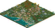
Park / Blue Jay

9 Comments

  • disneylhand%s's Photo
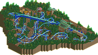
    This was great. Unfortunately, the layout got a bit weird in the middle but it recovers well by the end. Colors against the surrounding landscape created a refreshing atmosphere, but some of the paths would have me wishing there was a little more to look at in the park. This should be a good addition to your parks page.

    -disneylhand
  • Pacificoaster%s's Photo
    Personally, I was a bit let down by this submission. I saw StormRunnerFan's name in the folder and was excited. However, when I opened the project in game it was much of an anticappointment. The foliage was extremely redundant and the paths were a bit lifeless. Although I did enjoy the station and transfer track detailing. Overall, there just wasn't enough content to hold my attention more than five minutes. Keep building though bud. I know you have what it takes to impress us.
  • Comment System%s's Photo
  • Dimi%s's Photo
    I loved this and I'm glad it won design. It's simple but very beautiful and atmospheric. I could perefctly imagine walking there. I think the layout was perfect, original and interesting. I had never seen this kind of foliage before and even though it was a bit repetitive I loved the atmosphere it created in combination with the coaster colours. I don't think the paths were lifeless, I'd rather call it clean with the right amount of detail. There could have been a bit more architecture, but what was there looked great and I see it perfectly fit the concept you were going for. I'd like to see more sensational stuff from you soon but for now this was great.
  • Fizzix%s's Photo
    I have to say I wasn't a fan of the foliage, for sure. There could have at least been some more variety. The ride was very nice, though. Loved the archy and color scheme of the map, including the ride. I also have to say that I enjoyed Tomahawk much more than this. I feel like this is a step backward. Overall, a nice, but not great submission. Congrats on the second Design though!
  • zburns999%s's Photo
    I like how there was a clear "feel" to this design; the architecture, foliage, and path layout all worked well together. I thought the coaster was good. Nothing spectacular. That vertical loop would kill everyone, though. I know this sounds stupid, but my main complaint here is actually that this is a B&M invert. I'd like to see somebody try a rarely-used coaster type for a design: 4D? Hypercoaster? Stand-up? Let's see something new!

    And oh yeah, the blue jay enclosure was awesome. Nice idea, there! Overall, a worthy design, in my opinion.
  • pierrot%s's Photo
    just imagine you were walking around the path, loads of overgrown(not a mess) trees/shrubs everywhere, blue invert coiled around the hills, bare tree among the reeds..so beautifully done. very compact but also attractive design. I'm glad to see this in front page, definitely design worthy.
  • Cocoa%s's Photo
    very nice design, well put together. I agree that there should have been more to see, though, it was a bit bare. for the foliage, it needed a little more variance; imo you should have put more of that lovely tan bush stuff around Brushfire throughout the park and definitely incorporated some flowers and mushrooms and whatnot.

    but the level of detail and atmosphere was quite high, so kudos on a great design!
  • Louis!%s's Photo
    The colours to me didn't fit with the surroundings, they make the coaster stand out and are a nice combination, but with the surrounding foliage being so dark, I felt it just didn't work.

    The layout is solid, but nothing spectacular, solid layouts are great for most designs and most ride types but when it's a B&M Invert I feel people need to work harder on making them more interesting because we see so many of them.

    But nice design, I can see why it only grabbed the acolade by the skin of it's teeth though.
  • Airtime%s's Photo
    The station, queue line and entrance to Blue Jay were gorgeous, absolutely loved that.

    I wasn't keen on the location of the 2 frog hoppers but nice to see different rides used in RCT.

    As mentioned before the layout got a little odd it wasn't awful but not amazing.

    I think the foliage was very heavy and needed some variation here and there. The foliage seemed all or nothing, it was either full on heavy foliage or nothing at all which gave quite a few bare areas under the coaster.

    The whole design seemt very Wild Eagle which I loved.

    Nice to see more stuff from you Storm! Bring more though :p