Park / [NEDC2 #12]Christmas Village
-
 12-January 13
- Views 2,711
- Downloads 573
- Fans 0
- Comments 6
![Park_2598 [NEDC2 #12]Christmas Village](https://www.nedesigns.com/uploads/parks/2598/aerialm2314.png)
-
 23.85%(required: 65%)
 Design Submission

Casimir 45% In:Cities 40% Coupon 35% Dimi 35% Jonny93 30% Maverix 30% Austin55 25% CedarPoint6 25% Arjan v l 20% Pacificoaster 20% turbin3 20% Airtime 10% Goliath123 10% Louis! 10% pierrot 10% 23.85% -
 Description
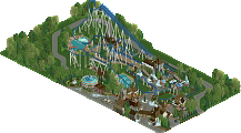
There is a special place reserved in hell for this park.
-
 No fans of this park
-
 Download Park
573
-
 Objects
126
-
 Tags
Tags

![park_2606 [NEDC2 #3] The Cult of Santis Clausim](https://www.nedesigns.com/uploads/parks/2606/aerialt2325.png)
![park_2586 [NEDC2 #9] Ring A Ding Dong!](https://www.nedesigns.com/uploads/parks/2586/aerialt2317.png)

![park_2616 [NEDC2 #2] Marrons Chauds](https://www.nedesigns.com/uploads/parks/2616/aerialt2322.png)

Lots of things where missing here.
Layouts wheren't impressive.
Architecture was bare, it needed some more decoration and refinement.
I was missing the peeps to create some more atmosphere and seeing that you used my bench, i wonder what you did to screw up the entrance.
If you wanted to change the path there, then you should've inverted the ownership of the park with 8-cars and then you can change that last piece of pathblock.
Invert ownership again to switch again.
Don't feel discouraged though, we all start simple and advance while building.
As for the entry itself I agree with Arjan v l that it was quite barren and that the architecture was lacking in technical execution. However I thought the selection of path texture, music, and building color/texture was rather warm and inviting. It was also nice to see an entry with so many rides integrated into a nice "village" sort of feel. One of the biggest annoyances for me (personally) is that those rooves don't line up with all tiles and actually "leak" a few pixels through from below. Putting a regular 1/4 tiles under each of those would've helped. Don't be afraid to construct bigger, more complicated buildings either as 1x(whatever) sizes tend to limit what you can do. The snow and ice environment was a little overly white... it's usually wise to work in some grey stone or the like to break it up a little.
Neither coaster was exceptional and sadly Ice Blaster was one of your few color related missteps (white on ice background) though I liked the train's colors.
I hope you're encouraged enough to keep entering contests here and elevating your game and skills.
Ride6
Airtime Offline
Also don't cut the land off so close to buildings. You've gave the map a really awkward shape. Give things a bit of surroundings, they help.
It was an improvement from your other stuff. Keep building you'll get better