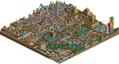
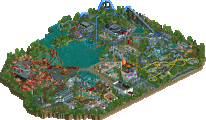
Quite possibly the most underrated top tier parkmaker at New Element. Every time we hold a contest, nobody ever mentions Butters' name as a threat to win the crown, even though he's been the second most consistently dominant contest parkmaker only second to natelox. He came in second place in the Blockbuster Challenge with "Anaconda: Escape From Amazonia" which came second to x-sector's "Evolution". He came second place in the next contest, NE's NextElement Challenge, with "Comstock Dash" that was beaten by Toon's "Gila". Then in the Hi-Rollers he put up an extremely impressive 3rd place entry "Trojan Dynasty", all while still winning spotlights, runner-ups, and #1 spots on the List. So why doesn't Butter get his damn recognition? Maybe now he will, with the most fun entry of the contest by far, Butter's Platypus Paradise. Taking his nickname (and H2H3 team name) to the extreme, building the perfect utopia for any platypus. You've got planes flying by overhead, shuttle launches, candy factory tours, treehouses, basement rollercoasters, flying cars everywhere, and everything is moving non-stop. It's one of the most in-depth entries of the contest, so much to see, so much fun everywhere you look, and so many cool bonuses everywhere. Awesome, awesome entry Butta!
butter, have you by any chance figured out how to make track invisible?
anyways, it was amazing to me. I agree with toon about the architecture, and for me, that pulls it down too. But a basement rollercoaster, a ground floor with a tv, bed, bar, etc. lovely. Cyber Shot was very nicely executed. That frog thing with the annoying little fly. A violent drunken swan? The shuttle to the moon was brilliant, even the giant platypus and the plane. All in all, if there is this much fun stuff in it to look at, i can't care too much about how the architecture still doesn't look great and the paths ridiculously horrible. And you know what? If butter would have had great architecture and paths, it possibly would have been an unanimous winner. But it didn't, but still a very respectable entry. This might be a very good example of how to have fun with RCT2. There's is no point to the park at all, and everything there looked like a hell of a lot of fun to make. Congrats Butter with a top 5 finish.
I wont be as insulting as my comment on corks as i can see he put a lot of time and effort into it,but i go for looks and this doesn't look good imho.The ideas are there kinda but yet again pointless,some of these high parks should have been near bottem imho,voodoo,slob,wme,phatage,john have been some of most impressive so far but i cant comment on rct1 parks cos i dont have original rct disk anymore..
The hacking is totally out of this world, i love the ideas and concept behind this park. Its probably the only park ever made that makes you laugh!
The drunken swan had me in stitches, how the hell did you hack the swan ride??!! The architecture is amazing and the detial is just as good outside the buildings as it is inside.
I don't need to see the other entries, this is my favourite...
Congrats.
This is the most ammusing thing I've ever seen in rct. The fly, the swan, that bloody monorail!?! Fat guys tap dancing? This reminds me of the kind of park you make while your mates are round, and you just throw little things in that you've laughed about in the past, or things that you dream about as a kid like the mansion etc. After viewing the park I cant help but feel like I know you more personally for some reason. The whole idea of theming a park to yourself was very funny, its such a break from the whole 'concept' parks or 'good looking' parks, this is about the only time anybody has used rct to express them selves.
The pink pole idea is ingenious, its like unwrapping little gifts one at a time. The custom flat's were amazing, that grey tower thing was mint and the swinging ship looked well put together. I could go on forever about how good this park is, but I'll stop now. :scarface:
Awsome shit Butter! that "A Day in the Life of a Platypus ride" was the most creative ride i have ever seen, i loved all the details tossed in, mainly that drunken swan i never thought id see better custom rides then i did in SF:WOE but man you did some awsome ones. your house was my fav part, that floorplan like idea was pulled off really well, amazing all around, only, yes some of the archy was poor, but thats all, best entry yet imo
9.5/10
P.S: I'll catch a bus and meet you in canada where we will kick Toon's ass
Wow! If this is number 5, I can't wait to see the next 4, cause they're gonna hafta be some amazing parks to beat out this. I loved the flat rides, the violent drunken swan was hillarious. The sculptures were simply amazing, I loved all the little details, I could keep looking at that park for forever. Amazing job.
I loved it it was soo fun to look at deffeintly the best so far.
A very very good job!!!! That TT statur just added that extra feel to the park. Once again nice job!
WHAT THE FUCK. my parents like ran into the room several times as I was viewing this park because I was laughing/saying "WHAT THE??" so many times.
The drunk swan? The custom inverter ship. Custom bumper cars? The lilypad launch? You're own mansion with interior + coaster in basement + a car thats not cool enough to come in??? A spaceship, a plane, platypus statues.
I think the worst idea in the park is referring to yourself as "Butt". Other than that it's great. I love the sculptures and creative flat rides. The architecture, not so much, except the mansion.
It seems that we both used the pt to make fun of the repetitive styles that so many people have adapted to and at the same time both of us had included hidden things that only one who took the time to appreciate such things would find out, although yours was in the park itself while mine was more or less in the readme. You also took a much lighter tone to yours, which definitely worked for me.
The ideas were great, the custom flats fun to watch, and whatever the hell the drunken swan is considered to be. I love the satire though the best, especially the architecture expo building. One thing I would suggest with the rooves is to do something like what you did in the Trojan thing where you use the wooden coaster as roof so you don't have to delete individual scenery; being that a lot of the hidden things were banners that if you used the scenery deletion tool, you would delete them too and just be left with open space. The architecture that you didn't use to make fun of your past style was very good, particularily the larger buildings like the mansion and the chocolate factory but even some parts like the Meet the Platypuss building and the others around there were very good. The varying sizes made things interesting.
The best thing about this entry is how much you've improved; the serious architecture was very good, the hacking although not too original still well executed and cleaner than you've ever had it before, the ideas being frequent and evident, and overall the accomplishment of attaining the feel that you were going for, something I know you've said in the past that you've really never been able to attain. Definitely something very fun to look at but more so to explore. Great entry, definitely one of my favorites, and I can't wait to see future work from you like that Outer Banks Pier that you had a while ago.
BTW my rampaging elephant will kick your rampaging panda's ass any day
This has got to be one of the most fun parks ever created in rct. You are definately one of my most favorite parkmakers. The platypus was really cool, as were the shuttle and the plane. I loved all of the amazing hacks and all of the custom rides. The frog and the annoying fly were funny...and the fly was annoying, it took a while for me to click it, lol. The Day in the Life of a Platypus was a really cool and funny ride to watch, very well done. The violent drunken swan was extremely hilarious and I was like 'what the...' when it went across the screen. Butter's Architecture Museum was a cool building. I also loved seeing inside of the buildings, that is an idea that I have always wanted to do but never thought I could make it look cool...but you sure did. The negatives were the repetitive use of arches, and doors for your buildings and the blocky look of the buildings due to the size of them. But I definately would say this is the best park we have seen in this compo thus far. Great job!
butter, have you by any chance figured out how to make track invisible?
What? Invisible........... track? No kidding? Tell me more about this "invisible track".
Anyway, these comments are incredibly flattering. Thank you. As you can imagine, I had tons of fun with this project (Up until I had to work quadruple overtime to get it done). Its a pity there wasn't more room in the park though. Looking over my notes, there was still my personal airport, the cordless bunjee jump off a cliff, my squirrel farm (Metal will know what I'm talking about here ), the ferris wheel from hell, and tons of other little details that I wasn't able to fit in. Still happy with the finished product though. On the architecture subject, I see my newer style is still as hit or miss as the older one, but I'm sure most will agree it's a step upward. You see, I'm not (as ) ashamed to be associated with the buildings in this park.
I think the worst idea in the park is referring to yourself as "Butt".
That actually wasn't an "idea", as you might say, but rather a way to conserve banner space.
One thing I would suggest with the rooves is to do something like what you did in the Trojan thing where you use the wooden coaster as roof so you don't have to delete individual scenery
Yeah, I probably should have, but I guess I just didn't want the roof tops to look so flat and boring.
I hope you're still going with that pier park!
Ah, yeah, Avalon. That project's probably going to be a gonner...... along with everything else I had going at the time. I just havn't been able to work on it in so long, I've lost interest. Plus, I have improved some, I could probably do it tons better a second time around.
What the hell? Last time I talked to you about this stuff, it was #2.
IRIS MADE A MISTAKE!!! I'M #2!!!!!! That was probably before Toon's results were in
32 Comments
iris Offline
Butter's Platypus Paradise by Butterfinger
Quite possibly the most underrated top tier parkmaker at New Element. Every time we hold a contest, nobody ever mentions Butters' name as a threat to win the crown, even though he's been the second most consistently dominant contest parkmaker only second to natelox. He came in second place in the Blockbuster Challenge with "Anaconda: Escape From Amazonia" which came second to x-sector's "Evolution". He came second place in the next contest, NE's NextElement Challenge, with "Comstock Dash" that was beaten by Toon's "Gila". Then in the Hi-Rollers he put up an extremely impressive 3rd place entry "Trojan Dynasty", all while still winning spotlights, runner-ups, and #1 spots on the List. So why doesn't Butter get his damn recognition? Maybe now he will, with the most fun entry of the contest by far, Butter's Platypus Paradise. Taking his nickname (and H2H3 team name) to the extreme, building the perfect utopia for any platypus. You've got planes flying by overhead, shuttle launches, candy factory tours, treehouses, basement rollercoasters, flying cars everywhere, and everything is moving non-stop. It's one of the most in-depth entries of the contest, so much to see, so much fun everywhere you look, and so many cool bonuses everywhere. Awesome, awesome entry Butta!
iBrent Offline
Evil WME Offline
anyways, it was amazing to me. I agree with toon about the architecture, and for me, that pulls it down too. But a basement rollercoaster, a ground floor with a tv, bed, bar, etc. lovely. Cyber Shot was very nicely executed. That frog thing with the annoying little fly. A violent drunken swan? The shuttle to the moon was brilliant, even the giant platypus and the plane. All in all, if there is this much fun stuff in it to look at, i can't care too much about how the architecture still doesn't look great and the paths ridiculously horrible. And you know what? If butter would have had great architecture and paths, it possibly would have been an unanimous winner. But it didn't, but still a very respectable entry. This might be a very good example of how to have fun with RCT2. There's is no point to the park at all, and everything there looked like a hell of a lot of fun to make. Congrats Butter with a top 5 finish.
If... WME would have judged
1-4. ?
5. Butter's Platypus Paradise- Butterfinger
6. Universal's Cayman IOA- slob
7. Darwood Grove- Kumba
8. Gouvia Point- Voodoo
9. WTF- Bokti
10. Continent Traasok- Twisted
11. Epica- Phatage
12. Disney's MiniSeas- John
13. The 10th Kingdom- Six Frags
14. Elements- Gir
15. Darkwood Amusements- Posix
16. Valkyr Sol- Corkscrewed
17. Ancient Enchantments- Prince Ashitaka
18. N.E.R.D.- Gymkid Dude
19. Harmony Harbor- Micool
20. Palm Springs Florida- NC
21. Country Squire Amusement Park- rwadams
22. Poplar Grove- Ride6
23. Lesheban Wilderness- Evil WME
RRP Offline
X250 Offline
The hacking is totally out of this world, i love the ideas and concept behind this park. Its probably the only park ever made that makes you laugh!
The drunken swan had me in stitches, how the hell did you hack the swan ride??!! The architecture is amazing and the detial is just as good outside the buildings as it is inside.
I don't need to see the other entries, this is my favourite...
Congrats.
-X-
Dixi Offline
The pink pole idea is ingenious, its like unwrapping little gifts one at a time. The custom flat's were amazing, that grey tower thing was mint and the swinging ship looked well put together. I could go on forever about how good this park is, but I'll stop now. :scarface:
Kumba Offline
9.5/10
P.S: I'll catch a bus and meet you in canada where we will kick Toon's ass
DragonInferno Offline
Elephant6 Offline
Leighx Offline
A very very good job!!!! That TT statur just added that extra feel to the park. Once again nice job!
chapelz Offline
This park was just awesome and mindblowing.
gymkid dude Offline
The drunk swan? The custom inverter ship. Custom bumper cars? The lilypad launch? You're own mansion with interior + coaster in basement + a car thats not cool enough to come in??? A spaceship, a plane, platypus statues.
Oh sheesh.
I need to sit down.
chapelz Offline
cBass Offline
I think the worst idea in the park is referring to yourself as "Butt". Other than that it's great. I love the sculptures and creative flat rides. The architecture, not so much, except the mansion.
Let's all go to Butter's house!
mantis Offline
Incredible park, Butterfinger. I hope you're still going with that pier park!
vTd Offline
Anyway, this was my #1 of everything I saw. Creative, beautiful. It had it all.
Phatage Offline
The ideas were great, the custom flats fun to watch, and whatever the hell the drunken swan is considered to be. I love the satire though the best, especially the architecture expo building. One thing I would suggest with the rooves is to do something like what you did in the Trojan thing where you use the wooden coaster as roof so you don't have to delete individual scenery; being that a lot of the hidden things were banners that if you used the scenery deletion tool, you would delete them too and just be left with open space. The architecture that you didn't use to make fun of your past style was very good, particularily the larger buildings like the mansion and the chocolate factory but even some parts like the Meet the Platypuss building and the others around there were very good. The varying sizes made things interesting.
The best thing about this entry is how much you've improved; the serious architecture was very good, the hacking although not too original still well executed and cleaner than you've ever had it before, the ideas being frequent and evident, and overall the accomplishment of attaining the feel that you were going for, something I know you've said in the past that you've really never been able to attain. Definitely something very fun to look at but more so to explore. Great entry, definitely one of my favorites, and I can't wait to see future work from you like that Outer Banks Pier that you had a while ago.
BTW my rampaging elephant will kick your rampaging panda's ass any day
guljam Offline
This is incredible!
Beyond My imagination...
this is my 1st park for best IDea
AustinPowers Offline
Butterfinger Offline
Anyway, these comments are incredibly flattering. Thank you. As you can imagine, I had tons of fun with this project (Up until I had to work quadruple overtime to get it done).
Its a pity there wasn't more room in the park though. Looking over my notes, there was still my personal airport, the cordless bunjee jump off a cliff, my squirrel farm (Metal will know what I'm talking about here ), the ferris wheel from hell, and tons of other little details that I wasn't able to fit in. Still happy with the finished product though.
On the architecture subject, I see my newer style is still as hit or miss as the older one, but I'm sure most will agree it's a step upward. You see, I'm not (as ) ashamed to be associated with the buildings in this park.
That actually wasn't an "idea", as you might say, but rather a way to conserve banner space.
Yeah, I probably should have, but I guess I just didn't want the roof tops to look so flat and boring.
Ah, yeah, Avalon. That project's probably going to be a gonner...... along with everything else I had going at the time. I just havn't been able to work on it in so long, I've lost interest. Plus, I have improved some, I could probably do it tons better a second time around.
IRIS MADE A MISTAKE!!! I'M #2!!!!!!
That was probably before Toon's results were in