Park / The Three Villages
-
 04-July 04
- Views 7,347
- Downloads 1,033
- Fans 4
- Comments 26
-

-
 84.38%(required: 70%)
 Gold
Gold

Cocoa 95% no RWE 95% yes Jaguar 90% no Liampie 90% no Scoop 85% no G Force 80% no Kumba 80% no ][ntamin22 80% no Ling 75% no posix 75% no 84.38% 10.00% -
4 fans
 Fans of this park
-
 Full-Size Map
-
 Download Park
1,033
-
 Tags
Tags
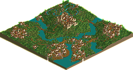
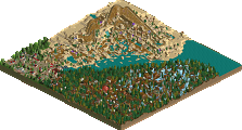
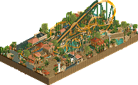
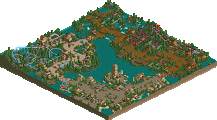
But what really hit the park straight to home, was all the attention to detail. All the awnings, barrels scattered throughout, the neat crops and clock towers really added some great eye candy and made the park really shine.
Great foliage, too. Love the grass as well.
Definately my favorite so far.
Corkscrewed Offline
And THAT, my friend, is why we will probably disagree on almost everything in RCT.
It's really the thought that matters to me, and maybe you didn't feel the actual execution merited my "stunning" words, but I certainly got a vibe from the park, and I love it. So blah!
Very enjoyable, and something to be looked at for inspiration and improvement. There are lots of lessons to be learnt from your parks IMO, and i'm trying my best to learn them.
Overall, I thought this park was way too bare...and I do understand what you were going for.
The lighthouse was cool and I liked how you used the rapids track for it. I also thought that your use of the side-friction track for awnings looked really good...I didn't like the red flowers, they seemed to detract more than add to the atmosphere imo. I also didn't like how you used the martian land for roofing...it just looked odd. The Three Villages Highway is cool, it's alot of fun to follow it through the towns and the countryside. The building with Elrocko in it is very well done. The landscaping overall is really good, but the foliage seems too 'structured' in places. A lot of the building forms are similar and that makes the park somewhat repetitive. Trostan is definately the best area of the park. The building with the rapids for stairs looks really good. The rapids ride is really cool...I love the loading platform and the hacked cover...very nice. The park definately could have used a coaster imo...but overall it was good.
That's a very high score.