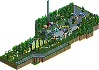
Park / The Hornet
-
 11-December 12
- Views 1,950
- Downloads 633
- Fans 0
- Comments 1
-
 20.00%(required: 65%)
 Design Submission

Jonny93 30% Phatage 30% Coupon 25% robbie92 25% CedarPoint6 20% Dimi 20% Goliath123 20% Pacificoaster 20% posix 20% Sulakke 20% Arjan v l 15% In:Cities 15% Maverix 15% tyandor 15% pierrot 5% 20.00% -
 No fans of this park
-
 Download Park
633
-
 Objects
91
-
 Tags
Tags
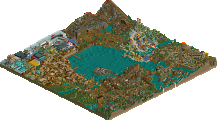
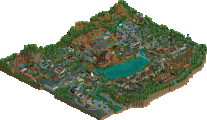
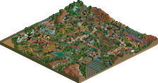
I've voted 15%.
I didn't really enjoyed it to be honest.
There was just no atmosphere ,it looked very bland ,some shops ,benches ,lights etc. could've made a difference.
The supports looked sloppy ,especially at the helix.
The pacing in the curve after the 2 loops is to slow i.m.o.
I can see that it took a lot of work to make the lifthill supports ,but again it didn't really looked well ,it looks like the coastertrack is floating a little.
I don't know if you know Geewhzz inv. hut hack ,but it would be nice if you learn that and apply it ,it creates a better result i.m.o.
Those corkscrew supports where a nice idea ,but not so well executed (glitching).
Also peeps walking through supports isn't really my thing, but that's just personal taste.
You can avoid that by using pathblocks and no footpath ,but that's up to you.
Some fences and blacktiles are missing, foilage seems rushed.
The only things i liked where the use of diagonal footpaths and the transfer station.
I hope you'll take more time on your next design/park to refine it.