Park / The Divine Comedy

Park_257 The Divine Comedy

20 Comments

  • iris%s's Photo
    Posted Image

    Posted ImagePosted Image

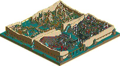
    The Divine Comedy by mantis

    Can more be said for the reigning Parkmaker of the Year? It's like a dark shadow has been cast over New Element ever since the first Park Wars, where we first caught climpse of mantis' brilliance, as Europa Worldwide took out the rest of the competition. The rest of his career is a blur, a highly celebrated and victorious blur, that has seen mantis winning spotlights, the NE Invitational, back to back Parkmaker of the Year awards, and the Best LL Park of 2003 with "Walkman of my Brain". So how does he follow all that up? Well, he came damn close to winning the biggest contest in RCT history. Still, the number one seeded LL entry, mantis takes his protrayel of Dante's Inferno right to your very own home, splitting up the Purgatory and Hell sections, with large, dreamlike walls. So many cool little extras to be seen everywhere, plus some good old fashioned asskicking parkmaking. Rides like "Testimony" are easily one of the best in the entire contest, and the trip to Mt. Sinai will have adventure fans drooling, as it takes inspiration from vtd's "Secret of Skull Mountain"..combining a car ride, a path to walk up the mountain, and finally climbing aboard a raft to plummet back down the gigantic waterfall. The hell section is just spot on perfect as well, with terrific coasters and a spooky atmosphere. A much more subtle approach then most would expect, but upon close inspection, it's just absolute brilliance.
  • Prince%s's Photo
    This park was amazing. I enjoyed it all. The reason I enjoyed the park so much is that there just seemed to be an eternal amount to it, it was quite overwhelming with how much stuff was in the park. There were so many small details as well, but there was one thing you missed...on the inferno bridge there is a castle scenery piece missing (uh-oh ;) ). Great park Mantis.

    ~Prince Ashitaka~ 8@
  • deanosrs%s's Photo
    Thank you mantis. For me, LL parks are stale when they repeat the same things. You do everything but, encorperating new ideas into every square of your parks, for example the arches. Congrats on the highest LL placement - it was most definitely deserved.
  • Kumba%s's Photo
    Nice Hell theme ;) But I liked the other side better, with the donkey tour ride (awsome idea btw) and the hanging gerdens it was all great, best LL entry EZ. not much bad to say here.

    9/10
  • BigFoot%s's Photo
    Nice job mantis. The detail in this park was fantastic, little things here and there I thought were pretty cool too. (Flag Holder, Never-ending stair case, etc).

    Not my favorite of the things you've built, but still enjoyable to look at.

    Nice job.
  • rctfreak2000%s's Photo
    Great job mantis. The archways idea was brilliant.
  • MightyMouse%s's Photo
    I had troubles aquiring a solid feeling on this park. It was either exactly what I wanted to see, or sore to the eye. Here's what I thought, in detail.....

    Everything seemed so, "blah" when I first opened the park up. However, after about a minitue or so of browsing it, I began to notice the insane details. I loved how you incorperated people from the Bible, and the addition of the pillar of salt was very unique(I vaugly remember that story). Testimony was very cool, and the colors were awsome in that section (they looked inspired by Egyptopia) However, the whole "hell color scheme" seemed 'somewhat' bitter. Those colors are used every time someone attempts that spacific theme(it gets old after a while). Oh well.


    Overall, it turned out great. Good job Mantis, old boy! :)
  • Butterfinger%s's Photo
    Isn't it sad that it only takes mantis 40 hours (years) to make a park better than my 130+ hour one?


    Nice park. The big, bulky 'seperating walls' almost ruined it for me though. IMO they could have been done much smoother. Or maybe I just don't understand the theme.
  • cBass%s's Photo
    This might be my favorite piece of LL work ever! Every bit of it is fun to look at.

    I really like the rides. Especially the reel and the transport ride. Well done.

    If only that one castle tower weren't missing. ;-)
  • iris%s's Photo
    That's my fault...he sent me a version with that fixed, but I didnt have time to change the file.
    Sorry.
  • cBass%s's Photo
    That probably cost him the win.

    [/guilttrip]

    ;)
  • Turtleman%s's Photo
    This park is quite refreshing. And I like that.
  • Caddie Gone Mad%s's Photo
    Wow. I loved all of the little details, the architecture and landscaping were amazing...
  • Valp%s's Photo
    Well, I honestly can't say that I loved this one, but I did enjoy it nonetheless. All of the Biblical references were a nice touch- (especially the pillar of salt and Judas's lookout in Hell) and Testimony has got to be one of the most insane, but traditional-looking rides at the same time. I liked the big walls separating everything- castle gold has never looked so good. Purgatory was a cool idea, and the woodie in hell was pretty good.

    Maybe I'll have to go check it out again... perhaps it will grow on me.
  • Ride6%s's Photo
    I enjoyed this and it is the best LL entry in the PT but honestly OZONE and X-sector had better LL entrys for Hi Rollers. The arches are brillent though, and you did a great job layering in details without being so obvious about it. However this park lacked the color and excitement of you other work. I'd say the coasters will both go down as legend though and the idea's were top-notch, just where did all the color go?

    ps- WOMB still owns.

    ride6
  • natelox%s's Photo
    The LL park that beat me (glare), so I figgured I'd have to be extra critical. My take on it, I really liked it. First, Purgatory. "Exaltation" was only the second of it's kind, and what a great attraction. I seriously need to build one of these. "Testimony" prooved fun and entertaining. The landscaping the tree placement was, with all my heart, absolutly perfect. That said, I still had my issues with the park. First, I seriously cannot stand your use of ladders. If you must use them, please use the "Coaster Ed trick" and remove the supports! Second, the bushes. I thought they really overpowered the whole area. You could have used some more trees in the corners. And finnally, the big sand walls, which elude me in their purpose. As for hell, I didn't enjoy it nearly as much as Purgatory (perhaps that was the point ;)) Nothing here caught my attention. Oh, and just before I argue the names of the themed areas, I must mention a very cool, creative new idea: The arches. I never would have thought of it. I think RCT2 has pushed LL players to look for ways to match what they can do and this is a perfect example. Way to go! As for the names, I will attest that I am no english major, nor do I enjoy the bible (I'm an aethiest), but my understanding of Purgatory is that it is a synonym for Hell. Why your purgatory looks like paradise is beyond me. And my final comment: I spend less than 40 years building a full blown 126x126. It is no wonder your parks are of such high quality.
  • mantis%s's Photo
    I have to point out that it's actually Paradiso - Iris just got it wrong in the write up. Paradiso is Dante's "heaven", and Inferno is his "hell". Purgatory is the in between bit (the boat ride).

    The walls were a dream I had. Nothing more or less.

    Thankyou so much for the comments and i'm so absolutely thrilled to come third behind two incredibly gifted parkmakers and in front of so many more. It's wonderful to share stuff with the community, and I hope as many people enjoy this as possible.

    I believe this to be my best work ever, and it's perhaps on as much of a personal level as womb was. If you feel like going to the website link in the readme you can read more about Dante and his visions of Paradiso and Inferno.

    And the arches are my proudest moment, so i'm glad to share them :)

    Thanks again.
  • guljam%s's Photo
    In 3 Words: Funny Park Designs :)
  • gymkid dude%s's Photo
    I guess hell was a popular theme, with Kumba, phatage and mantis all doin somehting.

    Anyways, those vertical coasters are fantasmic. Great...those coasters make a beautiful view...all 4 angles. Awesome opening shot.

    Great arches...

    I think I would've liked hell more if I hadn't seen 2 others, but not your fault. I kinda liked the woodie...I liked Bokti's and Mala's more to be honest. I liked Bingo Bango and White Stripes better as well.

    This definately isn't your best best stuff, although the heaven area was GREAT, the hell area was just good, and I prefer the chaotic ownage of Womb, CoD, and the brilliance of AoE better than this.

    NJ congrats on top 3!
  • Tech Artist%s's Photo
    It was a nice park overall, nothing amazing, just nice. I liked all the creative things here and there and the landscaping was awsome. Nice work Mantis.