Park / Halcón Azul
-
 13-December 12
- Views 7,769
- Downloads 717
- Fans 0
- Comments 37
-

-
 67.31%(required: 65%)
 Design

Louis! 90% Casimir 80% In:Cities 80% posix 75% Coupon 70% Liampie 70% Maverix 70% Sulakke 70% chorkiel 65% Goliath123 65% Jonny93 65% turbin3 65% Pacificoaster 60% pierrot 60% 5dave 45% 67.31% -
 No fans of this park
-
 Full-Size Map
-
 Download Park
717
-
 Objects
390
-
 Tags
Tags
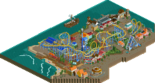
You've really improved your game man. Great to see. It's quickly done creations like this that have the best flow and "healthy" appearance.
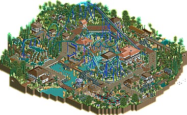
Compared to Doomed Domain you've improved a lot of things. Your jagged-rocks design is still strong but much more under control now. I like it. I still think you want to use less 1/4 rocks and just some full square ones that are merely "supported" by the custom ones. It'll relax the atmosphere a little by making everything look less custom and busy. Your composition is also much better and more purposeful. You put more attention to the paths now which really pays off. I think you could do it even more though. Near the entrance of this the path layout hits a T-junction and is pretty straight from there. Perhaps you could give it more flowing organic lines instead of this chopped off rectangular look. You've done that later in the park but I still feel you need more of it.
What I didn't like too much was the naming. It seemed a tad random "let's just use whatever spanish word google translate or wikipedia spits out for me here". A tactic I've used too and regret doing so. Sorry if this assumption is wrong and the names are actually much more purposeful, it's still the impression this made on me. So, try to see more of the whole theoretical concept behind your creations before you start. It doesn't need to be super precisely planned out. It can be loose in your head but as long as its there and you know what you're going for it'll guide you. And it'll spark naming ideas. Feel this would've benefited from that.
Lastly I think your overall aesthetic design still has some potential to create more "wow, that's so beautiful" factor, but considering your rate of improvement I think this'll come automatically.
Excited to see what you do next.
So yeah, cheers.
Err.... it did?
What i like most about this design, and your work, is that i feel i can actually watch you growing. That is rare, but i can see things you did differently compared with past ideas, i can see you experimenting, and i can really see you playing with different concepts. I like that, i think it shows you are thinking about what you make, and you are going to make some amazing stuff in the future.
FK
Fantastic job buddy.
Also thanks to Geewhzz for keeping N.E. alive and strong.
I just love it here.
Thanks to all the voters for your honest vote.
Comments are always welcome.
First design and i'm happy with it.
Only inspiration i had to make this design was indeed my debut accolade 'World of Creations'
I know many liked the Spanish area in there. Therefore i decided to retry that one ,but with a B&M coaster. I just wanted to make a B&M ,since i failed with the first one in World of Creations. So this time i've watched 'Dragon Khan' in Port Aventura in Spain on Youtube and made sure that the elements are used correctly this time.
So yeah trav ,you're right about revisiting the Spanish theme in my debut accolade.
Also nice write up trav (kort maar krachtig
@ posix : Thanks posix
I've definately taken a whole different approach again when i started this and didn't rushed anything... well maybe some foilage was a little rushed ,but not sloppy or out of place i think. I've been thinking about atmosphere from the start of the design ,making sure not to miss out on that this time. Interaction is just my thing ,it's obvious i guess.
Peep friendlyness is high on my list ,but it limits my pathing abilities somewhat ,but i'll try to improve that. I'll work on my landscaping and will try to use landtool rockformations also ,but it doesn't really work for grey rock i.m.o.
You're right about the names ,i've let google do the work for me.
I'll try to be a little less lazy next time.
Although 'Blue Hawk' = 'Halcón Azul' didn't sound too bad ,since the coaster is flying through the area.
I'm saving the real wow factor for my (hopefully) spotlight in the near future.
I don't want to run out of ideas too fast.
This design was also a breeze to make ,a tropical one if i might add.
And you can expect a lovely christmas design soon ,with NEW animated objects made by myself.
I'm starting to get handy with obj. editor and made some animated objects for my christmas release ,you'll love it.
@ Ruben : Thanks ,and i'm glad to be an inspiration for the site and it's members.
I'll keep the spirit and you can expect more for sure.
@ Faas : Cool? No it's hot.
Kidding Faas ,thanks.
@ Mr. Coaster : Thanks ,enjoy it.
@ olddtfan51 : Thanks and i did win an award ,it's a Design ,so i'm happy.
@ FK+Coastermind : Thanks ,it also wasn't intended to blow you away.
In that case i definately needed to put in a whole lot more nifty ideas and architecture.
I didn't want to put in too much effort ,maybe because of my previous work ,wich asked a lot of me and wasn't rewarded that greatly ,but i've learned from that.
I'm also experimenting a lot with the game ,as you've noticed.
At the moment i'm not spending too much time on difficulty ,but more on the basics and refinement of my work.
That coaster was build in 10 minutes ,so yeah nothing really special.
It became special once it was fully 'dressed'.
I'll work on colour usage ,that's definately not my strongest point.
You can expect more releases from me.
@ In:Cities : Thanks a lot man ,i just love that logo ,spot on!
I'm glad you've enjoyed it ,and it makes me happy to hear that i'm such an inspiration for you. I'll be looking forward to your work even more.
I'm happy to be here guys.
Edit : Louis ,i can almost say i love you ,for the love you had when you saw my design and voted on it.
I think you bit of more than you could chew by taking all the jobs ,but definately a lot of thank you's to you.
@ ][ntamin22 : I don't know ,maybe in my topic?
Now im not attacking the panel or anything, this happens over time and need to be corrected in order to maintain this beautiful site. We as a site need to recognize this problem and fix it before it ruins the site.
And as an extra note, 5dave. Could you please explain your thought process behind your vote. I dont think your an ***hole or a jerk or anything, I just was wondering where were the flaws that caused you to vote this design so low.
-GWL
Don't be angry though ,it won't help.
I agree with you that the stakes are getting higher as we speak.
And it might ruin the future for this game and site.
In the end ,maybe only the extreme die hards will remain here ,making it a very quiet place...
But don't worry.
I'll get that 80% score one day ,i'm sure.
I'll need to learn ridehacking for sure (wich i don't really like).
My skills are also developing fast now ,so expect more nice releases ,because i'm not done yet.
I'm also working on a concept for a big park again (a little bigger than World of Creations), but it'll take quite some time to make a concept that will be mindblowing and jawdropping.
One thing is for sure though ,if you want a spotlight ,then make something unique ,innovative and mindblowing.
Most members you've mentioned are here for several years now ,unlike others (me and you etc).
You've got to show something 'worthy' to impress them ,because they've seen it all ,unlike us. Maybe it's not totally fair ,but it's the way it is.
I'm a die hard ,so i'll keep pumping up my skills and get there.
Edit: Oh yeah 5-Dave ,please do explain.
I'm not angry or whatever ,but i am curious to know what you didn't liked about it.
Others feel FREE to give your comments ,because i've barely got response so far.
OK here's my thought process behind my vote:
1. Nice colors.. well well well the theme looks a bit generic to me, can't really tell what the theme is for now.
2. OK it's supposed to be spanish/mexican. Naming, foliage and overall feel are definately spanish. I can see also the buildings are somehow spanish but very blocky and scattered around for me. Also they miss some spanish details. Oh well there's a sign that says Espania - so Spain it is.
3. Well onto the layout. A B&M sitdown - pretty standard but that's only because I've seen so many in all those years - let's hope it has a nice layout and good pacing. Well the first half is pretty good, although just the standard B&M stuff besides the camelback. Well can't really say more. The second half is too short, or at least the MCBR is too late.
4. So how about ride interaction/integration? Well it's nestled quite nicely in the area, but also the first half is better than the second - the interlocking corkscrews completely over the path look wrong to me and like an afterthought and what I find most dissapointing is the queue. Beside short it's also pretty boring and offers no real sights into the ride itself.
5. Ride detailing. Well. While spending a good amount of attention to the lifthill/mcbr, there was no real attention given to the transfer track and the final brake... Around the ride itself no real items/gadgets are given to make it 'pop'. Stuff like that makes a ride memorable to me.
6. The supporting rides are there but don't really enhance the ride. Only the station of the railway plays a little with the ride itself. The car ride and the playground on itself were great, although they were just there, it could have been in every other design too.
7. OK which score to choose... hmmm I really don't know - It's nothing spectecular, nothing I haven't seen yet so it's definately below 70. The major flaws to me are the second half of the layout and the fact that it's the same old same old. Maybe I got picky over the years but I did not like this submission very much fits my impression best.
So that was about my thought process, although writing it down took a lot more effort to vote on the park itself.
Seeing that Arjan did this and how he amazed me with the doomed Domain, I'm sure he will convince me next time.
"MFG"
I've allready mentioned that i didn't do my utmost best on this design.
Maybe it shows...
I just wanted to build a 'fun' design ,not breaking my head ,but just something nice to look at.
Thanks for the tips on the coaster, i'm not so familiar with all the coasters in real-life, but i'll improve those facts mentioned next time.
Theming is not my strong point, will work on that ,as well as colour usage.
Won't mention the other points ,because you know as well as i do ,that i can do better.
But yeah ,you are getting nitpicky ,because i haven't seen/build so many b&m sitdowns YET.
And don't worry ,i'll convince you next time.
Hell yeahhhh