Park / Avantasia
-
 11-December 12
- Views 2,786
- Downloads 750
- Fans 0
- Comments 9
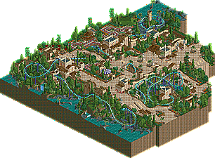
-
 56.54%(required: 65%)
 Design Submission

Dimi 75% Airtime 70% robbie92 70% 5dave 65% Casimir 65% Goliath123 60% posix 60% prodigy 60% Roomie 60% Loopy 55% Jonny93 50% BelgianGuy 40% Louis! 40% pierrot 40% RMM 30% 56.54% -
 No fans of this park
-
 Download Park
750
-
 Tags
Tags

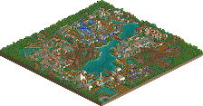
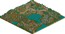
Sadly that isn't reflected in the score. Not saying this particular design should've scored higher, not at all because I know it is flawed. But I've got the feeling that you need modern techniques to score much higher these days. I doubt a nostalgic park can score over 80%, unless it's natelox.
I think I know why the style is still 'popular' though. It's because this style rotates about aesthetics and strong, simple atmospheres. Qualities that have been forgotten in recent years.
At least this is what makes me play LL. I like pierrot's work a lot but it doesn't inspire me like parks by natelox, Ozone, RRP or you, posix. Compared to recent micro-detailed LL work, I can count Fatha, x-sector and mantis as well. Among others.
I can't really comment much ,since i don't have LL yet ,but from what i can see ,it looks very nice. The layout is awesome and adventurous.
I'll check your park soon Liampie ,when i can.
I tried, but didn't get past silver, I know my park wasn't nostalgic in this sense, but it still didn't use any modern techniques.
Anyhoo, I should have voted slightly higher, looking back there are parts of this that are worthy of design, it's just the overall picture isn't. Had the layout been better this could have won design easily as the surroundings, even though nostalgic, were impressive.