Park / Light Shadows Valley
-
 04-June 05
- Views 3,766
- Downloads 489
- Fans 0
- Comments 30
-
-
 Description
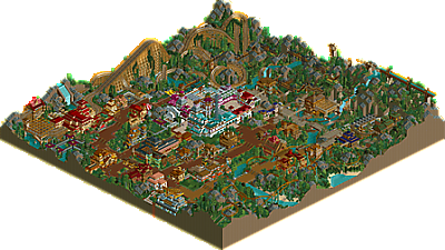
"Actually of all the parks I’ve built this on just barely gets nudged by Euphoria City as my favorite. My approach to this park was completely different than anything I did before. I thought of everything: land, trees, bushes, building, coasters, and all, as parts used to create an atmosphere out of colors, textures, and forms. As a result I’d definitely that the atmosphere (with the exception of the ugly-ass white building) is the most enveloping of anything I’ve ever built. I suppose it should be noted that it was disqualified from the RCT Olympics contest for which it was originally built, much to the dismay of several of the judges, and everyone at NE."
- Ride6, on his parkmaker page -
 No fans of this park
-
 Full-Size Map
-
 Download Park
489
-
 Objects
319
-
 Tags
Tags
![park_4140 [H2H8 R5] The Apprenticeship](https://www.nedesigns.com/uploads/parks/4140/aerialt3934.png)
![park_4822 [NEFC] Great Mesa Gateway](https://www.nedesigns.com/uploads/parks/4822/aerialt4720.png)
If there isn't any theme, why did it seem like each building had it's own different theme? One was dark/gothic, one was spanish looking, etc.
I believe that you have to have at least some kind of order, but if there was no theme, don't have any uniformity of a certain style on one single building. Different jumbled textures would have suited it better imo. This is just my advice, and you don't have to listen to it. Just consider it
I really actually enjoyed the park though, aside from what I mentioned earlier. The woodie area was my favorite. Beautiful stuff, man. I loved the station. I quite enjoyed all the rides, they were all so fun. The flyer was excellent, but it's a shame it ended so slow... as mentioned before. I think this park puts you on a whole new level of parkmaking.
Good job.
The landscaping is something that really caught my attention while viewing the park, those bare looking rocks sticking out everywhere made it very interesting to look at. The duelling woody running through this nice landscape was cool to look at and the same counts for that mine train. Although I liked the woody more. No comments at all, the park was truly an inspiration to me. Keep this work up man!
Anyway, Chauncey IS right, the elevation itself is poorly done, but atleast he actually ATTEMPTED it, unlike MOST of you screw-ups and your flat as a pancake bullshit
You would've blown everyone away if they didnt Fuckin DQ you...
The Mine Train was my favourite ride, awesome huge drop that really worked well. Nice how it went behind the waterfall too. Wonderful landscaping around it.
The Woodie's were good too, they had very strong individual layouts, just didn't duel quite as much as i would have liked perhaps. But very strong layouts and the bushes going up the lift hill worked excellently imo.
I didn't really like the flyer. While the first half of the layout was well made, the second half was pretty poor, especially those helixes going into half corkscrews...it went 10 miles per hour around one of the helixes! Too slow. But I really liked the born to fly theme.
I understand you weren't going for the "theme" park feel by sticking with a/several themes, but the architecture was perhaps a bit too random in it's colour choice. It's cool how no 2 pieces of architecture looked similar, but perhaps too many colours were used in the long run. I think you should have avoided the blue near the centre of the park.
One peeve i did have with this park were those random lines of ruin pieces going over paths and over the mine train. Firstly, they were all facing the same way making them look totally unnatural, and secondly, they didn't seem to have much support. If they had been there that long to look ruined, then they would have fallen in by now
Another thing. I understand with the olympics that your time schedule was very short, but some of the rides were unnamed. Launched Freefall 1 and Swinger 1 to name a couple. That pisses me off, since it takes a few minutes to name some rides. Also, it would have improved the experience if you were to have the rides open when you release a park. Then we get the music and everything and dont have to take the effort to click to get the duelers in time, only to have to wait for the train to load with passengers for 1 minute before it sets off (even though there aren't any passengers) I know, it sounds lazy on my part, but it just makes the viewing of the park more enjoyable if everything is laid out infront of you, ready and running for you to enjoy.
Saying that though, this was a fantastic piece of work, and definately would have won the competition. It puts you up to the top 3, if not the best Non-Parkmaker out there.
Sorry if I mentioned a load of stuff that's already been said, I didn't actually take the time to read all of the comments put prior to mine
Metro
PBJ Offline
but i saw your park a few minuts ago... and first of all: GREAT JOB...
there where a few things a din't like about it. the flying coaster was IMO not the best layout.. but the Mine and the Dou-woody fixed it...
the woody is a very nice one, maybe it was short but the amount of space was little. so nice one...
the mine coaster was great. like metro said: awesome huge drop that really worked well. Nice how it went behind the waterfall too. Wonderful landscaping around it. like the aquaduct, that was a very great "addon" to the ride..
the arcy was very nice, the coaster layout (minus the flying one) was great, landscaping was not great but well done..
SUMMERY OF THE WORDS ABOVE:
Great park, i love to see more of you