Park / Light Shadows Valley
-
 04-June 05
- Views 3,478
- Downloads 381
- Fans 0
- Comments 30
-
-
 Description
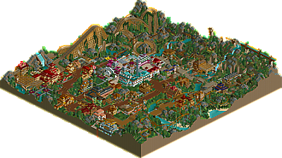
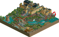
"Actually of all the parks I’ve built this on just barely gets nudged by Euphoria City as my favorite. My approach to this park was completely different than anything I did before. I thought of everything: land, trees, bushes, building, coasters, and all, as parts used to create an atmosphere out of colors, textures, and forms. As a result I’d definitely that the atmosphere (with the exception of the ugly-ass white building) is the most enveloping of anything I’ve ever built. I suppose it should be noted that it was disqualified from the RCT Olympics contest for which it was originally built, much to the dismay of several of the judges, and everyone at NE."
- Ride6, on his parkmaker page -
 No fans of this park
-
 Full-Size Map
-
 Download Park
381
-
 Objects
319
-
 Tags
Tags
![park_4140 [H2H8 R5] The Apprenticeship](https://www.nedesigns.com/uploads/parks/4140/aerialt3934.png)
![park_4822 [NEFC] Great Mesa Gateway](https://www.nedesigns.com/uploads/parks/4822/aerialt4720.png)
Corkscrewed Offline
ride6 actually stepped up for the "full size" Park round and crafted a full park. Somehow, it was disqualified for reasons I still don't understand. I suspect it would have killed the others, and that's why it was DQ'ed, but that's my theory.
MAP
DOWNLOAD HERE
Special thanks to Image Shack for hosting the screenshots and to GEOFF for hosting the parks.
Def. Shoulda won!
Bring this to the pro tour and you're going to give the rest a very hard time. 'Tis awesome, shame that the flyer was so slow at the end (and was so unlike a flyer in the beginning, though i even sorta liked that) The way it went up the lift was beautiful though. The woodies looked beautiful as well, though didn't duel enough in my opinion and were painfully short. The mine train worked really well with the theming, thought the layout by itself could have been better. The overview just says it all though, your own little world. A lot of inspiration from mala, but i definitely see your own touch to it. A job well done.
awesome.
Ah well, all in due time. This park was for me a small world, entirely my own, for roughly a month while building it. During that month I only worked on one other rct project (I spent a bit of time on an LL collabro) but this was over 95% of the time I spend in game. Yeah, the mala influence has been a major thing for me recently, I'm just tired of seeing and building the same old simi-relistic piles of crap over and over. Sure some people do it really well but I would rather do something that I can enjoy.
Personally I believe this to be my best work, I hope you feel the same.
-cg, you are an interesting person to say the least, in some ways I'm glad someone didn't like it. Makes me feel like I have room to grow. Even though I'll probably never make you happy, lol (well maybe with orange water
ride6
Corkscrewed Offline
Thing i liked the most was the coaster layouts, well, the wooden coaster layouts, they were brilliant and had some brilliant landscaping to go with them. The mine train i felt was too short but a nice edition to the park. The flyer was terrible imo the layout wasn't strong enough and the speed was horrible, a real let down if you ask me and why wasnt the whole coaster supported and just some parts of it? Moving on to the themeing well the architecture was good but i couldn't identify a theme, it was too many colours that i was confused on what theme to call it. The foliage was terrible, the main reason im not too impressed by this park i mean it was terrible, something you should work on ride6.
But hey, nice park i just dont think it was that amazing.[/font]
This is the reason that I warned my team to be wary of you in the playoffs, and now everyone can see why.
My architecture was admittedly overly colorful in this one, something I will try to organize in the future but I don't see what's wrong with my "horrible" folidge. I was purely using folidge as a texture rather than plants, personally I find it far more enhansing to the atmosphere of the park than planting "realistic" tree combinations.
Sorry if I'm sounding defencive but I've gone over the no theme thing like 20 times now. Why can't an amusement park just be an amusement park?
ride6
The composition is random, the layouts are terrible, the architecture is blocky, the landscaping disgusting, and the selection of colors, textures, scenery, etc, is even more disgusting. Even the "THE ELEVATION" Blitz talks about is poorely done, and quite cliche in it's own way (the "I wanna ripoff Mala so that everyone goes 'Wow' and I win the contest" way).
and cg? this wasn't so much to win a contest as to prove to myself that I could still get something done in rct, because at the time I was stuck in one collabro after another for months on end. I'm still in that situation more or less.
Frankly I didn't expect this to be very well recieved when I build it because people would moan about the textures and colors and then go piss all over themselves about how I copied mala.
ride6
Also, I make parks with large flowing landscapes which are nothing like Mala's. You'll see soon... don't want to get too much into details... and steal another topic... or... maybe... 256 x 256... no thrill rides... lots of flowers... lots of hills... a few buildings scattered about... single-wide paths... very pretty... very Scenario-esque... in a good way...
Corkscrewed Offline