Park / Seahawk
-
 21-November 12
- Views 5,228
- Downloads 788
- Fans 0
- Comments 42
-

-
 59.23%(required: 65%)
 Design Submission

In:Cities 80% posix 80% That Guy 70% Coupon 65% Jonny93 65% Liampie 65% Maverix 65% Sulakke 65% Pacificoaster 60% chorkiel 55% Goliath123 50% pierrot 45% robbie92 45% 5dave 40% Phatage 40% 59.23% -
 No fans of this park
-
 Download Park
788
-
 Objects
356
-
 Tags
Tags
![park_4120 [H2H8 R4] Ruigrijk](https://www.nedesigns.com/uploads/parks/4120/aerialt3860.png)
![park_4090 [H2H8 R2] Feira do Flamengo](https://www.nedesigns.com/uploads/parks/4090/aerialt3829.png)
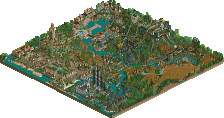
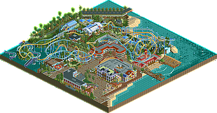
To seahawk. I thought its design worthy. It's not to memorable but its a pretty nice thing. The coasters were pretty good but i felt the archy let it a bit down.
Corkscrewy, the dualer with surrounded interaction is truely impressive, I enjoyed this a lot. the monorail as planter and building wall is sexy. ..others are super boring unfortunately. I'm a only one who tired to seeing indoor-ride with uninspring same 2x2 or 2x3 structure? the atmosphere is generic and lifeless. the colors are so dry (this is the major points of lifeless atmosphere), nothing was popped-up and didn't really caught my eyes.
Honestly I was much enjoyed your previous work like a Atlantic Adventures. I know this is your first attempts of CSO though, but indeed you're very skilled and one of antipacing player in this site. I think you have a great sense of composition and detailing, the details around dualer proves it. If you improve your color sense and more focused on actual theme, I guarantee you will punch the accolade soon again. keep improving!
I really would appreciate more feedback from everyone as this is my first time using CS. This was mainly a project to get used to how pieces worked and ways to build different things. I know its very generic but like I said, this was more for practice on certain ideas. Which is why it might not have been cohesive in places.
As far as hacking goes that's something I've never really gotten the hang of. Which is why the ride huts were still there. I ve tried but cannot for the life of me get it to work. I know foliage is something I desperately need to work on.
Overall I wasn't expecting this to get a design tho of course I was hoping haha. Keep the feedback coming please as I really want to get better. And want to know what I did right. I didn't realize how big of a pain supporting a dueler of this design and ride type would be untill way into the project haha.
So come on everyone, let's just let the panel do what they do best and that's making sure NE stays the best site on the internet. And let's get back to enjoying some great RCT.
Cheers,
-Josh
This.
The design was decent in my opinion, but not quite design-worthy, hence my 45%. If the surroundings had been a bit more cohesive, or if this was pulled off with more of an original take on the theme, I could see my vote going slightly higher. For your first go with CSO, this is quite nice, and you're really close to accolade-worthy work. I'm sure you can reach it with your next release.
That being said, if we keep getting complaints about the panel for every failed submission from people who are more critical in the screen phase than any of the "unfair" voters, I'd seriously consider leaving the panel. It's difficult to want to continue to help the community when the they would rather bitch and whine about every decision you decide to make. I may not calibrate, and I know that my tastes change, but I base my vote on my enjoyment of the park, the skills presented behind it, and the presentation of the work as a whole; essentially, a park will receive a higher score from me if it can keep my attention for longer than five minutes, something that this release, and similarly-scored releases from me, did not achieve. All I'm saying is that the panelists have no specific agenda against any players, and the number of panelists ensures a balance between objective and subjective reasons for voting.
robbie?
You seem to have forgotten our savior, robbie92, Cas. I kid, I kid.
It was just a feeling i had.
Because handing over accolades to everybody that submits is helping them improve? I believe in pushing to extremes to get the result you want, if you want it bad enough you'll keep trying and reach it with practise and determination, not by calling a system that works unfair or biased.
I liked the layouts, they held my attention well. however im just not a fan of beach settings next to grassy tree areas. They just dont mix well in this game imo.
Also the architecture was hardly spectacular in any sense, a typical style that appears often
-Josh
I'm having a problem with your lack of understanding of the word 'subjectivity'. Consistency itself is subject to subjectivity, as you can see that you're perception of my voting consistency is that it's actually 'apparant inconsistency' whereas I disagree. If this design was truly something to be revered by the community then that's the effect it would have on a wide range of viewers. If you think that I'm out of touch and that my views on contemporary releases don't sympathize with those that created them, I'll let you in on a little secret that I've been in those creators' position. I can be rating on an entirely different criteria than what you think should be the norm but that is 100% not your decision, and a fun fact for you is that I was appointed to be a panelist by the guy who gave this design an 80%. Maybe I'm allowed to not be a robot when voting and use my own mind, one that has been respected in this site in the past and has been the reason why I've been placed on this panel. People can still download this design and come up with their own opinions of it regardless of what I vote and in the end, the little title of 'Design' is not going to change the quality of this entry.
Ruben, see how you wrote "in my opinion"? I voted higher on those other entries because, in my opinion they were better. They showed more dedication to their respective concepts of the themed wolf rock or GCI woodie than this design which chose to just submit a lot of subpar, hackneyed-styled buildings surrounding what I thought was also a subpar dueling coaster. And this might be crazy but that last sentence might not hold true [i]in your opinion[\i] but again, I wasn't chosen randomly to be on this panel.
Maybe I am really out of touch with the current state of this site, because one of the best feelings I would get from releasing a park/design was the praise from people who have greatly inspired me with their work, the praise that other players would give me for being inspirations to them, and even the criticism from people that I could ultimately use to better myself in the end. What title the site decided to release the work as didn't really mean much to me or a lot of people I knew, and that's what we used as our stepping stones rather than participation awards. Corkscrewey knew this wasn't on par with what this site considers a 'Design' and you all gave him your thoughts on it and he should appreciate you for it. I took time out of my schedule to look at the park in-game and give it my rate. If there's something special I see that I want the creator to know, I'll write in the release topic about it, but when it's the same exact thoughts as what you would expect people to say, I'm not going to waste my time being an echo. I appreciate Corkscrewy's attitude to this thread, but other people have already voiced my opinions on this.
Seriously some of you really need to grow up though. It's not even like everybody rated this at 80 and I was a huge outlier. If you really feel the need to oust me as a panelist then you can start a petition or something, either way I'm much deterred to visiting a site that has been taken over by whiners.
I understand the pacing iiissss a tad slow and i never really liked that but with this dueler, (especially the coaster types i picked) it's hard to get it how I wanted it when this was never meant to be practice at coaster design nearly as much as it was meant to be practice at CS pieces.
Trust me, this is just the beginning for me..
-Josh
I agree too much whining is going on and liam sorry to say but your propaganda for YOUR opinion is getting a little old, it's his opinion to vote it the way he did, not yours, if you feel that it's unjust to chose designs and parks by democracy go ahead and use your extended arm to go back to the old days and you chose what wins or not singlehandedly..., this site isn't about you or your opinion and an admin calling out members of a panel that was chosen by your own colleagues is sad and destructive, I'm actually doubting your honesty towards the entire crew of the panel and I find it offensive how you behaved in this topic. And it's HALF of the panel that graded this below design score so all in all it wasn't that worthy of design, live with it and move on, democracy still stands here and the panel is here to make sure it does untill some complaisant henchmen with a big L on their chest come to vote that's not going to change.
Sorry corkscrewy that the topic of a good piece of work is getting torn up like this but I really felt like it had to be said, I applaud you for sticking to building something I myself haven't been able to do after h2h6 and I'm sure you'll get a better result next time...
My obsveration is that the bar for winning an accolade has shifted a little, due to varying panelist combinations per submission. It has always shifted, which is logical. Voting based on opinions is the whole idea behind the panel and I stand behind that 100%. However, where different opinions always seemed to be in balance (realism vs fantasy, rides vs theming, detail vs concept), I feel that the balance has been lost lately. In other words, the shift has been bigger than usual. It's an observation of a problem, and with mentioning the calibrating I was exploring a possible (partial?) solution.
I never said that you have to agree with me. If the majority of the site disagrees with my observation that's even better because the problem wouldn't be as big as I thought it was. That's what I want. I want no problems, not people agreeing with me. Makes no sense.
Now read it really close before accusing me of propaganda, calling out 'colleagues', me wanting to claim absolute authority, doubting my honesty or calling my words sad and destructive. The only thing you can accuse me of is insulting, because I did call you a retard.
And to talk about your shift I think it's unjistified to call it that, half of the members deemed this below 65% so call me retarded or you might've misread my previous post where I also stated this! THAT MEANS HALF OF THEM DIDN'T LIKE IT ENOUGH, HALF! So your argument is moot considering that 50% scored it lower, and tbh some people like kumba are known for rather high votes and some like wicksteed are know to be rather low, this has never been a problem so why is it a problem now? Plz do tell me all about it.
You did it again, misreading Liam's posts, as he never made this statement. He just said it might've won some time ago/in the near future.
He already explained that in both of his posts.
You btw. fully prove my problem with the panelist votings recently. Apparently voting is so personal that no-one is allowed to make remarks about it, or people's ego's will be shattered and bitchfights will be inevitable. There's nothing wrong with pointing out you believe the panel is rather harsh/inconsistent lately, but there is with the panelists not even wánting to consider those statements before going into full defense. Especially if multiple people are saying the same thing (Ling, Liam, Me, in this case Casimir up to a certain level) it míght just be there's a point in what we're saying you know...
Hate me for it all you want, but as long as you don't want to go into the content of our claims, and just into the ''insult'' we apparently pose to panelist's egos, there will always be people doubting the panel's behavior.
(P.s. love you guys for putting the time into being a panelist, don't forget that, but that doesn't mean we can't question the panel as an entity as well as its members in any way right? That'd be quite undemocratic)