Park / Seahawk
-
 21-November 12
- Views 4,720
- Downloads 659
- Fans 0
- Comments 42
-

-
 59.23%(required: 65%)
 Design Submission

In:Cities 80% posix 80% That Guy 70% Coupon 65% Jonny93 65% Liampie 65% Maverix 65% Sulakke 65% Pacificoaster 60% chorkiel 55% Goliath123 50% pierrot 45% robbie92 45% 5dave 40% Phatage 40% 59.23% -
 No fans of this park
-
 Download Park
659
-
 Objects
356
-
 Tags
Tags
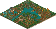
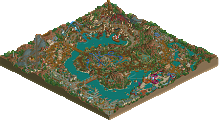
![park_4122 [H2H8 R4] Park Guell](https://www.nedesigns.com/uploads/parks/4122/aerialt3861.png)
?
Corkscrewy, it was a delight to watch! Sorry I didn't get to vote on it in time, I would've given it a ~75.
I'm used to seeing pierrot vote 20% below what something should be though, so not gonna dispute that.
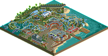
@ Corkscrewy: I really like the idea, the setting, and the architecture (particularly the Seahawk and submarine stations), but the pacing was below par. That first cobra roll in particular was murderously slow.
*Insert comment about a submission being "robbed"*
*Call out lowest scoring panelists and pull out other scores to contest them*
Come on NE, do something new for once.
Sometimes i do think some 'veterans' here have set the bar to high.
I'm going to download this and give my comments later.
Edit: I've looked at the park and i like it.
The ups: Ride interaction between the 2 coasters is lovely ,i really enjoyed that.
The architecture is nice as well.
The downs: Foilage wasn't really impressive ,a little boring to be honest.
The coaster's que also could've been done better with the use of pathblocks and step pieces in combination with inv. path (it will give a more refined look)
And please consider the inv. hut hack ,because it looks so much better without those huts.
The barrel roll right before the brakes is a no no.
Overall i liked this and would have give it 60/65.
But i'm not a panelist.
RMM Offline
NE was founded on setting the bar high.
this is nowhere near design worthy to me and i don't disagree one bit with those who gave it a 4. i feel that, years ago, something of this caliber would have no shot at the front page. personally, over the last few years, i would've shot down a majority of the designs that made the front page, including my own.
i'm sure the reason so many 'below par' designs, to me, get voted in is because there are fewer and fewer players playing the game anymore and we, as a community, can't really afford to only showcase 3 or 4 designs a year. i get that but i just don't feel the quality is what it used to be, and i'm sure i'm not the only one who feels this way.
No need to say that i'm bitching about it.
This 'high bar' isn't a problem for me ,you'll see.
But it might be for others.
I personally love the high standards here ,it can only strive me to get better.
I'm sure the next one will hit it.
"MFG"
I think you're being too simple about it here. Of course, there has to be a standard, and that standard can better be too high than too low. However, if an environment (like NE) is highly critical, I believe it's no more than fair/in fact very useful to be critical about the assessment methods and standards as well. Ling, for example, has a good point with the first example he gives. Nothing wrong with pointing that out. Keeps people sharp and keeps things fair imo.
For this specific submission I have to agree about the last part though. There's nothing that truly stands out about it and the map planning wasn't optimal. Quality of building/rides was good enough for a design imo, but maybe next time focus a bit more on the concept and composition. That would make the archy and layouts pop out a lot more.
I thought it was much better than all of the low-scoring design winners we've seen in past months. Yes, the duelling wasn't perfect, but making duellers is still much more difficult than making a "solo" layout. It just takes more skill and I felt he had to be rewarded for it.
I also loved the landscaping. It complemented the ride very well, especially right out of the station. The rest felt finished and had received above-average care like the custom cafe and under-water-ride entrance building. Also liked the flat ride which had a nice and sense-making name I can't remember as I type this. Made me feel as if a certain amount of inspiration went into this. I liked that.
You guys sound like Republicans who are angry over Romney losing and blaming it on the fact that lower-class people showed up to vote. I honestly am only a Democrat nominally and I would've voted for Romney if there was something good to vote for.
And about this site being elitist; why would you call it elitist? I know it is made for those ranked-up members, but why can this be considered a website for RCT2ers to get better and improve at the game? Isn't that what the community is made for?
This. Exactly. This is also what I wanted to point out with my post in this topic, and with my ''attack'' on pierrot the other day. It just feels like lately the chances of winning a design/award are getting more and more based on being lucky with who your panelists are, on personal preference of the panelists rather than apparency of skill, and on how those panelists feel like voting that specific day.
You can give people all the shit you want about telling you what to vote and not respecting your votes, but in the end the whole system is meant to award those who are ''good enough'', and for something being good enough you have to have a standard and a structured way of approaching that. If you just go around randomly voting based on preference for a style rather than on skill, or based on how you feel without looking at (your) previous votes, I guarantee you the design/award system is going to be messed up within no-time. Weaker designs might win where stronger designs don't, and with that the entire system will lose it's value as any level of objectivity will be lost.
@Phatage: Democrats need rules and order as well y'know, what you're talking about is more a hippie pov than a democrat one in my opinion. I'd be more interested in an in-depth response to Ling's critiques than in you taking a rather rhetorical defensive stance on your right to vote however you want to. That, for me, only proves Ling (and others, for that sake) has a point in his critique on recent voting behavior.
Once again, I'm not against the bar being set high, or against NE being elitist. I mean, the one reason NE is still going strong is because we have more people with heart for the game and people that know what they're doing than any other rct community. But I wóúld like to see some objective input, and fair scoring. If you wanna be high-leveled/elitist about the skill lvl on this site, than please be high-leveled/elitist about the modes of rewarding/voting as well. It can't be that you all talk about maintaining a high level and stuff, and than not taking voting as serious as you should to reflect this ''more professional'' approach to the game.
The atmosphere was good and the layouts were nice. I'd agree with most of the scoring.