Park / The Doomed Domain
-
 24-November 12
- Views 8,273
- Downloads 883
- Fans 1
- Comments 53
-

-
 58.85%(required: 50%)
 Bronze

turbin3 90% 5dave 70% Sulakke 70% Goliath123 65% Jonny93 65% In:Cities 60% Liampie 60% posix 60% Loopy 55% Maverix 55% Pacificoaster 55% pierrot 55% chorkiel 50% robbie92 45% Phatage 40% 58.85% -
1 fan
 Fans of this park
-
 Full-Size Map
-
 Download Park
883
-
 Objects
457
-
 Tags
Tags
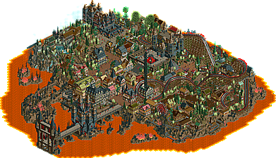

You made me very happy knowing that you love it so much.
You'll be the reason i'm going to retry this theme once more in the future, with hopefully even better castles and other forms of architecture combined with the insanity you saw in this park. I'm not giving up because of low votes ,i'm too hardheaded to do that.
@ molemaster43: Thanks ,glad you've enjoyed it
Something new will come up shortly...
Its a really refreshing park. You created a really nice atmosphere which fit very well with the theming. The interactions between the rides, scenery and the paths are really great. Your ideas are really nice.
Try in your next park to create a better architecture. Some variations in colors and forms could do wonders.
My biggest problem with this park is the fact that everywhere i watched are full of details. There was no room to relax and to take breath.
I think you are one of the upcoming stars of this site and your building speed is so fast. Really great that you improve from submission to submission. Finally congrats to Bronze and next time, i am sure, it will be a higher accolade.
You're right about the fact that it missed a decent relaxing area.
While i was building this i realized i had to few space to fit in all my ideas, thus it felt cramped, but somehow it didn't really disturb me at that time.
After viewing it regularly myself ,i realized my mistakes.
Personally i thought the architecture was nice ,not perfect ,but definately nice .Especially the castles.
I'll try to kick that a notch up in my future releases though.
What really strikes me is your interaction between rides and peeps and landscape and archy. The arches and tunnels and roller coasters whizzing past peeps was wonderful, and really brought the park together. And this convinces me of amazing things coming from you in the future. There are moment where your textures and archy fall abit short, but that is the easy part to learn. Creating complex interaction is one of the harder things to grasp in RCT, and you definitely have it.
I loved the woodie and its interaction with buildings, i loved the minetrain (that first run through the islands is mesmerizing to me) but i think the hidden gem is the mini-minecart coaster. All the trick tracks and near collisions were perfect. In general, i thought you did a fantastic jobs of merging interesting rides with their surroundings.
The oozing piece was overwhelming, but unique. I loved the misty mountain affect, and was impressed by your ornamentation and layering on the buildings, particularly the black Gothic ones. All in all, wonderful work, truly enjoyed exploring it, and look forward to more of your work in the future!
FK
Well, to be honest, I think voters should supply a reason for their opinions. Not only that, but I've seen a few parks that may be high quality, have half-ass efforts put into them. Other parks I have seen have barely missed the accolade and it is just a shame. Maybe there should've been some sort of "Honarary Mention" group in the NE database and a small writeup (maybe even by the creator) for parks that have missed the Bronze, but aren't terrible at the same time. This will still maintain the quality of accolades while allowing those that put effort
My opinion on this park, well the foliage was bad to be honest (and I'm not one to talk, lol) but the architecture was great. Yes, there are higher quality accolades but this has a certain level of creativity and uniqueness and I personally find it better than any of the soul-less "realistic" bland mc-park spotlights that grace this website so often. Boooring. Despite the awkward foliage and enough jagged rocks to make me cry, this park was a solid bronze IMO.
FK
I loved your review, and to be honest ,interaction is easyer for me than architecture.
I've got a real strong vision on how to create interaction.
Thanks Jaguar ,you've also mentioned a strong point that annoys me to be honest.
You're right about the fact that the difficulty in there isn't being rewarded ,i guess.
I've put more effort in there than anyone would guess.
And then even votes lower than bronze felt like an insult.
Prove will come soon ,you'll see in my next release 'Halcón Azul'.
despite the fact that it looks good, it was only 1/5 of the effort and difficulty compared to The doomed Domain. I wasn't even inspired to build that design, it was more a test to see what's being appreciated more ,and i know now. The scores are also way better than Doomed Domain. I do admit that carefull planning in that design has created a better result.
But still... it stings me.
This might also cause that i'm not going to build parks like Doomed Domain anymore soon.
So much effort and so little understanding.
Several users also mentioned that the archy was lacking, but we're talking about not even giving a bronze for it.
I've seen bronze releases that can't even measure with this one, so again stunged.
Ofcourse more designs and parks will come.
But crazy out of the box thinking might have been ruined.
So i'll build parks that have been build according to rules of reality from now on i guess.
Less effort ,bigger score.
Too bad though ,no understanding for out of the box thinking is an inspiration killer.
I hope that i didn't hurt feelings ,but it's the way it is.
Edit: I've changed my post a little ,because i don't want to offend others who don't feel the same way as i do.
Everybody has a different idea of valuable work.
http://www.nedesigns...de-lage-landen/
http://www.nedesigns...471/fun-island/
http://www.nedesigns...reepark-berlin/
http://www.nedesigns...onder-showcase/
http://www.nedesigns...amusement-park/
Some of these could have been accolades, some not. The fact is, all of them are quality parks that deserve more recognition than a lower scoring park. Some are of higher quality than a few bronzes I've seen.