Park / Shangri-La: Expedición al Himalaya
-
 25-October 12
- Views 9,990
- Downloads 890
- Fans 0
- Comments 49
-
 60.00%(required: 65%)
 Design Submission

In:Cities 75% Louis! 70% AvanineCommuter 65% chorkiel 65% Jonny93 65% Loopy 65% turbin3 65% Pacificoaster 60% Casimir 55% Goliath123 55% Phatage 55% robbie92 55% Sulakke 55% Maverix 50% pierrot 40% 60.00% -
 No fans of this park
-
 Download Park
890
-
 Objects
212
-
 Tags
Tags

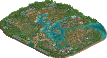
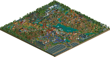
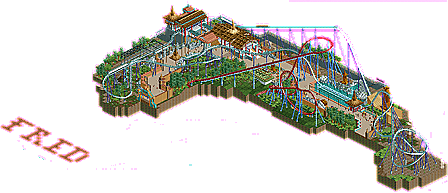
To me, this was good. It just lacked substance. The "cropped out" coaster just made it seem unifinished and lazy, like you were rushing this. I understand that its a design submission, but still. It would've been a nice touch. The Beemer's layout itself wasnt bad, but was rather short and a tad boring. Your architecture is solid, but I feel like there could've been so much more. If you would've added to the surroundings, you're probably looking at at least a 70% on this.
I agree with a lot of the points pierrot makes as you can see. But I would've voted around a 60% on this. Thats what I feel it deserves. More substance and youre looking at a no-brainer design here. The foundation is there, yet the "stuff" to put this over the edge is not. And thats why you didnt win on this.
But relax though man. You made a very nice little park here. We're all here to have a good time and build rollercoasters. Its not the end of the world if you dont win an award for one. Just take the criticsm as helpful and move on to the next project. Im sure next time around you'll get it.
Another problem with this is size. Compared to many large scale megas out there, such as Shambahala you will notice the layout isn't just thrown into a cramped area such as yours is. This was my biggest problem, your design lacks and noticeable elements that make a B&M mega what they are, long spread out floater air time hills. Sure you have the first diagonal but the way you designed it in rct looks more like a small airtime hill for ejector not floater, you should of extended some 30* pieces in there to make the hill more drawn out. Look at other megas such as Diamondback, AC and would you believe it Goliath, where my username came from, youll notice long drawn out floaters. Your coaster had none, simple as that.
To say you deserved design is wrong, size plays a large role and for yours the size was way off. Sure smaller designs have been awarded (See for example Thunderclap) but the coaster is very small as GCI's should be but there is also much more on the map. For a B&M mega this map should have been nearly twice the size. You had a small portion of DK and really nothing else. Dont be afraid to incorporate actual parts of a park into a design, after all a design is a small portion of a park and not just the coaster.
And don't tell me im wrong on megas, there the best coasters and i know them well.
Also you should of used the other trains, the jagilt ones i think their called
Lol, people said when Shambhala was build, it was ruining the looks of Dragon Kahn (the red coaster).
You will win sooner rather than later FredD.
That the foliage seemed rushed, is also because I don't like placing foliage. I always do that as quick as possible.
Keep at it bud.
Dude... just no...
Politically they are polar opposites but we are talking building style here cas.
To speak of 'the' Chinese building style basically is madness.
I guess you mean the 'cheesy Chinese' and the 'cheesy Tibetan' styles, though. Which would go together brilliantly. Because they're both cheesy
Shame it didn't make it, and I myself loved it and might've given this about 70% for on a macro-level this is great, but I can see why this was close to but not a design for many of the panelists based on a more detailed level and possibly lay-out.
The one thing I dón't get: Pierrot? What is going on man? You've done this on several parks, and I don't see why you're a panelist if your park judgement is só far from that of other panelists time and time again.... I see you as the (by far) lowest voter on a lot of (especially RCT2) works lately, and this makes me wonder whether it's fair to have a devoted LL'er that doesn't care that much for RCT2-ing voting on RCT2 parks (Same the other way around of course). You've voted below average 15 out of 20 times, and had the lowest vote a whopping 11 times. Not to speak of the dreadful vote on Mystique, a well-designed woody that albeit horribly themed deserved a higher vote for the layout alone. (As also shown by all other voters except by Posix) Don't get me wrong, you have the right to have your opinion and express it ánd you're a véry skilled LL'er, but your votes on some recent parks are just só far away from the rest of the panelists time and time again.... I'd almost say you're tóó skilled a player, and in the sense that you're unable to objectively look at lower and middle class parkbuilding. (was this controversial? Hope not. Just really thought this needed to be said as I've noticed this more often lately)
@Scotlands_finest: No. Just no. Listen to Casimir for this one, as the styles are radically different, especially in detail. It's like saying the Irish countryside and southern Britain have the same archy or something...
well, I've got only 3 LL parks during the panelist (how sad btw..) Mystuqye..I still didn't get why the unfinished design got over the 45% it just didn't make sense for me. I will never give any higher score for unfinished one.
sorry friend..but it sounds like bullshit. and I'm not only skilled panelist, just see other panelists again.
Wicksteed Offline
what the hell? so 'middle class' players are able to look at parks objectively?
Obviously everyone has subjective ways to see a park. pierrot probably is biased by his own preference for LL and he probably is biased because he is a perfectionist etc. But others are just as biased because they prefer rct2, because they care mostly about coasters, or details, or architecture, etc. etc.
That why we have a panel of panelists, whose votes together give some sort of objective result.
Of course panelists can be criticised for their decisions and should have reasons for their votes (which pierrot has), but it really makes no sense to criticise them for not voting objectively - if anyone did that we wouldn't need a panel. [/rant]
On you design, Fred:
I just quickly looked through it, and I'd say it's a nice piece of work, but not too memorable for me (hope I'm not offending you here)
Heres some criticism, that might help you:
I noticed many sterile places that were mainly due to long straight lines where the path just directly bordered to walls. It feels like in a pedestrian subway or any other spot where you are not supposed to stay but to move on.
Sight lines (not for the peeps but for the actual viewer) are highly underrated by many players, I believe.
In this screen you have many nice details, but they are hardly visible because of the track going over them.
foliage has already been mentioned: I suggest you use a slightly broader variety of trees, and just take your tame to place them..
and I also think you should have finished dragon khan. I've said it many times before, cutting things off is atmosphere killer no. 1.
As you say Pierrot: ''thats just because I'm a perfectionist, so I have a high standards than other panelist. what's wrong with it? I really can't find a problem with this. because as you said I have a reasonable reason.''
But whát if we'd have beginning players as panelists that would vote everything 90% higher? Guess the society wouldn't like that, as in that case the panelist' opinions does not equally reflect the general view, even though for those beginning players it is a reasonable vote as all just looks good to them.
What I'm trying to say: Maybe you're voting with the wrong perspective? You can't reflect stuff on your own skill/work/traits like being a perfectionist, but should imho vote on a park for what it is, and I feel like you might not be doing that enough. You're a panelist to vote on a park's quality, not on how much it looks like what you would do. That'd mean Fantasy builders could vote great Realism parks down, Quick builders could vote detailed nitpicky stuff down etc. etc. (Other way around as well) even though that's just personal preference of the builder, and not a show of skill/product quality. I myself am a perfectionist, much like yourself, but I cán see the joy in other styles and don't see why they deserve lower votes just because the builders have another philosophy.
Don't you find it striking how much your votes keep on standing out from the rest?
I, myself, think it's good that you're on the panel. You're critic and I like it, I don't think the panel should be too generous and I think you therefore are a good voter.
It's people like pierrot that keep this site the best of the best.
IMHO the site has become over critical and I hope its not turning builders off. It did me and is part of my lack of motivation.
As for the design, I enjoyed it. Thank you for building it