Park / Shangri-La: Expedición al Himalaya
-
 25-October 12
- Views 10,257
- Downloads 900
- Fans 0
- Comments 49
-
 60.00%(required: 65%)
 Design Submission

In:Cities 75% Louis! 70% AvanineCommuter 65% chorkiel 65% Jonny93 65% Loopy 65% turbin3 65% Pacificoaster 60% Casimir 55% Goliath123 55% Phatage 55% robbie92 55% Sulakke 55% Maverix 50% pierrot 40% 60.00% -
 No fans of this park
-
 Download Park
900
-
 Objects
212
-
 Tags
Tags
brb for review.
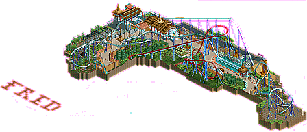
Layout- Was a lacking. I think that might be in part because Shambhala is a tough layout to translate to RCT, some things just dont make as much sense in RCT as they do in real life, such as speed hills, and an MCBR as the 2nd to last element. Only one airtime hill hurt pretty bad here to. I'd have to say the worst part of the design was the layout, which makes design 100x harder. Also, DK seemed worthless.
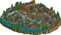
The theming itself, was very easily worth of accolade. The station and queue buildings were very nice, just might have overused the roof object. The entrance to the design itself was really neat, and so was the statue across from the splashdown.
Either way, you've improved a lot, I'm for sure you're next attempt will be a success. Maybe just need to spend a bit more time.
Why on earth would speed hills make no sense in RCT? Doesn't make any sense saying that. Speed hills are very fun to ride IRL so why shouldn't we translate that into RCT... Look at the stats, no red G's, so what's the problem? It's very common on real life coasters so I don't see any problem doing that in RCT (as long as it doesn't cause too much G's). You say Shambhala is a though layout to translate into RCT. Well too bad this ain't a recreation of Shambhala. It's nothing more than a coaster heavily based on Shambhala. But yeah, if you tought this was meant as a recreation of Shambhala, say the layout is weak because Shambhala's layout is hard to translate into RCT.
The MCBR just before the brakes looks weird, I admit that. I was disappointed too when I saw it on the construction photo's of Shambhala. But I've done Shambhala, and believe me, it doesn't feel weird. You can't see it as MCBR, more like a pre-brake. It makes that the coaster can run on 3 trains flawlessly. The only place were the train with visitors in have to wait is the brakes just before the station. It doesn't stop on the lift or the MCBR. It makes capacity so much better, one train leaves the station and the next one is already entering the station. I know the MCBR does slow down the train a bit, but it has just enough speed for the last part of the track. And I don't mean just enough as just enough to make it to the brake run. I mean that the speed is good enough for riding that track. It's not my fault the RCT block brake brakes so hard...
Thanks for the rest of your post. Which is helpful to me. But next time I'll just reset the RCT year because I think some don't understand that some people can build more in a specific time than others. I guess it looked better if there was 67 or something instead of 33...
Was thinking of it, but when I did seriously thought about it, it was kinda too later. Don't ask me why but I have build it backwards
Yeah you know me. I can't live with this score, it's not a spotlight submission so there's no way to compare it. If I submitted this as a spotlight submission, it wouldn't make it to silver. Either wouldn't make it to bronze I guess. Therefore the map is way too small and there aren't enough attractions on the map. So it would be completely judged otherwise. According to the accolade overview this is a design submission. I find this a pretty low score, and certainly when you look at my submission before this, which was also a design submission. This just has 2 fucking points more than Agrabah, while this one is at every level much better. As I said on the New Block, yes I am a bad loser but I can accept it didn't get design. It's the score I can't live with.
I would really like feedback and explanation from all the judges. I want to know why Pierrot just gave this 40% for example. Because I can't understand that. Louis was so nice to give explanation and feedback. I'd really love to hear some of the arguments they have to give me this low score. One judge said to me on the New Block (a Dutch forum) that he would have given me a slightly higher score if there were more peeps. Really? Well, than we're done.
Excuse me? The map was so small? Like almost every other design you mean?! Yeah there are no other attractions on the map which makes the map not so big. But as I have based this on Shambhala, this is a logic result. Because IRL there is also only one attraction the new Tibetan area: the coaster. The layout was short? Look at the statistics in game. 1400 meter length. That's just 100m less than Shambhala, and my coaster has a brake run which is much shorter. I don't get how you can say this...
Read my answer to Austin about what I said about the MCBR. I didn't want to slow it down, it's the RCT block brake that slows it down. Nothing I can do about really. The brakes before the block brake are set at 43 km/h. First it was much more so the train just teared trough the MCBR but while I was testing the coaster, it caused problems. Because when there was a breakdown and a train was stuck on the brake run before the station, the MCBR couldn't stop the train and they crashed. With the brakes in the MCBR set on 43 km/h it could stop. But that also made that the train slowed down more.
The critique I get saying that there's not enough track after the MCBR is also a critique Shambhala has get. I too found it unfortunate that there wasn't more after the MCBR but I've done Shambhala and afterwards I didn't pity that anymore. I'll remember what you said about the over-flanged supports and take that with me to the next project.
Little question to the admins: when I'm viewing my profile, it says "no points" for Shangri-La. Shouldn't there be 60? Because for Agrabah and Mullion Harbour there are points next to it.
Onto my thoughts of this, I thought the layout was brilliant. There were some places where I did think, hmmm... that would look better like this, but in most designs I get that feeling. The ending was perfect. Ignore everyone who says it isn't. For some reason B&M are rolling this style of MCBR across the board, and you're right, for some reason they work great, and are indeed more like a pre-brake run. Train glides through into another turn or something and hits the final brakes, saves a lot of space too.
The Khan layout was great, you took the time to make that look good where you could have easily just put it's lift-hill and first drop in, the cut away effect was great and didn't look like you'd forced it. Makes me wanna finish that layout
Support work was lovely, my only suggestion would be to colour the flanges the same as the supports and go for standard B&M lift-hill supporting (angled a-frames).
The best part of the design was the station and the queue-line building. Both brilliant pieces of architecture. The rest of the map was lacking in this skill, but the station and this building were done so well that, for me, I could look past the lack of it, when you think about it anyway, new additions to parks nowadays don't come with much at the beginnging, when you look at Swarm, in terms of archy it has the station and a toilet building, the rest is made from upside down vehicles and shipping containers. I don't believe in a design you need much architecture as long as the finished piece looks whole and is of the right quality which I believe this is.
I can see why people didn't think it was design quality, and had you just done a few little things here and there it would get the design easily, but what you've got to take from this is that you are improving, you're only 5% off winning design and there is a lot of positives to this. You're a quick builder, keep at it and you'll get there in no time.
Sorry that I sound harsh, but it's extremely aggravating to see someone getting caught up in such a furor due to missing out on an accolade.
And if you want to compare with Goliath's Diamonback, don't. You voted accolade for that one. For this one you didn't so I don't see the comparison.
And if you want to win design based off a real coaster, maybe it's not a good idea to recreate the shitty bits. 'It's like that in the real one' is no reason for me, or probably any other panelist, to drop the critique. Flaw = flaw.
to defend bad design. If Shambhala did something poorly, or something that doesn't translate into RCT, and this isn't a recreation, why would you use it or try to mimic it so closely? And by the map being small I meant you cut it literally right at the track for the entire first half, and this means there is no context. No foliage. No surroundings to bring me into the map. It's just a coaster on a rock.
- Layout rather short + not exciting
The fact that it's based on a real layout doesn't neccessarily make it work in RCT. It didn't have an eye-catcher.
- "Cropped out" really just looks lazy
Basically boils down to "Why bother to include unfinished parts of another layout". I've also really come to dislike peeps walking on black tiles. You should've given it a proper "entrance" and you should've given the whole area a spacial closure.
- Heavy object repetitions
While I acknowledge that you seem to have an eye for a general tibetan style, its 'bareness' HAS to be executed through something else than repetitive structures (take the path walls as an example). I would've liked to see recurring incorporated elements (shapes, textures) rather than whole structures.
- Way too compressed
It severely lacked space. And elevation changes. It basically was just the coaster with 3-5 blocks adjacent in every direction. (hyperbolically speaking)
- Missing interconnections between elements
What I'd demonstrate this with would be the transition from paths to those rock objects. If you chose to use objects that stick out of RCT's usual object palette, you HAVE to incorporate them perfectly.
@Casimir: thanks, that is some huge feedback that I can use. I still don't agree about what is said about the layout. If you say there's no eyecatcher, what about the Shambhala-helix?
Also your building style is pretty good. You don't use that much details and you leave enough room for the viewer to imagine themselv into the design.
Thats the reason why i voted 65% and i think its definetely design worthy. I hope you reach with your next submission an accolade, you truly deserve it.
I'm afraid, although the concept is inspiring and quite unique, this is completely not design worthy for me. I personally hate the placement of red coaster, it just ruins the big picture and adds unfinishedness. I usually didn't matter how park size is small or big but this is only acceptable with amount of right detail. this is not. foliages are meh, awkward path color(because it's just too bright, perhaps gray crazy pabing could be works perpectly.), the tunnel from first drop is ugly and blocky, full of useless/mess 1k ruins.
(heres are quick critics, maybe you can't understand what I said but I know how you feeling now. I had a same feeling when I got 45% and 50% score from Louis and Airtime(see my first design). I assured it's definitely design worthy so I felt robbed and tried to ignore their opinion, before long I realised it was fucking dumbass attitude though. I'm quite sure you will understand me when you are improved a lot later..)