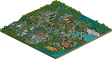
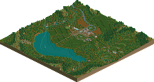
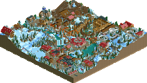
Park / Ashcombe Country Park

31 Comments

  • posix%s's Photo
    This had a lot of heart put into. Reminded me of childhood days. Very fun to explore. The nostalgic feel was very well captured. The details all made sense to me and were created with finesse, allowing me to immerse into this. Very nice job and a refreshing release.
  • Comment System%s's Photo
  • Louis!%s's Photo
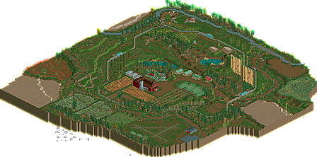
    Just a note (mainly for me): The aerial should have 3 maps, 1 for each version.
  • turbin3%s's Photo
    It was great and as poxis stated above, it had a lot of heart put into it. But RCT2 is - for me - about building rollercoasters/theme parks, so only 50% from me.

    Congratulations though!
  • Flap%s's Photo
    Sorry but it's too empty to me.
  • Ling%s's Photo
    Gold? Spotlight? Really? This is the best representation of a farm, or a period map, or a study in foliage since... probably ever, but there's just nothing there. I loved the little wooden catwalk through the trees, but beyond that, it just didn't seem like there was anything going on, even from map to map. Was anything else added between the last two other than the coaster? Because I couldn't find anything else (oh, well, the tractors I suppose, but that felt like taking a step back in time when there's already a train circuit running). The invisible station hacks working so smoothly was the most impressive part for me. For this to be anything more than a concept creation, I feel several more "years" of development would be needed. It's not even about the "roller coasters and theme parks" thing... but one big ride wouldn't have hurt. I feel like you got the first five years of operation, and the interesting stuff would start in just another one or two.
  • Jonny93%s's Photo
    I am sorry with the map louis i didn't know how to add three of them in the preparation site so i made the one of the latest version.
    I really like what you build there. Everything you made was brilliant there and the park itself had a lot charm but to be honest it was to less content to vote higher.
    I really liked the trams as cashbox. This was a great idea. The attractions fit very well with the park concept and i liked them. Also great job on the foilage.
  • chorkiel%s's Photo
    It's beautifull. Good job on creating such an aesthetic masterpiece.
  • Xtreme97%s's Photo
    And now you're #1, eh? I wondered why the points were updating :p
    Anyway, excellent stuff. The park and landscape were great, the foliage amazing and I loved some of the ideas like the stone circle. My only real problem was the lack of any big ride, even if it wasn't a roller coaster.
  • tdub96%s's Photo
    Oh how sick would it be to make this a timeline park...

    *Enchanted Elements flashbacks*
  • Louis!%s's Photo

    And now you're #1, eh? I wondered why the points were updating :p


    HELL YEAHHH
  • robbie92%s's Photo
    Glad that I warmed the seat up for you for a year? :p
  • posix%s's Photo
    :)

    Jonny, you can just upload maps (or pairs of maps) three times and each time it will add a new one. Louis, if you upload the missing ones you might want to first save the one that is there, remove it, upload v1 and v2, and then add v3 again.
  • Steve%s's Photo
    Fantastic work, Louis!(!) Really, nothing I didn't like on this map. You took a great concept and made it into something wonderful and inspiring. I loved that tree top walkway thing, too. I want to see more from you soon, dude!
  • rct2isboss%s's Photo
    I think some people are missing the beauty of it. Its so realistic and I love the landscaping.
  • XCars%s's Photo
    I absolutely love this! It was so charming and this reminds me of the corn mazes and pumpkin patches in Illinois this time of the year. My only complaint is that I wish you had continued it further. I would love to see this in the 80's and 90's. I could totally see a little carnival appearing with a fun slide or something and maybe a corn maze. Nevertheless this was great. Well done!
  • molemaster43%s's Photo
    I really enjoyed this. It gave off a great vibe to it and everything fit together fairly nicely. The only thing that didn't feel right to me was the Big Apple. I feel like it didn't fit in with the area it was placed in. Besides that, I loved it!
  • RCT2day%s's Photo
    I've always wanted to do a park like this but thought it would be too bare. Great job, very realistic and unique atmosphere. I think Silver might be a tad bit high (high bronze for me) but it really was something special. Brilliant work.
  • Turtle%s's Photo
    This is absolutely wonderful, one of the best releases i've seen in a while.
  • Midnight Aurora%s's Photo
    Absolutely beautiful, Louis. Thank you.