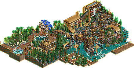
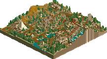
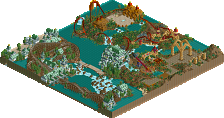
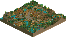
Reminded me of x250, but the buildings seemed rather stocky and too thin. The WW water features didn't really help, and the layout felt very meandering for most of it. Perhaps exploring the temple the way you have it laid out would be better-suited for a mine train.
Is this the same guy that basically left the site because he wasnt happy about the votes of panelists, If you sent this in as a design i think it would have won... I havent viewed it in-game so i dont know the full story but looking at the overview i cant see any reason why it wouldnt have won.
Looks better than your last submission. Literally, that space planet battle thing looked awful. The whole structure with the towers above the water was cool, unfortunately the coaster was lost in there. Not a too big deal though. For the rest, same problems as usual: horrible naming, weak theme execution.
Overall could've scored around 45% I estimate. So if you didn't reject the accolade system, the accolade system would've rejected you!
The theming was good but too much. Focus it more, spread it out more. The bridges are a nice touch but too many as well. Give some space to your ideas, develop them clearly, let them breathe, don't amass to fill.
The composition wasn't working at all for me. Looked like you might have had some quick back and forth decisions as to what should go where. You need more planning for path layouts to make them flow and have more adequate space to exist.
Your foliage needs some refinement. I would first use taller trees with care where they need to go. Then the closer you get to the main path and park itself transition over via smaller trees and finally just shrubs. It looks like you built everything and then fill-clicked the empty spaces with trees. They hide too much stuff and are often in the way. Their colour-combo also didn't always work for me although this is merely a subjective aesthetical concern.
So in short: more focus on spacing (=composition), more breathing room, more attention to path layout, more careful tree placement.
There are serval reasons why i designed it like this, when you go deep into my inmagenation, keep a good look at the deep details, you will find out why. The Deep details are not just in the theming itself this time, that's the little hint.
Lol Dive deep into the temples to find your wet treasures in the water temples far beyond...
It's a little hint to keep looking for what i've meant by it.
15 Comments
Comment System Offline
J K Offline
5dave Offline
Will take a look later!
"MFG"
disneylandian192 Offline
Ling Offline
ScOtLaNdS_FiNeSt Offline
Looks good man, So keep building.
chorkiel Offline
It is a major improvement, over his other work though.
Ruben Offline
p.s. the name is a tad awkward.
Liampie Offline
Overall could've scored around 45% I estimate. So if you didn't reject the accolade system, the accolade system would've rejected you!
In:Cities Offline
Come on Disney, we're waiting!
Corkscrewy Offline
-Josh
posix Offline
The composition wasn't working at all for me. Looked like you might have had some quick back and forth decisions as to what should go where. You need more planning for path layouts to make them flow and have more adequate space to exist.
Your foliage needs some refinement. I would first use taller trees with care where they need to go. Then the closer you get to the main path and park itself transition over via smaller trees and finally just shrubs. It looks like you built everything and then fill-clicked the empty spaces with trees. They hide too much stuff and are often in the way. Their colour-combo also didn't always work for me although this is merely a subjective aesthetical concern.
So in short: more focus on spacing (=composition), more breathing room, more attention to path layout, more careful tree placement.
Flap Offline
Ruben Offline
The name just got even worse.
(Sorry mate, couldn't resist)
Flap Offline
It's a little hint to keep looking for what i've meant by it.
Deurklink Offline
I like it.