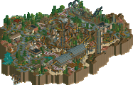
Park / Raven

23 Comments

  • Gwazi%s's Photo
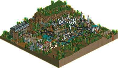
    I honestly thought the haunted mansion was a bit tacky and overdone. It just wasn't the most aesthetically pleasing building I've seen in a while. However, the coaster itself was absolutely brilliantly done. Loved it all, especially the interactions. I could easily imagine myself sitting next to that pretzel loop watching it dance with the cliff. Very good stuff. Overall very solid and worthy of a design, in my opinion.
  • Casimir%s's Photo
    Giving the front of the Haunted Mansion those towers, kind of enclosing the entrance area was a nice touch. However, I also think that the rest of that building was just too 'blocky', as in just not that visually interesting. While going through the map, I also encountered some details I personally would've done differently, e.g. leading the exit path through the café/gift shop or letting the queue also break through the front of the station in some places. The rest of this design was absolutely top-notch, though. Superb ride/path interaction all over and a level of hacking cleanliness one can only hope to achieve with LL!
  • Comment System%s's Photo
  • Ling%s's Photo
    I love those battlements. The layout's fantastic too.
  • gir%s's Photo
    ^ Indeed, making a good flyer layout is especially hard to do as well. The fake tree that acts as a support is a nice touch! However, in general, I did think that it was perhaps over-Codexed. People seem to like that look nowadays though. Definitely design-worthy either way--really interesting to see such a tight distribution of votes.
  • pierrot%s's Photo
    the theme is clearly cliche and repetitive. but you can't escape the fact this is one of well executed horror theme. the haunted mension seems most codexed work loopy has done, although it's bit overwhelming but suits well with theme and probably one of coolest structure in rct. the flyer is unique as hell. the foliage and landscape is certainly highlight in this park, you will find everything just works perfectly.

    my only complaint is steel supported bridge near the lift, love the idea but I think it just kills atmosphere.

    this man is scary, his technic of codex is improving at each release. but he always didn't forgot to add old school LL charm, which is really hard to pull off well. no one can reach this level I think.
  • Cocoa%s's Photo
    brilliant design! easily the best horror theme I've seen in LL, certainly rivals your area in your spotlight :p. Those two purple buildings are really so brilliant, I love the one with the wooden trims under the roof. Station was awesome, layout was awesome, foliage was spot-on. I thought the mansion was maybe just a bit not aesthetically pleasing. I liked the appendage that came off it, maybe the thing was just too big and square, I don't know...

    at any rate, this was the first time I have opened any rct in easily a month, I've just been so busy with year 12 stuff. I don't think I'm gonna manage much time to play this year. Hopefully I'll get out a design, but we'll see.

    oh also, please consider, when using the brick maze for walls, lowering each maze one more unit onto the one below it (so there each maze wall is only 3 high). This gets rid of the black lines and I think would REALLY improve the haunted mansion.
  • Goliath123%s's Photo
    Great design as said by many, noticable highlights have already been mentioned as well (Tree support, purple building etc). So yeah, one of my fav designs for a while.
  • Arjan v l%s's Photo
    I can only judge from the pictures, but those where very nice.
    The supports look clean ,very good for rct 1.

    I wish i could say more ,but i can't see the rest of it.
  • Liampie%s's Photo

    Those two purple buildings are really so brilliant, I love the one with the wooden trims under the roof.


    This! Amazing. Great logo as well. For the rest, see writeup. :)
  • disneylandian192%s's Photo
    Great coaster, great writeup as well. I don't have a problem with the level of hacking. This presented a new standard for Loopy's hacking skills, i'm sure this was more exploration of his own skillset than detail for the sake of hacking and detail (unlike a lot of RCT2 these days).
  • Casimir%s's Photo
    From the Panelist comments section:

    Giving the front of the Haunted Mansion those towers, kind of enclosing the entrance area was a nice touch. However, I also think that the rest of that building was just too 'blocky', as in just not that visually interesting. While going through the map, I also encountered some details I personally would've done differently, e.g. leading the exit path through the café/gift shop or letting the queue also break through the front of the station in some places. The rest of this design was absolutely top-notch, though. Superb ride/path interaction all over and a level of hacking cleanliness one can only hope to achieve with LL!

  • posix%s's Photo
    Yes yes, whoever released it forgot to merge topics.
  • Casimir%s's Photo
    ;)
    Wollte keinen kritischen Druck machen, hatte nur grade keine Zeit, was komplett Neues zu schreiben ^^
  • Flap%s's Photo
    Loved it!
  • molemaster43%s's Photo
    Can't view it in game, but from what I see, I really enjoy it. The coaster came out really nicely. My favorite part is probably the area around the entrance of the coaster. The trackitecture and architecture done there is very nice. Keep up the good work.
  • Loopy%s's Photo
    Thanks for all the comments so far guys and for voting this as a design.

    Now to address some things specifically:

    Gwazi: The mansion building was something I thought would be very hit and miss as I was building it. I wanted to include a ride I hadn't personally built before and settled on a custom haunted house. The coaster and parts map are heavily inspired by Alton Towers as can be seen by the 'air' like start to Raven and the house itself is based on Duel.

    Cocoa: Part of the reason I chose this theme was to try and modernise the area from my solo so I'm glad you noticed that :p The I-Screams building near Raven's turnaround is my personal favourite building in the whole map. I love how the purple stands out against the black track of the coaster.

    I did initially intend on lowering the maze pieces so that they were flush against one another but codex didn't want to let that happen. It's extremely prone to refreshing the map editor when maze pieces are included for some reason and it just became a pain to do.
  • Milo%s's Photo
    Nice one, Loopy. Some of your best work ever.
  • InnovativeGaming%s's Photo
    Absolutely breathtaking track layout! :)
  • geewhzz%s's Photo
    loopy, i really really loved this. always a treat to get to see any of your work finished.