Park / Thunderclap
-
 02-October 12
- Views 14,243
- Downloads 1,127
- Fans 6
- Comments 64
-

-
 85.00%(required: 65%)
 Design

wheres_walto 100% Fizzix 95% RMM 95% robbie92 90% Sulakke 90% 5dave 85% AvanineCommuter 85% Coupon 85% Liampie 85% geewhzz 80% Goliath123 80% Louis! 80% Pacificoaster 80% Loopy 75% pierrot 65% 85.00% -
6 fans
 Fans of this park
-
 Full-Size Map
-
 Download Park
1,127
-
 Objects
396
-
 Tags
Tags
![park_4091 [H2H8 R2] Tubiao Action Park](https://www.nedesigns.com/uploads/parks/4091/aerialt3830.png)
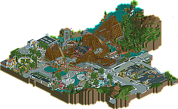
The coaster was fantastic albeit with that glitchy diagonal piece of track on the turnaround (a shame you couldn't remove it). The surrounding area didn't gel with it though. I would have liked to have seen some more archy in a similar vein to the station building. Although saying that, I did enjoy the rapids and having the entrance through the paddle steamer was a nice touch.
The light colour of the road to the right of the coaster is my main gripe. It becomes a bit of an eyesore as it stands out in a bad way. I think if it had been kept the same colour as it was on the far right it would have looked a lot nicer. Right now it blends a little too well with the path with no suitably sized building in between to break it up.
Fantastic work however disneylhand. I look forward to seeing what you come up with next as you really push the boundaries of RCT2 trackitecture.
Without being able to open this in game, this looks absolutely fantastic.
It's one thing if you dislike the use of trackitecture to represent real-life objects like roads and roofs, but it's another to complain about the inclusion of a dam because it 'ruins the atmosphere'. Yeah no one like to see a dam while riding a coaster, but if that coaster is built in an area that requires a dam to prevent flooding or to redirect water flow, then there's nothing you can do about but build around it, which is what Disneylhand did.
I personally loved the trackitecture here. My one dislike about the park would be that some areas look a bit bare/unfinished and others were kind of messy to the point of confusion. Cleaner lines can be achieved while looking complete, and that was the one thing this design was lacking for me.
@ Loopy, completely agree about the backstage path; if it were darker and didn't match the path within the park I think that would improve this a lot.
Also especially when you have the diagonal paths with curved monorail. Its just there because it can be. As pierrot said, objects can do the same if not better job.
The only good use of it is id say the steeplechase fences, i've always thought those looked good,
and I may be misconstruing what you're saying, but if your last sentence ("The only good use of it is...") is referring to general trackitecture usage then I would disagree completely on that as well. I don't want to assume but it seems like that's what you're trying to say.
No, as you know he didn't recreate a real park. I can't criticism for a dam if he was trying to recreate a real one but it's not. he always had a choice as to what he would do, and he built a dam near the woody, and it's physically / visually obtrusive.
I love both
Think what you want thats just my view
Recreation or not, realistic parks are different from idealistic parks. In realism not everything is nice and pretty with no visual obstruction in sight - this is pretty obvious. If you're translating a realistic park into RCT, even if that origin is in your head and not in the real world, there will/can be physical obstructions like the dam that's present. I think it ADDS to the atmosphere of the park rather than detract from the atmosphere... it brings some dirty little imperfections into the work and keeps it grounded in reality, making the park even more realistic, more believable, and more 'atmospheric' in the sense that it feels as if you were in a REAL park in the REAL world.
If the entire park was the perfect version of what a real-life park would be, then it would be more of an idealistic park that would be practically impossible in our world, so I wouldn't call it 'realistic', which this park was to the T.
Too bad about that f*cking black hole.
I also loved the roundness created by the trackitecture, but in general ,the trackitecture was overdone. I like the idea of a turning platform for the watercoaster, but the glitching ruined it for me.
Overall a very nice design, congrats.
P.s. : Avanine ,why are you so bothered?
Respect the opinions of others.
I don't see where I showed I was bothered, and I don't see where I didn't respect the opinions of others.
That seems like you're bothered and unable to understand/respect others there opinions.
But no more, because i'm not willing to discuss about this, it's pointless.
In the end ,i'm sure Disneylhand can step up for himself
Chip, I did enjoy the design, as evidenced by my 90% vote. I do think that the trackitecture got a bit excessive at points, but that's mainly personal aesthetic opinions rather than any RCT "right or wrongs" that I believe in. The rapids were flawless, and I loved how you worked out things like the dam in the backstage areas.
I didn't intend to diss anyone though, so i'm sorry if i did.
And you're right ,maybe i shouldn't have responded like that anyway, so i'll refrain from that from now on.
No grudge ,allright?
-Josh
But it a great, massive design, so kudos