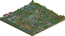
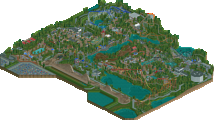
Park / Thunderclap

64 Comments

  • Pacificoaster%s's Photo
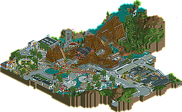
    For the most part I really enjoyed this submission. The coaster itself didn't do much for me but it was the queue and station interaction that really caught my eye. The architecture was great. From the creative use of track as roofing and walls to intricate scenery detailing, that area really all came together quite nicely for me. The path was quite distracting. You used too many textures and colors and it really just began looking like a mess. However, the rapids was stunning. Great use of monorails, suspended coaster, and steeplechase for railings. I loved how the queue entered through the steamboat and continued to have great interaction by having the path adjacent to the ride itself. The creative use of coaster track continued to the backstage parts where you built roadways, retaining walls, more architecture, and even a dam. I truly loved your usage of trackitecture throughout this project.

    Overall, this is one creative design and I can't wait to see how you progress from this. Great job.
  • wheres_walto%s's Photo
    I loooooooved this. It was refreshing, so fun to look at and explore. You did things I've never ever seen done before in terms of trackitecture, texture, and object usage.
  • Fizzix%s's Photo
    Probably my favorite Design ever, and I'm not a huge fan of Realism. The ride, the trackitecture, the atmosphere, the hints to Dollywood(beside the ride of course), the dam, the archy in general, just everything was amazing. The gate building was ridiculous, as was the theater, and the station. That restaurant next to Thunderclap was amazing, I stared at that one for awhile. The steamboat was close to, if not the best, that I've ever seen. Just an overall astounding Design, I cannot wait until next summer for your next project.
  • Louis!%s's Photo
    I found the use of the trackitecture in some parts overbearing, it seemed to use more trackitecture than LL does in some places, I've never really understood the use of track in RCT2 when objects are sufficient. I know in some places it is needed, it worked incredibly well on the overpass and underpass, and for the steam boat too, but in some places it didn't seem necessary. I also thought the path was an eyesore. Really ruined the design for me, the texture and colour just didn't look good.

    The layout though was great and the design as a whole was really nice, the station building was beautiful, reminded me of Wodan's, overall, it was a great piece of work, worthy of the 80% I gave it. But this could have been higher if the issues I explained above weren't there.

    Great stuff dlh.
  • RMM%s's Photo
    ... :eek: .


    i can't even begin to describe how jealous i am of that layout.
  • Comment System%s's Photo
  • Faas%s's Photo
    Wow. Downloading it now.

    Edit: Really cool. I liked some small things, like the fact that you used a restroom purely for the restroom signs and the dryer things. The layout was awesome but it could have been a bit slower at some points.

    Congratulations on the accolade.
  • olddtfan51%s's Photo
    This is a really nice layout the water ride is as nice as the coaster. :mantis:
  • Ruben%s's Photo
    Looks amazing dude! Can't see it ingame right now, but I'm sure gonna enjoy this a lot.

    Also: That boat. Just. Wow. That boat man. :drool:
  • AK Koaster%s's Photo
    This is a great design, congrats on the accolade. The coaster and the rapids ride are beautiful, and I love the little extra touches (like the body dryers next to the rapids ride and the fully developed backstage areas)
  • Six Frags%s's Photo
    Really innovating stuff with the trackitecture! So refreshing to see the potential it has, and you using all the benefits of having more curly forms in the architecture/structure design.
    At some parts it didn't work as well as others, and regular objects would've worked better imo, for example most of the go-karts track, but overall it did work amazingly well.
  • ScOtLaNdS_FiNeSt%s's Photo
    Very nice overall. In the layout i thought there were some parts that looked awkward and other parts that were very good. Deserved accolade but 85% for me is a bit high. I would have went 75-80% But thats just my opinion. Anyway really well done disneylhand.

    ThunderCrabs
  • 6000000flags%s's Photo
    The trackitecture is amazing. This park felt incredibly organic because of it, and the backstage area is one of the most detailed and well made ever. Definite 90+% from me. The trackitecture shown here will be revolutionary.
  • Goliath123%s's Photo
    lots of unnecessary trackitecture for me, especially around the rapids.
    Still a very solid design though
  • RMM%s's Photo

    unnecessary trackitecture


    what does that even mean?
  • Turtle%s's Photo
    One of the best pieces of work we've seen in ages. So many glorious little touches with trackitecture, little things etc. that really make a potentially stale realistic atmosphere so interesting. The pathing near the rainbow building was a particular highlight, along with all of the rapids, the station flythrough, the dam, the toilet used as signs, and many other things. Very well done.
  • Sulakke%s's Photo
    This is one of my favorite designs ever. I thought it was groundbreaking and typical disneylhandish. The coaster lay out was brilliant and so was the rapids ride. I also loved the landscaping. I somewhat agree with Louis on the paths and it's a shame the black hole has got such a prominent spot... Also, I like to see some frozen staff/peeps in your next submission, or at least staff to clean the paths etc.! I haven't got any more complaints though. It was nearly perfect. Hence the 90%. :) Still in doubt whether I should have give you 95%. Well, maybe next time!

    Attached Image: 1.jpeg

    And how did you ever come up with that?!
  • pierrot%s's Photo
    Posted Image

    eh, It seems I'm the only one who dislike this..

    the 'B' area is the main issue for me, I have no idea why the ugly gray dam is located near the fascinating woody. nobody would love to seeing a dam while riding, it completely ruins the atmosphere. the landscaping / foliage is awkward and randomly placed. rapids area has a lots of glitch and the bright color of the roads are didn't fit well. the car ride trackitecture seems overdone for me, generally ​I'm a sucker at ultra-detailing but there's no reason for using that​, I'm sure you could have done better with custom objects. (I'd assume that's why Goliath123 said 'unnecessary trackitecture'.)

    It sounds bit harsh and negative but I hope you don't get me wrong, Harmonious composition is the most important factor that I consider when I'm scoring. yeah, every single parts / details are truly astounding and the 'A' area definitely deserves over 85%, but when I'm looking at the big picture, I felt the 'B' area is extremely disconnecting​.
  • trav%s's Photo
    I pretty much completely agree with Pierrot. The backstage area completely ruined this for me. I also didn't see the point in a lot of the trackitecture, it just made it look messy in areas. The layout was beautiful though. I'd have given this somewhere around 65% - 70%, but probably around 80% - 85% for the non-backstage area.
  • BelgianGuy%s's Photo
    I actually agree with you pierrot... in a park context this works better but this extensive backstage part distracts a bit from the focus of the design for me aswell