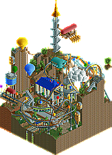
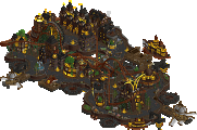
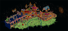
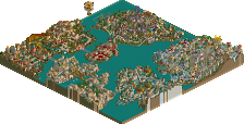
My alternate idea was to create a vertically stacked Super Mario World type park that goes through clouds. Your white blocks reminded me of that idea, and the style is pure Xcoaster. In this case, RCT 2 shows its natural "advantages" over LL, though both are definitely quality pieces.
Oh no! I see someone didn't use RCTModified to open my park! Haha, actually, it's not that bad, it mostly just makes it seem like the suspended monorail isn't quite as suspended.
Anyways, quick park spiel. I was dozing off while listening to Led Zeppelin and I started thinking of a bunch of random things. Then I decided it would make a nice park, and it would consist entirely of various things that amuse me. So I drew up that concept art sketch, and started building the ground level (skipped the sewers; who needs them anyways?). It started off pretty well the first day, my hopes were high, things were looking good. The next time I opened it I started adding more stuff along the edges and it got kind of messy. Then the coaster added even more mess. So near the end of this I wasn't really feeling the original idea anymore, and I kind of stopped caring, so I added a lot of shrubbery so I'd have something to turn in, and luckily, it stopped looking quite so bad. I'm still not particularly fond of it (I honestly thought WME had this one in the bag, and I really was looking forward to being done with the contest; my apologies), but that's probably because I'm generally not a huge fan of fantasy parks, mainly when I make them. But anyways, it won, so I certainly can't complain, and I won't anymore. Plus, while working on this one I got a nice idea for my next park, so I'm now set for a while.
The general theme of my park is actually my schoolwork (mech. engr. & material science). When I originally came up with the idea I was thinking of ways to convert a hot air popcorn popper machine into a flying machine (our main project for one of my classes). The main ideas in the class seem to be helicopters, hot air balloons, and my own weird idea, using electrolysis to convert water into hydrogen. So that explains the majority of the stuff. And the trees are supposedly hydrogen fruit bearing, since electrolysis isn't exactly speedy. There's also some of my usual steampunk styled stuff, some other engineering things, and so on. The coaster I wanted to name after meteorites or something, so it was named Pallasite for a while, the coolest type of meteorite. However, that was boring, so I started changing it. No offense to Comet on the final name.
The park was originally named Eccs Hcos'tra, in tribute to myself and the original theme of stuff that amuses me, but that was decidedly dumb so near the end I instead named it after the Materials Science department at my school (CBEMS) and the professor who teaches the 8 am Mat. Sci. class I have on Wednesdays. And that department is where some of the other names came from (i.e., my favorite technical term, Charpy, and my research advisor, FAM). The End!
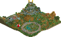
EDIT: WME's entry. Admittedly not that impressive from the overview, but talk about densely packed. You've definitely achieved a jungle feel without ever feeling simply messy (not that it'd be easy to find your way around there, lol). And that coaster really goes to show what you can do in a small space and with with limited track. It seemed like it'd never end. And even with all the density that you have, there are some nice details in there. I especially like that building the coaster goes through at the top of its launch hill; it has a good feel. Same goes for just how the ride queue goes parallel to the launch track.
Xcoaster, the peeps are finding their way perfectly ;P.
I can see why xcoaster thought his park wouldn't win, but all the same, i can see why it did. The hot airballoons, the cloud with the face, all brilliant theming.
I'm somewhat glad i'm out, even though i'd have taken it upon myself to try and win the contest if i had won this matchup. And i expected to win, really. Maybe the layout from above isn't easy on the eye, but once you dive in there you can see what i mean. This is one of my personal favorites, and i really do hope that everyone atleast downloads it and spends enough time to see the coaster run its full circuit. Because, yes, it does complete every bit of track you see there.
The coaster was originally constructed as a 7 car per train coaster without peeps, for the fans: you should see how it runs then (you'll have to put the amount of 'circuits' back to three, as well). It is pinch perfect, every spike is met by a near crash. I'm happy it runs quite well with peeps and 5 cars per train as well, though. I'm a peep fan, and this is one of the most peepable parks I ever made. (even though for some odd reason, the peeps intensity preferences are fucked up in this version, but it still works out.)
I really do feel that xcoaster had some very interesting theming ideas. But i've never seen a jungle executed well in rct either.
To me, i don't see how this wasn't a tough matchup to decide on. (in other words, i feel that it was controversial, but i'm not the one to decide) I can even go as far as to say that my entry, in the end, might have been 'better'. But Xcoasters was definitely more easy on the eye. And it was easier to spot what makes it a quality entry, probably one of the best of the contest.
It's funny that you (xcoaster) pick the building at the top of the launch hill. It was one of the last bits of park i made. Maybe because it isn't completely swamped with other stuff, and this is relatively out in the open. But that, to me, is what this contest was (and hopefully to some extent still is) about. Putting a lot of things in, because you only have such limited space. I was actually on that track, to a different extent (larger map), with my pro tour entry. It doesn't have the most mindbobbling theming xcoaster seems to knock of his sleeve like stardust. But it contains a lot of trial and error, a lot of thought as to how exactly you can make something cohesive with generally 'too much' stuff. I feel lonely when attempting this, which makes it even more gratifying. And it pays off, in my view. Everything i've made has taken people time to enjoy. I know for fact that most of the people enjoying my work are people that have spent time looking at it.
So what i want to ask, is for you, anyone, to atleast take the time to look into what makes this entry special to me. And then decide what you think of it. I really only disregard comments from which i gather someone just skimmed the top of the iceberg of my jungle park.
^ I did, lol!, even if I was too late to cast my vote in this match-up. (which would not have changed anything either).
But I was blown away by the coaster, while also the execution of the jungle-theme ( by far not my favourite theme, but this was one of the few good ones imo...) in this one impressed me, and of course adding the peepability to that.....
Xcoasters was no less classy work, and I enjoyed as well as valued that one practically as much as Evil's, but for reasons mentioned above I would just with a fraction have gone for Toboyara Jungle.
Anyway, two excellent MM parks for sure!!!
Congrats to you both, and a pity that of these 2 just one can go on in this contest, but that's all in the game, and: wishing you great ideas again XCoaster, cannot wait to see what you come up with next, (must be really dificult to find so many ideas for things on such a small map!!....and execute them....)
This has gotten 18 votes yet only 5 comments not from the builders? Come on now... this is one of the best matchups in the contest so far.
Evil had a brilliant coaster. It was over the place, reusing track, going backwards.... it was just all around fun to look it. No offense to Levis, but this is a coaster hack done thoroughly well. The train is always moving and there aren't any dull spots. The theme itself is very impressive. This is probably the best pulled off jungle theme I've seen. It's very convincing. Of course the fact that it's peepable makes it even cooler. I think what let this down and may have ultimately pushed it in x-coaster's direction is that it's bordering on almost messy. A jungle obviously is, but at times it's hard to catch what's going on with the coaster and everything do wn under the tree canopy. That being said, it's still a great entry.
To X-coasters, an equally fantastic entry and something that held my attention for a good while. There is something about that style of building things which is kind of mesmerizing. It's all so very clean and comes together well. I'm always impressed by the amount of different colors that are present without anything really clashing. The coaster itself was fun to watch, darting in and out of everything. I liked the multiple courses of tram line and with Modified, it looks very cool. Other nice touches are the suspension bridge with the lift cables-- I've done that a few times, but never as well I'd say-- and the tower with the spiral staircase. The composition on that is the best I've seen. I can see why that won, and on the whole I think that's probably the best entry here. It's very close, though. 2 really great entries here. Looking forward to seeing the next entry coming up.
The closest match i have judged yet and it certainly was a pleasure.
Xcoaster - Amazing. I loved every second of it. All the rides were creative the level of detail was fantastic and i loved how you created this very own world of yours yet I still feel i knew everything about it. Your are my pick to win the whole dam thing so please don't disapoint me. I'm routing for you.
EvilWME- Your entries including this one have been fantastic and as well as Kumba i'd say you were the most consistent player out of the whole contest. This entry did not disapoint. Everything was perfect. The coaster was awesome and it was the best jungle theme i'd seen in a while. I'd love to see it on a greater scale.
I choose Xcoaster by a small margin as I loved his entry that little bit more.
I loved both entries. The Jungle for it's peep-friendlyness, for the crazy hacked oaster and for being a little functionating park. I didn't like the whole crowdness of it and the colors. Yeah I know it's a jungle, but it was just too brown and green to me. Hydrogen Mining had an excellent atmosphere, the rides weren't THAT great, but they did their job well. The let-down in this park were the strong points of the other one imo. I expected more hacks in this one. I also fell in love with the theme. It was unique and totally new. And also well executed
Wow, these are all the people interested enough in actual parks? I thought NE was somewhat 'revived', but its basis has shifted from parkmaking to bitching over why Kumba won by forfeit, camcorder makes parkmaker and what has made you happy today. Heck, it's even more interesting to see two people not put enough time in their parks.
I'm truly dissapointed. Please save yourself the trouble of going into discussion about this, for me- this stands.
I must say that I enjoyed both parks, and am not sure who I'd select to win. This matchup was quite good, though I don't have much else to say about either entry. The first time I saw Xcoaster's entry, I had no idea what it was, but seemed themed to The Adventures of Baron Munchasen or something similar. Now that I know what it's supposed to be, it's much more enjoyable. WME did a great job making such a stale theme so interesting and he's one of the few people left that can make a coaster that will hold my interest for over ten seconds.
I voted for WME in this match up as I thought his entry was much more superior. His coaster is quite possibly the best of the contest. The atmosphere is also stunning and pulled off with perfect execution. I hope people had their note-pads and a pen out when looking at this entry.
It's funny because this is one of the first coasters I have ever truly enjoyed from WME. Most of his work I can't identify myself with but this entry was different in some way. I guess that's why it lost
13 Comments
Kumba Offline
Round 4 - Match-Up #3: Xcoaster vs. Evil WME
#1 Xcoaster with his entry:
Seibemshiring Hydrogen Mining
#2 Evil WME with his entry:
Tobayara Jungle
The winner, after 8 votes the judges, by a score of 5 to 3, is... Xcoaster
Xcoaster advances to the final 4 where he will face the winner of the CedarPoint6 vs. Ride6 match-up.
Corkscrewed Offline
Xcoaster Offline
Anyways, quick park spiel. I was dozing off while listening to Led Zeppelin and I started thinking of a bunch of random things. Then I decided it would make a nice park, and it would consist entirely of various things that amuse me. So I drew up that concept art sketch, and started building the ground level (skipped the sewers; who needs them anyways?). It started off pretty well the first day, my hopes were high, things were looking good. The next time I opened it I started adding more stuff along the edges and it got kind of messy. Then the coaster added even more mess. So near the end of this I wasn't really feeling the original idea anymore, and I kind of stopped caring, so I added a lot of shrubbery so I'd have something to turn in, and luckily, it stopped looking quite so bad. I'm still not particularly fond of it (I honestly thought WME had this one in the bag, and I really was looking forward to being done with the contest; my apologies), but that's probably because I'm generally not a huge fan of fantasy parks, mainly when I make them. But anyways, it won, so I certainly can't complain, and I won't anymore. Plus, while working on this one I got a nice idea for my next park, so I'm now set for a while.
The general theme of my park is actually my schoolwork (mech. engr. & material science). When I originally came up with the idea I was thinking of ways to convert a hot air popcorn popper machine into a flying machine (our main project for one of my classes). The main ideas in the class seem to be helicopters, hot air balloons, and my own weird idea, using electrolysis to convert water into hydrogen. So that explains the majority of the stuff. And the trees are supposedly hydrogen fruit bearing, since electrolysis isn't exactly speedy. There's also some of my usual steampunk styled stuff, some other engineering things, and so on. The coaster I wanted to name after meteorites or something, so it was named Pallasite for a while, the coolest type of meteorite. However, that was boring, so I started changing it. No offense to Comet on the final name.
The park was originally named Eccs Hcos'tra, in tribute to myself and the original theme of stuff that amuses me, but that was decidedly dumb so near the end I instead named it after the Materials Science department at my school (CBEMS) and the professor who teaches the 8 am Mat. Sci. class I have on Wednesdays. And that department is where some of the other names came from (i.e., my favorite technical term, Charpy, and my research advisor, FAM). The End!
EDIT: WME's entry. Admittedly not that impressive from the overview, but talk about densely packed. You've definitely achieved a jungle feel without ever feeling simply messy (not that it'd be easy to find your way around there, lol). And that coaster really goes to show what you can do in a small space and with with limited track. It seemed like it'd never end. And even with all the density that you have, there are some nice details in there. I especially like that building the coaster goes through at the top of its launch hill; it has a good feel. Same goes for just how the ride queue goes parallel to the launch track.
Lloyd Offline
Xcoaster's entry just oozes style, and his style is one of, if not, the best. I love it, and that's pretty much that.
Evil's was good enough to win most match up's though, it's just been beaten by something very good.
Evil WME Offline
I can see why xcoaster thought his park wouldn't win, but all the same, i can see why it did. The hot airballoons, the cloud with the face, all brilliant theming.
I'm somewhat glad i'm out, even though i'd have taken it upon myself to try and win the contest if i had won this matchup. And i expected to win, really. Maybe the layout from above isn't easy on the eye, but once you dive in there you can see what i mean. This is one of my personal favorites, and i really do hope that everyone atleast downloads it and spends enough time to see the coaster run its full circuit. Because, yes, it does complete every bit of track you see there.
The coaster was originally constructed as a 7 car per train coaster without peeps, for the fans: you should see how it runs then (you'll have to put the amount of 'circuits' back to three, as well). It is pinch perfect, every spike is met by a near crash. I'm happy it runs quite well with peeps and 5 cars per train as well, though. I'm a peep fan, and this is one of the most peepable parks I ever made. (even though for some odd reason, the peeps intensity preferences are fucked up in this version, but it still works out.)
I really do feel that xcoaster had some very interesting theming ideas. But i've never seen a jungle executed well in rct either.
To me, i don't see how this wasn't a tough matchup to decide on. (in other words, i feel that it was controversial, but i'm not the one to decide) I can even go as far as to say that my entry, in the end, might have been 'better'. But Xcoasters was definitely more easy on the eye. And it was easier to spot what makes it a quality entry, probably one of the best of the contest.
It's funny that you (xcoaster) pick the building at the top of the launch hill. It was one of the last bits of park i made. Maybe because it isn't completely swamped with other stuff, and this is relatively out in the open. But that, to me, is what this contest was (and hopefully to some extent still is) about. Putting a lot of things in, because you only have such limited space. I was actually on that track, to a different extent (larger map), with my pro tour entry. It doesn't have the most mindbobbling theming xcoaster seems to knock of his sleeve like stardust. But it contains a lot of trial and error, a lot of thought as to how exactly you can make something cohesive with generally 'too much' stuff. I feel lonely when attempting this, which makes it even more gratifying. And it pays off, in my view. Everything i've made has taken people time to enjoy. I know for fact that most of the people enjoying my work are people that have spent time looking at it.
So what i want to ask, is for you, anyone, to atleast take the time to look into what makes this entry special to me. And then decide what you think of it. I really only disregard comments from which i gather someone just skimmed the top of the iceberg of my jungle park.
RCTNW Offline
James- rctnw
Emergo Offline
But I was blown away by the coaster, while also the execution of the jungle-theme ( by far not my favourite theme, but this was one of the few good ones imo...) in this one impressed me, and of course adding the peepability to that.....
Xcoasters was no less classy work, and I enjoyed as well as valued that one practically as much as Evil's, but for reasons mentioned above I would just with a fraction have gone for Toboyara Jungle.
Anyway, two excellent MM parks for sure!!!
Congrats to you both, and a pity that of these 2 just one can go on in this contest, but that's all in the game, and: wishing you great ideas again XCoaster, cannot wait to see what you come up with next, (must be really dificult to find so many ideas for things on such a small map!!....and execute them....)
Emergo
CF Offline
CedarPoint6 Offline
Evil had a brilliant coaster. It was over the place, reusing track, going backwards.... it was just all around fun to look it. No offense to Levis, but this is a coaster hack done thoroughly well. The train is always moving and there aren't any dull spots. The theme itself is very impressive. This is probably the best pulled off jungle theme I've seen. It's very convincing. Of course the fact that it's peepable makes it even cooler. I think what let this down and may have ultimately pushed it in x-coaster's direction is that it's bordering on almost messy. A jungle obviously is, but at times it's hard to catch what's going on with the coaster and everything do wn under the tree canopy. That being said, it's still a great entry.
To X-coasters, an equally fantastic entry and something that held my attention for a good while. There is something about that style of building things which is kind of mesmerizing. It's all so very clean and comes together well. I'm always impressed by the amount of different colors that are present without anything really clashing. The coaster itself was fun to watch, darting in and out of everything. I liked the multiple courses of tram line and with Modified, it looks very cool. Other nice touches are the suspension bridge with the lift cables-- I've done that a few times, but never as well I'd say-- and the tower with the spiral staircase. The composition on that is the best I've seen. I can see why that won, and on the whole I think that's probably the best entry here. It's very close, though. 2 really great entries here. Looking forward to seeing the next entry coming up.
J K Offline
The closest match i have judged yet and it certainly was a pleasure.
Xcoaster - Amazing. I loved every second of it. All the rides were creative the level of detail was fantastic and i loved how you created this very own world of yours yet I still feel i knew everything about it. Your are my pick to win the whole dam thing so please don't disapoint me. I'm routing for you.
EvilWME- Your entries including this one have been fantastic and as well as Kumba i'd say you were the most consistent player out of the whole contest. This entry did not disapoint. Everything was perfect. The coaster was awesome and it was the best jungle theme i'd seen in a while. I'd love to see it on a greater scale.
I choose Xcoaster by a small margin as I loved his entry that little bit more.
5dave Fan Offline
I loved both entries. The Jungle for it's peep-friendlyness, for the crazy hacked oaster and for being a little functionating park. I didn't like the whole crowdness of it and the colors. Yeah I know it's a jungle, but it was just too brown and green to me. Hydrogen Mining had an excellent atmosphere, the rides weren't THAT great, but they did their job well. The let-down in this park were the strong points of the other one imo. I expected more hacks in this one. I also fell in love with the theme. It was unique and totally new. And also well executed
"MFG"
Evil WME Offline
I'm truly dissapointed. Please save yourself the trouble of going into discussion about this, for me- this stands.
Ge-Ride Offline
geewhzz Offline
It's funny because this is one of the first coasters I have ever truly enjoyed from WME. Most of his work I can't identify myself with but this entry was different in some way. I guess that's why it lost