I'm not sure if you are continuing this park or not (I'm new so haven't been following parks) however I found the park to be a very good start. I liked the coasters alot and found they had good layouts. I think if you continue with this there is definitely the potential too easily pick up an award. ~Salsaontop~
It hurts Steve. This was wonderful. I'm so amazed how after all those years where it seems you never touched the game you still very clearly still have "it".
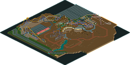
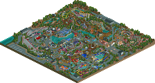
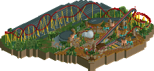
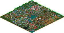
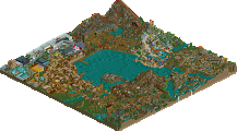
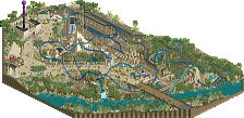
I love the first screen, the second is kind of... weird. Empty, too. I've never been a fan of the way the modern NE style handles roads in RCT2. Glitching supports on the hyper detract quite a bit, but the parking lot looks good. Last screen, as Liampie said, is brilliant.
I'm not sure if you are continuing this park or not (I'm new so haven't been following parks) however I found the park to be a very good start. I liked the coasters alot and found they had good layouts. I think if you continue with this there is definitely the potential too easily pick up an award. ~Salsaontop~
Thanks, Salsaontop (interesting name)! I plan on finishing this someday, just no motivation or time at the moment and wanted to share this with the site. I'm glad you liked the layouts of the rides, I wasn't too sure about any of them, really. Thanks again!
It hurts Steve. This was wonderful. I'm so amazed how after all those years where it seems you never touched the game you still very clearly still have "it".
I'm sorry, posix! I'm glad I was able to surprise you with this. Thanks for the kind words!
What's up with the motivation, or maybe lack of time? I would love to see your work finished.
Yeah, no motivation or time right now and just wanted to share it since I didn't see this being done anytime soon. Thanks, Arjan!
Dude, Steve I would have taken this
Feel free, man!
I'm not too sure about the entrance but the rest is fantastic. The last screen is spotlight material.
Thanks, Liam! I am actually quite fond of the entrance, heh. The last screen is actually the first thing I built on this, so thats probably why it's so good; its when I was inspired
I love the first screen, the second is kind of... weird. Empty, too. I've never been a fan of the way the modern NE style handles roads in RCT2. Glitching supports on the hyper detract quite a bit, but the parking lot looks good. Last screen, as Liampie said, is brilliant.
Thanks, Ling! The road section was one of the last things I started and its very unfinished and wouldn't end up being so empty, aha! The supports were actually an idea of robbies, trying to make them appear fuller. Glad you liked the park, man!
Why do you keep doing this starting projects and not finishing this was fantastic. The layouts were amazing and so was the architecture. So sad to see your work go to waste
10 Comments
Comment System Offline
salsaontop Offline
posix Offline
Arjan v l Offline
I would love to see your work finished.
nin Offline
Liampie Offline
Austin55 Offline
Liam-
Liampie Offline
Ling Offline
Steve Offline
I'm sorry, posix! I'm glad I was able to surprise you with this. Thanks for the kind words!
Yeah, no motivation or time right now and just wanted to share it since I didn't see this being done anytime soon. Thanks, Arjan!
Feel free, man!
Thanks, Liam! I am actually quite fond of the entrance, heh. The last screen is actually the first thing I built on this, so thats probably why it's so good; its when I was inspired
Thanks, Ling! The road section was one of the last things I started and its very unfinished and wouldn't end up being so empty, aha! The supports were actually an idea of robbies, trying to make them appear fuller. Glad you liked the park, man!
Louis! Offline