Park / Hyatt's Crystal Cove Resort
-
 26-August 12
- Views 10,213
- Downloads 1,204
- Fans 3
- Comments 20
-

-
 67.69%(required: 60%)
 Silver

Pacificoaster 85% In:Cities 80% RMM 80% AvanineCommuter 70% BelgianGuy 70% Maverix 70% wheres_walto 70% chorkiel 65% Goliath123 65% Jonny93 65% Phatage 65% turbin3 65% geewhzz 60% disneylhand 55% pierrot 45% 67.69% -
3 fans
 Fans of this park
-
 Full-Size Map
-
 Download Park
1,204
-
 Objects
236
-
 Tags
Tags
disneylhand Offline
I understand this is part of a multi-map project and that object/style re-use could be solely for the sake of continuity, but I feel as though it has held you back from improving with each map.
-disneylhand
What I liked a lot:
*The slides were simple and effective. Great look and I love the canvas roofs!
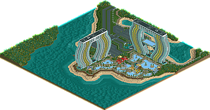
*The actual towers were unique and interesting. The curves were great, it's really amazing that you pulled off such a difficult shape! You're really the best at this and you've really perfected your craft in coming up with creative ideas for these resort towers.
*Great overall planning and composition of the resort, it is very believable.
*Love the pool balconies, very cool, something I've never seen before in real life.
What I felt can use improvement:
*The Pool areas: while very well crafted, they are dead and not very beautiful. You can liven it up by including restaurants, pool bars, cabanas, dance areas, etc. There seems to only be one small building in the area (towel rental?) and it's blocked on all four sides... but from what I can see it looks very boring (grey with teal roof, no detailing). Take a look at the pool areas in high end resorts like the Wynn or Bellagio in Vegas and you'll see some differences between those pool areas vs. the one here: the underpool tile designs, the foliage is well manicured and not as 'random' as the flower patches here, there's a lot less paving vs. buildings., there are a lot of shady trees over the main throughfare for the hot sunny days so it's a bit cooler underneath the foliage, there are trash bins throughout the pool area, towel collection bins, etc. I think the best way to fix this would be to open up the ground floor of the resort (which imo should be taller, given that it's the lobby it shouldn't have the same ceiling height as the actual hotel rooms) and have it interact with the pool areas through patio restaurants, bars, or clubs. Right now the towers are completely closed off and they aren't integrated into the pool area at all, which I feel is a missed opportunity.
*The Towers: As I pointed out above, opening up the ground floor and raising the height of the first floor would be a significant improvement in this resort. While I do really love the towers, I can't help but feel that none of your resorts look contemporary; most of them seem "dated" when it comes to the architecture. I think this is partially due to the restrictions of RCT, but this tower looks like it could have been built in the 90s instead of the 2010s. The main entrance area of the hotel isn't very attractive either; it's just a large gray brick overhang. Considering how much detail you put into the actual towers, this was a bit disappointing. The upper floors of the hotel should have something to distinguish the suites vs. the standard rooms. I don't know of many resort towers that doesn't have larger top floors for their VIP guests. Also from an architectural standpoint, most resorts have a larger footprint for the ground floor to include restaurants and service areas, which seem to be missing here. There is no way you can stuff anything that significant into the space you've got for the first floor. For more compact resorts in major cities, the restaurants/clubs/gym/spa facilities are usually spread out throughout the building on different floor. But with all those balconies it seems that every floor is taken by rooms and not public areas. Take a look at resort towers, most of them have a very large footprint for their ground floor and if there is a ground floor pool area, the resort almost always have restaurants/cafes lining the property facing the pools. Towers don't usually just rise from the ground unless space is very limited like in NY city or Tokyo. In a large resort like this it's just strange not to take advantage of the space!
*The suspended pool would have been cool if it were a true infinity pool. If you got rid of the paving around the edges and had an overspill gutter underneath that would have been really impressive. Also, there probably shouldn't be private balconies (ie. hotel rooms) on the same floor as the suspended pool, which is considered a public space; imagine if your hotel room was located on a hallway where all the hotel guests have to pass through to get to that pool!
*The parking lot would be very dark at night. Some lights and some more details could be really helpful here.
I am really looking forward to your next map in project aries. Overall I really enjoyed this resort, and I'm glad that project aries is back in progress!
Congrats!
This is a spot on description on how I feel about this park.
Don't get me wrong I love the hotels, but once you get past the first shockfactor you'll notice the detailing is paper thin. But then again this pretty much describes pretty much any park he made so it's not really a surprise. They work from the overview and the grand total, but zooming isn't something you should do as it will leave you dissapointed as there is only one layer of the park (well maybe two if you consider all maps combined). Then again it's probably the only way to get a project as big as this done unless you make it a full-time job. I personally prefer a smaller scale level though as it is more intimate and personal but to each his own I guess
AvanineCommuter - Thanks for the feedback and you bring up very valid points. I could have done all the improvements you suggested (and then some) and provided I had the desire, I might have taken the time to do most of them. What it really comes down to is I was finished with the map. I accomplished what I wanted to do with it. I could have spent more hours adding a bunch of details (although the object limit was an issue) however I really don't find that part of rct2 enjoyable. In short, I accomplished what I wanted to accomplish and it’s time to move on to something else. I actually thought about just submitting this as noncompetitive as I knew there were things missing that if anyone dug deep into the map, they would notice (as all of you have). That’s fine. Again, it’s my style and it’s a form of relaxation for me only once I’m done with a map, I need to close it out to provide a sense of closure.
Over the next few weeks, you will be seeing maps with not much on them but rather closing out maps that may or may not have anything on them. My goal is to have all 25 maps available for download at some point in the near future.
Again, don’t look into this too much. It was a fun map for me to build and get back into the swing of things.
That said, for those that enjoyed it, I’m glad you liked it.
James
The towers themselves were very interesting, the pools on each floor and shapes is very striking.
I think if this had operating pools, slides and monorails it'd be so awesome and bring this alive, easy high gold.
I could'nt help but look at those tower and hope that somewhere in this project is something comparable to Stratosphere or CN tower overlooking Rogers and BR park.
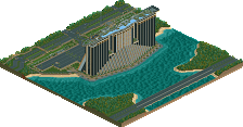
I especially loved the beachfront, even the way you terraformed under the water, and the boardwalk and dock were nice touches.
As always, anticipating whats next!
Surroundings could have used a bit more detailing... still, whatever. You're pretty dug into your style so yeah.
I still would love to see a more definite theme from you sometime, though
As bugs bunny once said, "you might rabbit, you might" (only the old guys might get that reference!)
Ride6
-Josh