Park / Corsair Veredian
-
 16-August 12
-
 Corsair Veredian
- Views 32,208
- Downloads 1,298
- Fans 8
- Comments 100
-
 83.75%(required: 70%)
 Gold
Gold

Xeccah 95% no Cocoa 90% no inthemanual 90% no Sulakke 90% no MCI 85% no FredD 80% no Ling 80% no posix 80% no 5dave 75% no SSSammy 75% no 83.75% 0.00% -
8 fans
 Fans of this park
-
 Full-Size Map
-
 Download Park
1,298
-
 Objects
473
-
 Tags
Tags
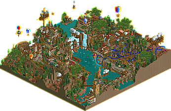
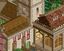
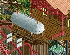
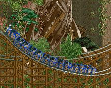
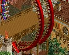
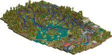
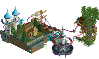
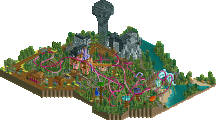
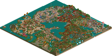
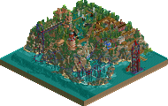
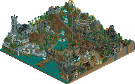
You could have crushed 'Waterfront'.
HK's park was nice enough to justify them getting the vote other than through my bitterness about the other park.
Whitehawk Offline
Honestly that made the park SO MUCH BETTER for me. Just gave it such a cool atmosphere in that area. And I loved the entire green lantern area and Man of Steel. On the other hand, I kinda got lost in HK's park. A lot of the themes seemed so overdone as of late, which isn't necessarily park-breaking, it was certainly a good park, but I just ended up preferring the Replacement's, by a very small margin.
Slightly more detailed thoughts later.
What I didn't like was the fact that the peeps won't ride the mine ride due to missing ride stats. And the other mine ride was on test mode... When I see running trains I want to see sit peeps in them!
And the floating monorail did absolutely not fit into the park it was the only huge let down.
The archy in the park was topnotch. Liked the gouvernor's house and the dry dock.
Replacements park was just another movie park. The mainstreet had very good houses - no question - but it was all the same and seen a hundred times. Chinese theatre and the building next to it were fine though. A pity that the peeps couldn't walk over the pavement. Moreover, the buildings had mostly no purpose. There was only one that had all the shops in it. no souvenir shops in a main street, huh?
The rides were all three very mediocore. Floating supports here and there. etc.
The entrance building though was excellent. And sure the park had some nice park but it couldn't convince on the whole with clever details and good ideas/concepts. And for a Warner Bros. park I would have wanted to see more than Batman, Superman, Greenlantern. They have so many other good movies so that you definitely shouldn't have done all on superheros...
On a whole the park seemed very rushed as if you had a park running and wasn't pleased with it and then started a new one like three weeks before the deadline. Compared to the HK's park parque warner seemed like half the size plus it felt like only a part of a bigger park. However, in a H2H Final I personally want to see a complete, self-contained park that's not a cut off of something more.
All in all
I got RCT2 to work again just in time to vote on this one; I'm speechless. While I do believe HK's done better this H2H, the atmosphere in this one is still bloody fantastic. It reminded me of Myst on more than one occasion. I loved how grand and majestic everything was; I really feel you pulled the theme off well. Great job.
Colorado-Fan Offline
This park was fantastic! There were some amazing ideas!
HK, whilst this kind of park will always make me happy I'm struggling to 'hone in' to specific parks as there's just so much going on. I will be viewing again a few times to get into it but I really thought this was the clear winner for me. Some seriously beautiful things going on though.
My first reply was simply a joke, my second was discussing hypothetical resemblances between La Rêve and Corsair Veredian. I did not attack the opponent, nor did I praise my own park above the other. If you still think my second reply was 'wrong' in some way, it's only a matter of action triggers reaction. Usually I try to refrain from these things on NE, at least until the voting is over.
Chill, dude...
All I simply ask is for people not to make their final judgment on the parks until viewing both for a decent amount of time. Somethings take a moment to evolve.
Oh, and turn on the music for the Superman ride in our park.
But what I really wanna say is that there are so many things to be said about our park (just as a message to my team mates: I will say them peacefully
Lets just say for now that this is not what we wanted to present you...things have definitely taken a weird route here for us and our park got immensely affected by our miscommunication.
This park will probably pop up in the AD in the next month, maybe even in seperate topics with different versions of it.
edit:
also don't take this as me defending anything please
I opened the Kitchen's park first and spent a long time looking around. The overview does that park NO justice, I implore everyone to just explore all angles, watch the dueling woodies, look at some of the ingenuity of object choices (something team HK has done collectively better than everyone BY FAR). The inspiration isn't quite as strong as some of the other parks you've built (another thing you've done best), it felt to me a bit like La Reve, a bit like Terra Progressia, with a pinch of Sea of Sagas thrown in, but those are all great parks in their own right. Balloon World (I can't remember what the hell it's actually called) was a bit rough, 2 more weeks would have given it elite status in the competition, but as it is, I feel it's stronger of the 2 parks.
I feel the Replacements are trapped in their styles. To me, every single one of your parks (minus Kim-Jong Ivo) has similar visual characteristics. It was awesome Week 1, pretty good Weeks 2 and 3, but it got boring in Week 5 and the Semis, and to me it's boring here. The color schemes just aren't that exciting and there's way too much unbroken path, but I suppose those are both results of the unfinishedness. I really like the Dive layout, the custom music did add an air of epicness to the park, and I applaud your use of sunken 2x2 Oak Trees as thick bushes, haven't seen that done before. But the whole Superman area is an eyesore (not the supports though, they are very well done, the overview just makes them look bad), the bridge connecting it is big and ugly, and the whole Chinatown area is just too...gaudy. It looks like when Sey used to post screens with the colorful grid base land still applied, way too much to focus on. Gotta say though, I did love that entrance building; classy, good color scheme, good shape. There were bits and pieces that stood out like that but just not enough to win me over. I'm looking forward to hearing your explanation, Fisch, I was looking forward to a finished park from you guys.
Also, with this being the Grand Final, I think it's time for an airing of grievances. I just have one, it's the majorly overused adjective "cohesive" or the superfluously strewn complaint that a park "lacks cohesion" ... Enough with that already, find another word to describe something. I'm sick and tired of constantly reading that and thinking to myself "what the fucking fuck does that even mean?" Really, how can somebody fix that? Be useful in your critiques. Anways,