Park / Mythos
-
 16-August 12
- Views 10,267
- Downloads 1,096
- Fans 1
- Comments 57
-
1 fan
 Fans of this park
-
 Full-Size Map
-
 Download Park
1,096
-
 Objects
367
-
 Tags
Tags
![park_3153 [MM2014 R1] Bad Kraken!](https://www.nedesigns.com/uploads/parks/3153/aerialt2759.png)
The damage is done. Blackholes, miscommunications, the damage is done now... Let's get to the positive things. We've got a good park by (mostly) JK and another probably good park to look forward to. If you could open a topic in the advertising district, that would make up for all the frustration a little.
J K, thoughts on Mythos later.
It corrupts whatever is on the tile. If a section of track is on the black hole...you'll get an error trapper as soon as any train hits that tile.
They also tend to multiply if not addressed immediately. I've posted screens of just such an occurance more than once.
Pay attention to what's being said and stop acting like a fucking noob.
BTW...I'm seeing everything that's being said and I'll reply to it all as soon as I don't have to wait for the girls to approve my posts. And, not before.
Shaman Offline
/endsarcasm/
And, I always immediately fix blackholes, and yes, if you don't fix it and start hacking like a fucking noob again you'll get more..
Also, you can't even fix a blackhole, so who's the fucking noob here?!
Back on track please as I'd love to hear some more reviews on the park rather than the RD's performance which we're all over with now as they've given us some really great parks this competition.
Okay, we'll start with the good here:
These snake monsters were damn cool, even if I don't know what they are.
Whilst this is probably something terrifying in mythology, here it just looks so cuddly and cute, like one of those little doll things from the Vauxhall Corsa adverts, I love it haha.
I think this could be executed better by giving it a bigger body compared to the length of it's legs, but it's a pretty darn good Pegasus here.
I assume this is meant to be a Sphynx type thing, and it's pretty good, I think it could have more of a head though.
I love the architecture here and just how peaceful it feels, very nicely done. The use of grass is excellent, not enough people use bare grass when landscaping, unless it's just a completely smooth surface.
Again, the architecture in this area just feels so peaceful, and the detailing is top notch, some good stuff here J K
Probably the best Rct trident seen (Not that there are loads of them, but this is still a very nice one). My only complaint is that I don't have a clue what the peach thing is at the bottom. Is it a hand? Is it a foot? Is it just a peach coloured block?
I loved the colours in this little area. I don't know what myth this actually is (Atlantis maybe?), but it really made me think of 'Under The Sea' haha.
Now onto the things I didn't like so much:
This is just ugly I'm afraid. I think if you'd had more time, you could have added more details on it, but at the moment it's just not that great. I'm also not a fan of the black/green combo, I don't think it really makes it feel as 'dark' as what it could do if say it was a black/purple combo. The roof object is also hideous, but that's just my problem with the actual object, so not your fault there.
Again, another pretty ugly tower. The colours at the very top are weird with the different types of brown, the roof object is ugly again, the spire isn't in the middle/symmetrical with more spires (I think it would look better with 4 spires), the white is far too overpowering and the whole of the 'layered' structure is just underdetailed, which when you're using a bright white and a bright blue on/around it, you need to have more detail on it so that your eye isn't just attracted to big bare walls.
Another ugly spire. I'm afraid I can't even think how I would improve this one, I just don't like it, sorry.
One thing I noticed in a few places around the park was that some of the walls are lacking detail and so look really quite bare and not that attractive. I'm really hoping this was just due to time constraints because looking as the more detailed archy in the park, I think even you yourself know that you could have done better there. This was one of the worst offenders, just a big grey wall.
This was another underdetailed area. Whilst not necessarily underdetailed had it been a different colour, the fact that it's in the middle of the map, it's bright gold and is King Midas' castle (Even I know who he is), I would have hoped for a lot more on this, but I really think it was just down to time constraints so I can't complain too much.
Overall J K, I would probably have given this somewhere around 75-80% had it been sent in for an accolade. I think it's solid gold worthy. I also think it really shows where your true talent lies: making sculptures, you're one of the best in the game at it. It also shows that you're really good at smaller architecture, but that you need to work on your larger structures because they either end up as a mismatch of colours/textures/objects or they just look a tad underdetailed. Well done on grabbing that bronze medal for the Canes though, and this was definitely one of the better parks of the season.
The park itself was built in about five weeks. Walt was a great partner and a very capable builder. It was a great pleasure to build on this park. I just wish I had a lot more time so everything was done to perfection. I've wanted to recycle the greek inspired concept from one of my first ever parks; Sikinos so it was a great way to do this.
Was a great pleasure to build this h2h! It was just as successful as ever. Long live NE!
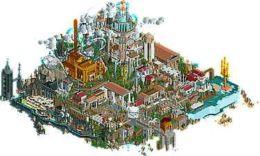
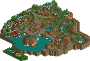
Looking at the park as a whole, some things strike me. It's overwhelmingly vertical, with so many lines and spires, and excellent height variation throughout the park making the whole thing look extremely epic. Which is exactly what you'd want for a park based on Mythology and the height of a civilization. It's also really fun looking, lively, lots of rides and movement, although peeps would have been nice, I admit.
Some things I loved -
- River Styx. In fact, the whole underworld section was done brilliantly. I imagine it would be very easy to make such a place look dull and lifeless (pardon the pun), but there was enough colour and movement to make this quite atmospheric. Loved how low down to the map it was, and the rocks melting away into the darkness was excellent.
- Mount Olympus, as a whole. Towering and majestic, good colours and textures, loved it.
- The sculptures throughout the park were excellent. The sphinx, cyclops, Cerberus, Hydra, Poseidon's trident, all of them were instantly recognisable and in scale, which is what you'd want from a sculpture.
- Colours and atmosphere were strong and full of feeling. It felt slightly cartoony in the same way that Dreamport felt slightly cartoony. A sense of fun, which I don't mind at all. It characterises your work, JK.
Really nice park you two, i've been very impressed with Walt recently, you've been improving seriously man. JK, always so nice to see work from you, and this is much more quality than your week 4 park was. I can see more of you in here.
Great work again Jonny for finishing this! Lovely stuff. And well done to all our team (well, except a few who went missing/were slacking
Seeing NE has kinda a crisis now and there's no real activity anyways I will review the last few parks.
The theme of the park wasn't really fresh but I think it was executed pretty nicely. What stood out the most for me where the statues throughout the park as many mentioned already (Cyclops, Scylla,...). Also I loved the underworld section of the park. The steps into the river styx were really great, I really liked that. Also I liked the size of Mount olympus - felt pretty much perfect to me. My favourite rides of the park definately were the log flume, the maze and the water coaster. They had something unique to it with some nice interaction! The coasters were nice but not breathtaking - Demigod had a nice fantastical approach to it but it lacked that wow-factor which cannot be achieved that easily anymore - maybe a great hack or some cool darkride parts could have made this ride even better. The mouse coaster felt unsupported, squeezed in and placed above everything else - almost like an afterthought. The staff with the dialogues are nearly in every Hurricanes park this season, but I still love the idea - it adds to the story and you find something new each time. What I didn't like about the park was the fact that you cared for peep-ability throughout the park (queues, entrances, working semi-realistic rides) but didn't care to let the peeps in. Maybe you explained it already but I thought that was a big let-down. Some of the structures were too much 2x2 and suffered some texture issues, majorly those trav explained already. Also the visible track on the rapid ride was ugly. All in all not your best work, Jonny but still pretty nice. If you work on some of your lazyness (some structures, afterthoughs) and more unique rides/hacks it will definately be a step up from your already great parks! So keep it up - hope to see some cool stuff from you in the future!
"MFG"