Park / Theive's Run
-
 08-August 12
- Views 2,628
- Downloads 553
- Fans 1
- Comments 16
-
 55.77%(required: 65%)
 Design Submission

posix 80% In:Cities 75% Liampie 65% Pacificoaster 60% turbin3 60% wheres_walto 60% 5dave 55% Camcorder22 55% Goliath123 55% BelgianGuy 50% chorkiel 50% Jonny93 50% Maverix 50% pierrot 40% RMM 20% 55.77% -
1 fan
 Fans of this park
-
 Download Park
553
-
 Objects
215
-
 Tags
Tags
![park_2432 [H2H6] R5 - Reservoir Dogs - Galaxy Geeland](https://www.nedesigns.com/uploads/parks/2432/aerialt2182.png)
![park_2498 x2 [WORKING TITLE]](https://www.nedesigns.com/uploads/parks/2498/aerialt2254.png)
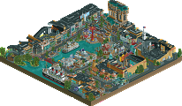
I guess if this was not insanely rushed it might've won something.... whatever, better luck next time I guess...
And RMM, a 4? Though I expected some low votes around the score of Pierrot, I did not expect a score so low....
Please explain.
yeah...
I wasn't meaning that In a wrong or asshole-ish way RMM, just I'd like an explanation.
RMM Offline
how cute are you!
and no worries Shotguns?, no offense taken.
my problem here, i guess, was the scoring and the writing next to them. when voting it says things like, "i didn't like much in this submission". i think that was next to 20% and well, at the time, i didn't like much in the submission. so that explains the low vote.
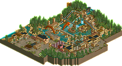
but to be honest, even if i were to re-do it, i wouldn't have voted any higher than 40%. it's a design right? with that said, i think the actual ride itself was extremely boring and uninspired layout wise. if the ride was top-notch, this would have been a 55/60. there wasn't really anything interesting with the ride itself, nothing popped. i felt that the landscaping near the ride was very sloppy and not very well thought out. and the colors of the architecture didn't really run well together for me. none of the actual buildings really defined themselves and, again, they didn't respond to each other. the flow just wasn't there. the cohesion was absent.
i felt that the ride itself was very weak (which is a no-no to me when it is the focus of the park), the composition didn't flow to me. overall it was just very bland. i do see your potential, Shotguns?, but here in this submission, accolade quality just wasn't there.
I'd really like to hear this.........
This just gave me more than all of the parks that amass details for no reason and look totally laden and disorganised. Shotguns, forgot to add one thing: The orange dragon-ish sculpture kind of thing was a total no-no. You shouldn't have added that. It breaks the vibe.
Next time work on a better layout and you'll win a design very soon.
Sorry for being harsh but please don't be discouraged, you definitely have a potential. Keep improving dude! I'm sure you'll get something in future.
god damn, i'm making full circle with my pt2 stuff, but i understand a ton more about what makes older parks like ROB so fucking good than what i did when i was starting out in 2012. Like, literally just looked at the entryway to eversio lemuria (yeah i open old parks all the time lol) and how great and open that composition is. it's hard to explain w/o a photo, but how the path dips into the arches and how the landscape with the helix juts out on side of the archway is fantastic. i think people like slob and posix went/go a bit overboard with it but i think macro, despite how hypocritical it sounds for me to say, is lovely.