Park / [H2H6] SF - Hurricanes - Rowling Versus Tolkien
-
 05-August 12
- Views 55,085
- Downloads 1,329
- Fans 4
- Comments 161
-
4 fans
 Fans of this park
-
 Full-Size Map
-
 Download Park
1,329
-
 Objects
539
-
 Tags
Tags
![Park_2455 [H2H6] SF - Hurricanes - Rowling Versus Tolkien](https://www.nedesigns.com/uploads/parks/2455/aerialm2205.png)

![park_2400 [H2H6] R3 - Flying Germans - The Adventures of Harry Potter](https://www.nedesigns.com/uploads/parks/2400/aerialt2142.png)


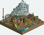
I've told PAC how brilliant i think this park is, but i don't think this is the perfect park. I believe this might be the perfect studio park. It lacks one or two major rides, IMO. I mean, what is there in rides is fantastic, but it needed a big coaster. I know you were very against that as "unrealistic for disney", and in that i must agree with AVC. I think a big coaster would have made this park that much more amazing, so who cares if disney would or woulnd't do it. But that is generally my only criticism. everything you did is near flawless.
FK
tdub96 Offline
I actually really like the concept. One of those things that just jump out at you... there is actually a LOT of similarities between the characters in the books. Sirius/Aragorn, Harry/Frodo, Dumbledore/Gandalf, both have dragons, both have trees that have a mind of their own. As such, I think it's a really clever concept for a park, as it allows you to take the best parts of both stories, both so atmospheric, and the ideas are endless.
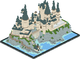
First off, your Hogwarts building is excellent. A difficult building to capture the feel of, and yet you did it really nicely. Unfortunately you have it right next to such a barren area in Moria, kinda ruins the natural feel it needed I think. Excellent details around Hogwarts, the Quidditch tryouts ride is just so clever. Strange with the go karts noise, but there you are!
I liked the Shire, but didn't love it as much as some other people it seems. Still really nice though. Right next to this, you have perhaps the cleverest part of the whole park. The ent vs. whomping willow rides. I actually have no idea how you hacked those rides to actually punch, but that's got to be the best use of that hack so far. One of those jaw-dropping moments in the game. Thankyou so much for that Kumba (i'm guessing).
The Weasley section was nice enough, but didn't feel like it belonged next to the Shire, for example... although i'm not sure where it would have belonged. I think the general park layout left a bit to be desired; kinda felt like a collection of ideas, with no eye for the park itself.
I seriously dislike those circular glass window objects, and they really stuck out being in so many different colours. That sort of ruined the feel of Diagon Alley/Hogsmeade for me, although the snowy rooves were very nice. Again, as with a lot of the park, this area has such nice details and moments, but as a whole it just doesn't feel atmospheric. A lot of the architecture looked slightly strange. The entrance is nice enough, quite a mish mash of styles, but again lovely details. The book especially is so fantastic with all the characters coming to life.
The Sirius/Aragorn ride was just kinda plonked there. Both such cool characters, why a slightly boring reversing coaster?
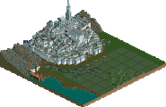
The large white castle (Minus Tirith?) was if anything too white. I know you're trying to depict things as true to the movies, but I think it would have been far more aesthetically pleasing with trims and things. Such a white city would definitely have things like awnings, wooden rooves in places, this kind of thing. The Mount Doom ride was very cleverly done, but again the setting was so dull. Obviously a massively hard place to recreate without it seeming dead atmosphere wise, and another place where maybe some deviation in favour of aesthetics would have been nice.
Overall, it was a really nice park, i'd be intrigued to see the parts that you cut out as well. It's just a shame you had to go up against...
DAW... This was one of those parks that is just SUCH a pleasure to see during construction. Pacificoaster has made one of the parks of the competition for sure, and potentially the nicest Disney park for a good long while. With this, you've definitely moved yourself up to robbie/nin levels of skill. Massive work.
As a park, I love this. It's cramped, but I like that. There's absolutely no wasted space, but it still feels like everything is exactly where it should be. Such brilliant planning, and you feel as if every area has exactly the space it needs. The overall picture is fantastic, but then you come down to the micro level and goddamn, there are so many tiny little details that just blew me away! I can't list them all, but here's some of my favourite.
The fire truck squirting water, the wooden track made from scenery so it's perfect in scale, the perspective wall in New York, complete with Empire State and Chrysler buildings, the paddle steamer, some of the New Orleans architecture, the indoor theming on Facilier's, no, in fact on ALL of the rides, the yachts (!!!), the Golden Gate Bridge, the theming on the Finding Nemo theatre, the entrance architecture (so warm!), the Mickey watertower, the overflowing dumpster, I could go on.
Architecturally, this is up there with the best realistic work ever done. Such brilliant use of texture throughout. That Tower of Terror is amazing.
It's been a joy to be in the same team as Pacificoaster, I really feel like he's stepped up his game so much recently, and there seems to be no end to it. He came into a park like Lijiang, and improved it from Liampie and Sulakke's level, and made them improve as well. Then he takes this concept and runs and runs until it's literally almost perfect. He's given fantastic feedback and criticism throughout this competition, sticking around the team forums and generally being helpful to everyone. Not afraid to be blunt when it's needed, it's been a pleasure, sir. Very well done.
As for DAW itself, I truly poured so much passion into this park which assisted me to keep a steady mind and stay inspired. Planning and construction on this park started day one of the competition and I believe that is what helped for it to turnout so well. I knew from the start that making a park so concentrated around architecture would be a risk, but I thought if done well enough it could result in a very unique release. The reason I wanted to build a Disney park is because there have only been a couple in RCT2 that really struck me as good (Disney Air, Walt Disney Studios). Nin was definitely one of my greatest inspirations architecturally. I believe his style of building would have complimented mine extremely well and this park could have been x times better if he were to assist me. I was surprising myself as I was becoming a more strong and confident builder over the duration of this park's construction. Many things were rebuilt and I believed they made such a positive impact on the atmosphere. Some of my favorite things of the park would have to be the boats (especially the fisherman's yacht and the cruise ship). Those ships took hours of trial and error to be cohesive with the surrounding architecture and detailing. Another area I enjoyed making was New York City. The perspective wall in particular. It is simply a mind fuck that is actually hard to notice. I built some facades behind the actual blue wall to have your eyes make you believe that the grey building was painted flat on the blue wall. I tried to add as many little things around the park for the viewer to be fascinated by (ie firetruck, semi truck, barbecue, etc) but perhaps they got lost in the architecture. As for the hidden mickeys. How many could you guys find? I put quite a few in there, and for those who believed the water tower was one of them you are highly mistaken. You didn't think I would make it that easy did you? All in all this park was really fun to build. In the end I was almost sad to let it go because I just wanted to keep building or expand it but all good things must come to an end I guess. Not only has this been my greatest accomplishment in RCT2 to date, but I believe this park will be the catalyst of many great things to come. I really would like to thank the community for your support and the admins for deciding to bring forth H2H6. Without you guys this park would be nothing and I would still be miles behind where I am today. Again, thank you all.
Again, awesome work PC, a deserved win indeed!
*Going to count the hidden Mickeys*
Oh, and I would love to see you and nin teamed up, that indeed would be a great chemistry..
Will do a screen review/little things later..
edit; I also want to thank MCI and Co for the Youtube video review of the parks, great to hear you guys like it so much!
Hero.
Harmony and cohesive flow, ie the macro play, was the great skill this had, apart from the insane details and aesthetics.
FK
Hurricanes: I'll start with the things i liked.
I love the huge castle with the black rooves ,wich i.m.o. isn't really underdetailed, I've got lot's of pictures from castles (because i like castles), and i think a lot people misunderstand the purpose of a castle. They are mostly build to last and not to be pretty.
The green and black big creatures are nice.
The duelling switchtrack woody and the other dueller with the loop are also nicely done.
I adored the Whomping Willow Uppercuts, really nice creation.
The difficulty of the ride 'battle of mount doom' is definately appreciated ,i couldn't pull of something like that, but it didn't feel like a smooth ride all around.
The ghost train ride is nice too.
I liked the architecture in some places.
The shark idea , nice ,but it was allready used before in the h2h, and it will probably be used more often.
The Gringotts mine carts is an okay ride, not spectaculair.
The train that travels around the park is also nice, but i didn't like to see the track elevations, better cover those up or don't use elevations i.m.o.
Also like the foilage ,especially that mushy part where the train travels through.
The less liked parts:
As said ,i liked the architecture in some places ,but in some places it felt sloppy or strange ,same for some colours. The white rooves all around where a bad idea, sorry.
The entrance didn't make sense to me, and it didn't fit in.
I'm afraid that the map was to small to really make the theme work.
The fireworks idea is nice but it didn't suit there i.m.o.
I've enjoyed the park.
WOW ,unbelievable ,this is the shit!
I'm greatly impressed by this park ,it looks great ,it feels great.
I'll start with wat i disliked in this case.
Only this.
It felt unfinished...
Other then that beautifull ,atmospherical, harmonious and full of life!
Great accomplishment!
The rides also where lovely ,especially Escape from Alcatraz, i love it.
The park is just full of ideas and nice touches, just to much to write.
Pacific , just wow man.
I've enjoyed the park.
Was steve originally intended to build on this as this was supposed to be R5's submission?
Tower of Terror
Tokyo DisneySea
Yes, Steve was supposed to assist me but he ended up getting a couple of jobs and had some RL things to take care and in result did not have time to build on this park. This park was intended to be released for week 5 as our team has said in other topics but since we clinched our playoff spot and thought this park was good enough to advance us the the finals we strategically changed things around a bit. Our sequence of releases would have been Lijiang, Le Reve, then DAW which would have made our team look relentless when it came to releases. Along with the rest of the team, Steve brought forth some good ideas as well but did not have the time to transcribe those into the game. Therefore DAW became a solo and was pushed back to the Semis.
Very nice work Hurricanes, love finding new ways of using things. Very clever.
I so freaking love the building in SF (based of the one at Kearney and Columbus?) and the detail of the I80 west sign in EfA would actually be the way to escape from Alcatraz... not just some made up number. I just freaking love this Pacific coaster. I remember a long time ago mentioning CedarPoint6 better watch his back, but now the only person needing to be watching there back is you, cause your on top right now as far as I'm concerned.
http://www.vijfzintu...p?topic=21596.0
Plagiarism in the autist-capital of the internet. Legolord admitted that he built it off a screen but he denies that it's wrong with submitting his copy for a contest, crediting himself. Gratefully accepting comments that this is his best work yet. I find all of this laughably dumb. Plus, there's a sarcasm-banning mod (Super G) censoring everything we say from now on.
Just sharing.
Edit: Super G banned me from the forum just because I was letting the rest of the competitors of the contest know it was not his work.