Park / [H2H6] SF - Hurricanes - Rowling Versus Tolkien
-
 05-August 12
- Views 58,464
- Downloads 1,454
- Fans 4
- Comments 161
-
4 fans
 Fans of this park
-
 Full-Size Map
-
 Download Park
1,454
-
 Objects
539
-
 Tags
Tags
![Park_2455 [H2H6] SF - Hurricanes - Rowling Versus Tolkien](https://www.nedesigns.com/uploads/parks/2455/aerialm2205.png)

![park_2400 [H2H6] R3 - Flying Germans - The Adventures of Harry Potter](https://www.nedesigns.com/uploads/parks/2400/aerialt2142.png)


I know you worked so hard man
That's not that surprising tbh. Considering that it is often hard to create something cohesive with more than one person (hell I can know during my group projects at uni). The surprise for me is that it was made by Pacificoaster. For me he just came out of nowhere creating this awesome piece of work. Hell, I had to click his name to view what his previous work was, only to realise the 2 other things he has on his page where pretty cool as well. I often forget who built what if I remember it at all. The only things that really stay with me are the ones that made that lasting impression on me and tbh I'm very hard to impress these days. PC, you just made something I will remember forever and therefore I salute you!
Unfortunatly a bit one sided, caused by two lotr/hp fanboys...
Man, you're officially my favorite builder on NE! Congrats!
But also, very interesting that Kumba and SF went this round. I would have thought for certain Kumba would save himself for the finals.
MVP lock in...
At the same time I'm kinda disappointed to see it was a solo, as it kinda circumvents the whole idea behind H2H, which is meant to team up parkmakers and make a great park together. AH well, I'll probably get flamed again for voicing that..
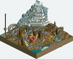
Our park had a REALLY bumpy road. As you could've read in the readme it was delayed because we found out another team was doing a HP park too.. We decided to still go with it and incorporate the LotR theme too, just because we thought at that time a versus park between the two could work out well. We also had Levis attached to this project, but he (I guess) had some personal issues he needed to solve..
Then there was a collision of styles during building, as Darren and mine styles turned out to be true opposites. In short, my style is to try for aesthetics above all, while Darren prefers ideas. This partially led to me losing some motivation for this project so it sat a while again as Darren had also some personal stuff which required his time (sister getting married). So all in all we had the park for like 25% done 1 week before the deadline. I wouldn't say it was that much of a rush job, as imo all the areas look fairly nice, but I agree with the general sentiment that our park wasn't consistent. Maybe it's smart of HK to go solo on this in that regard as it gives a much more cohesive and overall on the same level park.
Also, we had to cut 2 areas, because we were exceeding the amount of maximum tiles you could use (as can be read in the readme).
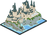
All in all though, it was still a pleasure to work with Darren again, and in the end I really like what we cooked up in the short amount of time we had. I still think Hogwarts is my best work to date..
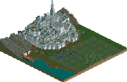
Oh, for who did what, I did Hogwarts + lake + chamber of secrets + Hogwarts rides, the entrance area (minus the entrance gate), Diagon Alley, Hogwarts express course and Minas Tirith (minus the flying stuff above it). Darren did the rest. We also did some minor improving around the park on each others work.
Again, amazing work PC!
yeah, but I know that solo projects are emotionally and physically demanding. Especially this semi-final, He handled the pressure well and his outstanding performance brought victory to the team which was very impressive to me, and still is
That is all.
*Loved the entrance, clever use of scenery to make the pages of the books! Invisible duel was a great idea, I still have no idea how you did that. o.O
*Architecture throughout diagon alley was a bit strange... I don't really understand what you were going for with the kaleidoscope of window colors; they clashed horribly and did not look good. I DO understand that you were going for snow-covered rooves with the white in Hogsmeade, but without any snow coverage on the ground, the atmosphere looked too dull/sterile. Perhaps if you lined the streets with white decoblocks/bushes to make piles of snow that would have brought more atmosphere to the entire area. As of right now, the white rooves kind of killed the atmosphere. The actual buildings in that area were great though.
*I LOVED LOVED LOVED the shire... so fantastically pulled off, I only wish it were bigger! The overgrown-ness and the lovely flowing hills were captured so well there. Fantastic!
*The tower with the roto drop... I see the idea, but this looked too messy for me.
*Hogwarts was beautiful, great composition and overall aesthetic. Quidditch was magical! The lake was nice with a lot of details underwater too.
*I LOVED the multiple flying sculptures through the park. Such creative use of existing scenery pieces to create the creatures! Especially liked Fawkes and his tail, the spines on the back of the green dragon, and of course aunt marge... I actually laughed out loud! One of my favorite parts of this park for sure.
*The coasters were not my favorite and I definitely wished for something more aesthetically pleasing layout-wise. Just not my taste, although the dark coaster (is it called Mt. Doom? I forget) did have some impressive hacks. Not enough to compensate for the lack of interaction with the area, and overall the coasters just left a lot to be desired.
*The big white castle was dull architecturally, and felt unfinished. That is all I can really say about it.
*Overall composition of the park was slightly convoluted and didn't really flow all that well. It seemed like these sections were built independently and then they were loosely tied together with paths. Some park planning would have been helpful.
*I did love all the little details throughout the park, but for me there was not enough "big picture" in the park; I wish the same amount of effort that you guys put into all these little things (which are all FANTASTIC and up to the standard we've all come to expect from builders like Kumba) was put into the overall flow/composition of the park, which doesn't feel as cohesive and clean as it could have been.
Still, this is one of the better parks of this season and definitely put up a fantastic fight. Great job to both builders!
As for our park: Absolutely incredible work from Pacificoaster, who has created a park that will go down in annals of history here at NE. However I do have some criticisms that could not have been executed given the completeness of the park and the time frame:
*I've disliked the Escape from Alcatraz ride since the beginning and I've made it known. Although you've pulled off the concept fantastically, for me, it is exactly "rock n' rollercoaster" with a SF theme, which in the end screamed "boring realism". Your previous idea of an outdoor 'cruisin' california' type ride similar to the Carsland ride would have been, IMO, so much better in place of this ride.
*Same thing with Queen Mary's haunted ride, which is basically "Haunted Mansion" in a haunted ship. Although you are right in the fact that Disney has not built a maze-like attraction, IMO the idea ride for a haunted ship would be a haunted maze throughout the corridors of the boat, just as the real Queen Mary has during Halloween.
*San Francisco really should have had an elevation change. The whole park is just really flat, which you can't really tell because of how close everything is together (which is a bit cramped, but that's mainly due to the 60x60 restriction and not so much with your planning, which is spot on). The painted ladies? Yeah that would be great on a hill. What you've presented here though is already so well done though that I can't REALLY complain.
*Facilier's Curse was superbly done, although The Sorcerer's Apprentice really is my favorite ride (the interiors were amazing on this one... completely legible in what you were trying to convey). ToT could have been a hacked roller coaster but no one on our team has the hacking capabilities I think to pull off a realistic representation of ToT IMO. It'll probably take Levis or Cena to do that one justice.
*Of course the BEST part of the park is in the architecture, which was absolutely fricken flawless. Beautiful and most importantly CLEAN use of scenery objects to create realistic structures. Gorgeous, atmospheric, realistic, and completely believable.
*I know that this park strives for realism as much as possible, but like I've previously stated elsewhere, I definitely prefer idealism to realism. Disney is not known for complete outdoor coasters in real life but that's why there's RCT: so we can build our ideal park. I feel as though this park is so realistic given the 60x60 footprint but it could have taken a more idealistic route. If this park were actually really to be built in real life, then it would be not one bit better OR worse than the current existing Disney parks. What I would LOVE to see you do, PC, is to build an IDEAL Disney park that if were converted to real life, would outshine any park Disney could EVER build... all of this while retaining the detailed realism in RCT that you've so masterfully perfected. I hope you understand where I'm coming from?
Someone recently said to Robbie92 in the dump that he should stop wasting his talents on Six Flags style parks and instead do something more creative; I COMPLETELY agree with that sentiment for both you and Robbie, who happen to share very similar styles imo.
So overall, my message to you is that I hope you can embrace idealism with open arms in your next project. While realism is fine as it is, IMO it is just boring compared to what you can create given a little creative spark; just think of Disney with an unlimited budget and a wider audience and what that could be if you were to make it in RCT!