Park / [H2H6] SF - Hurricanes - Rowling Versus Tolkien
-
 05-August 12
- Views 55,085
- Downloads 1,329
- Fans 4
- Comments 161
-
4 fans
 Fans of this park
-
 Full-Size Map
-
 Download Park
1,329
-
 Objects
539
-
 Tags
Tags
![Park_2455 [H2H6] SF - Hurricanes - Rowling Versus Tolkien](https://www.nedesigns.com/uploads/parks/2455/aerialm2205.png)
![park_2400 [H2H6] R3 - Flying Germans - The Adventures of Harry Potter](https://www.nedesigns.com/uploads/parks/2400/aerialt2142.png)


disneylhand Offline
-disneylhand
I might be a lot more local then I normally am in these topics, but I have some pretty good points and facts to back them up.
I would agree that their park is better then ours, we put out a good park and thats the best we could do.
love that attitude, dude.
To say that you can't judge a park by an overview is bullshit. I agree that you have to see the park in game to CAST A VOTE, because there is a LOT that you cannot see in an overview (3 other perspectives, interactivity of elements, hacks, the rides' flow etc. you know all this of course), but it is 100% possible to judge the overall look of a park by an overview, which is what I did.
And yes I still stand by what I said: the architecture of your park is not the strong point. Your park's strengths seem to be from the details in bringing both themes alive in the game, in the 'little things' (some of which you can already see from the overview), and immersiveness.
The fact that 60000000blah (whatever his name is) said that your park had architecture of the same quality as our park made me do a double take, which admittedly made me react harshly. You're right, I shouldn't have said 'wrong', because it is an opinion. But you don't necessarily have to see the park in game to know that your park's architecture isn't in the same league as our's. *note, specifically speaking about architecture and nothing else*... Do you disagree?
And 8 minutes in game is enough to claim to like one park over the other. Doesn't matter if it's these two fantastic parks or one of these parks vs. an incomplete park. IMO this is the classic case of fantasy vs. realism, and you know what? Sometimes people don't care how good the other park is if the park in their preferred style is at the same level of quality...
Hurricanes:
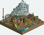
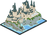
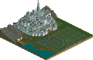
This park was really good. You really matched up the themes very nicely (especially with the characters and with the bank vault in moria) but I can't help feeling like it was just LOTR references in a harry potter park. Its unfortunate that you had to cut rivendell because that would have made it a little more balanced. All the themes were pretty adequately done, but I can't help but feel that the park just feels old... like it could have been released two years ago. Not that that's a bad thing, but there does seem to be a bit of a lack of detailing throughout the park. Sure, the main stuff is there, but the buildings seemed just a little plain and 'lifeless'. It just didn't have energy or color to perk it up. But nonetheless, some outstanding details, most notably the drop tower in the weasley house, some of the castle (although a little more attention to detail could have been nice), and the structures dotting the park. I did feel that minas tirith wasn't really up to scratch though, I think it was that the layout of it just didn't seem quite right, and it was a bit unfinished looking all around. But still a great park, one of the better ones of the competition.
Forgot to mention the nighttime thing. Sort of hurt my eyes, and seemed pretty gimmicky. But I guess it was sort of cool. It made me want to turn my computer brightness up
Heaven's Kitchen:
Liampie, how did you get such a perfect team? This park is just gold. You guys nailed fantasy with la reve, and then perfected disney realism with this park. I mean, just wow. I wish I could be every player on your team simultaneously
To start off with, PERFECT architecture on every single spot in the park. I have never seen a better New Orleans, Hollywood, San Francisco, or New York. Fisherman's Wharf... just amazing. And you made a rollercoaster of out scenery in coney island?? Do you know that we are playing a game which specializes in making rollercoasters?!? Haha, I just love to death every square inch of this park. You put interiors in EVERY building, backstage areas that somehow were just as alive as every other part of the park, and just... just... stop being so good at this game
In case my review was not clear enough,
it blows my mind , i really get the feeling back to reopen my universal studios park!!.
just every peace of all objects just fits perfect!!!, the boats, houses, rides, boulevards, etc.!!
NYC really inspired me, but that means for the whole park
Congrats guys, you won the h2h6 in my eyes !! you stand above every park !!
I vote Heaven's Kitchen
RMM Offline
this is exactly what annoys me about new people here. the new guys finally get a little comfortable and they start to repeat the most obvious points and reiterate the 'rules' of rct and the 'rules' of NE on members who are a few weeks newer than them.
gijssie doesn't need to copy the link. clearly, you understood what he was doing. you knew who he was voting for so why wouldn't posix or whoever is counting the votes? sure, he didn't bold-face his link, big deal. telling people they have to have the exit/entrance on opposite sides, that they must place foliage the way everybody else does it. blah blah blah. i'm not usually one to rant about shit that'll most likely never change but c'mon.
i'm not just picking on you shotguns?, but it seems that recently there is this huge iflux of immature new members that won't stop bickering and whatnot. maybe it's cause the veterans are focused on h2h and we got the ad full of new guys telling the newer guys how to tell the newest guys 'how things go' here at NE.
but it's kinda embarrassing and i think it really shows about how we 'veterans' need to loosen up on the 'rules' of rct and just play. we make this game so damn monotonous to the point where... well, just read the last few pages of the dump. read some of the new guys' topics. meh.
this may not be the place. maybe this goes beyond rct and NE but blah, whatever. i'm sure some people here will get what i'm trying to say.
rabble, rabble, rabble.
EDIT: anybody else have issues opening the canes' park? it says i'm missing 'sfsnake...' .DAT file. i added all the .DAT files included.
fucken oath, this has been one of the biggest factors as to why ive just kinda dropped out on ne lately, some of the members are fuck wits. If you think im a dickhead by all means good for you, im just voicing my opinion.
Download and look again, it's definitely in the zip.
I'm sorry that what I said was so bad. And I didn't think what I said makes me an immature, albeit new, member.
EDIT: Though I do agree with you that I was wrong in the dump a few days ago, even if I wasn't the only one dragging the drama out.
Both of these parks look really nice. I will convey my comments after the match-up has ended. As for now let's keep it civil and on topic. Thank you.
From the first look, this was really great - this park oozes details everywhere! But all in all I wasn't a fan of the dual theme here. It just didn't work as intended IMO. I think it would have worked better if you'd splitted the park in half or just settle on one franchise generally. The Harry Potter areas where much better and the LOTR felt like an afterthought, which it probably was regarding your readme. The only exception was the shire, which was executed really great. In the entrance area I thought the buildings were a bit too colorful and different from each other and also there wasn't that narrow and crammed feeling of the 'real' Diagon alley. The King's Cross entrance was really nice though. Godric's Hollow was a nice little area and I really liked the darkride with all the details in it. The Burrow looked nice, but I didn't like the Weasley shop right next to it. The house itself didn't look good and the placement would have been better if it was in Diagon Alley itself. The shire was nice as I said, but it missed a signature ride. Also the high water level with the floating train tracks was kinda ugly. The Willow and Treebeard ride was great but then again I thought the mashup was strange. The lake in front of the castle was nicely executed with all the details from the movie, but I missed that squid and other stuff from the books. At the castle itself, I loved the chamber underneath, the greenhouses and the outside parts. I just wished you did some interiours too (great hall, dorm room, great staircase). The broom ride was hilarious with that motor sound. LOL! Maybe the broom coaster instead of the gokart thingy would have been better? Also the big tower objects weren't that nice to look at, as the objects themselves don't look that good IMO. Hogsmeade was great - I like the fact that you kinda based it on the IOA version. What I didn't understand was the Sirius Black - Aragorn mashup. Dunno how those two connect? The Gringotts Moria thingy was also strange and seemed rushed. The coaster in there aimlessy curved around. IMO it could have been a lot better. Minas Tirith itself was nice, but also a bit crammed. The duelling dive machines seemed very short and lackluster to me. The flying stuff was nice, I loled at aunt Marge - great idea!
DAW:
Wow, another great overview already! What first bothered me a little was a missing entrance structure/gate. I just couldn't find the entrance to the park at first. Also the visible stations of the tram ride were kinda distracting. The architecture in the entrance area was great, though. Loved the Hollywood-esque style of it. Also the hidden Mickey watertower was nicely executed. The overhead wires for the trams were a great idea and the Finding Nemo musical theater was pretty awesome. What I didn't like were the white glitches in the park - those can be avoided with MOM quite easily. The ships were ridiculous - one better than the other! Also the fact that you built a darkride in one of them was really cool - although the darkride itself might have been a little crammed in there. The park itself gave off a crammed feeling, as all the theming was pretty dense and there was stuff everywhere. I loved the backstage areas too with Kumba getting overrun, the filled dumpster, the technical rooms and the roads behind the buildings. The New Orleans area was one of my favourites in the park. The theming was spot-on and I loved that Princess and the Frog ride. While the coaster part itself wasn't that special, I really loved that water ride part in the bayou and the indoor scenes - Great work! The New York area was great too - the details that stood out most to me were the fake perspective mural and nice firetruck with Magnus drowning - Awesome!
All in all a VERY strong matchup, but one park has to lose, so:
Oh and I think that Hurricanes overview has a small error in it, at the border Mount Doom - Minas Tirith.
"MFG"
Easily my favourite of the contest so far
I'm not gonna talk down your park like some of your team members are talking down our park.