Park / Neverland
-
 24-July 12
- Views 23,095
- Downloads 1,396
- Fans 6
- Comments 111
-

-
 76.25%(required: 70%)
 Gold
Gold

chorkiel 85% G Force 85% Sulakke 80% bigshootergill 75% csw 75% Liampie 75% Louis! 75% trav 75% alex 70% Austin55 70% 76.25% -
6 fans
 Fans of this park
-
 Full-Size Map
-
 Download Park
1,396
-
 Objects
516
-
 Tags
Tags
![park_4178 [H2H8 Grand Finals] Heaven's End](https://www.nedesigns.com/uploads/parks/4178/aerialt3929.png)
![park_4074 [H2H8 R1] Wit's End](https://www.nedesigns.com/uploads/parks/4074/aerialt3814.png)
Well ,if you want to make an impression ,you'd better change your avatar.
(Hmm re-reading that, it sounds like I'm on drugs, I can't be bothered to make myself more coherent)
never said it was, never said it wasn't.. sorry i got your panties in a bundle.
I already voted, but I'd like to kind of second JJ (the first, non-drug-explanation part).
The LL park really did nothing special for me. The hacks were nice, but... well... It just was a bit all over the place.
What really makes me sad, though, it that I voted for Neverland not because it's breathtakingly innovative or qualitative, but just because it didn't lose my attention as quickly as PitS.
Brilliant move by RDs. Most people with LL capability tend to prefer LL parks, thus you limit ur voting base to people more likely to vote to you. That being said, this park was both amazing and not. Some of the park was brilliantly done and very fun, but in a classic LL way. some very fun hacks, but nothing perfect. compared to the detailing of Siege of Jerusalem, more bare. The idea in general was fun, loved the coasters, especially the ending to total recall. My biggest problem is that alot of the park seemed references only for the sake of name dropping. I mean, Paranoid Android Cafe, but it's just a big round grey station. Total Recall, but where is the references to Total Recall that makes it Total Recall? Cafe at the end of the universe, but it's on earth? it seemed you made a sci-fi park, then went back and named everything Sci-Fi names, but nothing more. This late in the competition, those references should come with reasons for such, as in a sculpture of a Paranoid Android, or the cafe actually floating "at the end of the universe". I know that is hard to do in LL, but if so then you chose the wrong medium.
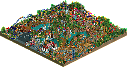
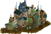
Neverland, on the other hand, seemed a bit sloppy and a bit half-baked. I mean, a large portion of the park is wrapped up in a large mountain in the middle. There are some parts around that island that seem unfinished, or just plane bare, especially around the native American area. The rides were fun, but not particularly amazing layouts. The entrance area was perfectly done, but i agree that is seems replacements have done this entrance area time and time again. As walto hinted at, some sloppy choices. In the Hook area, you had awnings over the brown wooden path made of of the same brown wooden piece. It makes things sloppy and unclear as to what is where. simply making it a new color will do a load of difference. The crocodile; however, was brilliant. But again, right behind it the hook station is hard to size up as it has all these complicated rooves overlapping and similar in color, it becomes hard to distinguish things. That all being said, the archy was general wonderful, particularly around tink's magic flight. Biggest mistake; however, is not doing the interior of "flight to neverland". an open roof to show us interior details would have won this for me. this late in the competition, interiors should definetly be tackled, especially when already so close to the map edge.
So, not to rain on anybodies parade, but i just had some issues with the parks. Alot of brilliant things, but a number of misses i think. I'll be back to vote in a bit
FK
Full review later. Vote later
Decided on Neverland, but I'd have to agree with the others that neither of the two seemed to stick out. I liked the dog's concept, but I feel like they used Roomie just for the sake of using him. I don't mean to offend anyone but I feel like the the Hanes and the Canes got jipped because imo i feel like they should be the two finalists, but still good luck to all the teams.
In few words, while i felt RD's used references without actually referencing much, the Replacement's park seemed unrefined.
FK
Ideas were more interesting, and the overall style was more appealing. Ride layouts in both were rather poor in my opinion, but the foliage in Neverland was very good, probably its best point. This one was close, but I feel like there's just more to look at in Pebbles.
Both parks had things I really liked, but both parks were pretty mediocre for semifinal parks. ****** I was really disappointed by your parks in the H2H.
Full photo review will be done tomorrow.
Cooler rides won it for me in RD's park.
disneylhand Offline
The idea behind the rapids ride in Pebbles was nice; as was its execution.
I would agree that the layouts in both left a lot to be desired. Tink's ride being an exception.
Isn't she just lovely <3
In all seriousness I am a bit disappointed in this match.
Reservoir Dogs: Granted I cannot view the LL park it looks mediocre from the overview. I am sure there are a variety of cool little hacks in there but it doesn't look as intriguing as earlier parks from your team. I think it may have been a risk to present an LL park at this stage in the competition but if it's worthy enough the votes will say it.
The Replacements: Neverland had a few moments of greatness, but as said before there is just another pirate ship made of strictly wooden 1/4 block pieces. The island in the middle almost felt as a filler to me. The back of it had little effect on the atmosphere and composition as a whole. The coaster layouts were fun but the woodie didn't seem to be accented as well as the others.