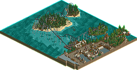
Park / The Trial
-
 26-July 12
- Views 3,732
- Downloads 591
- Fans 0
- Comments 38
-
 33.08%(required: 65%)
 Design Submission

Camcorder22 45% Fizzix 45% In:Cities 45% Jonny93 40% posix 40% chorkiel 35% Phatage 35% robbie92 35% CedarPoint6 30% Maverix 30% Pacificoaster 25% tyandor 25% wheres_walto 25% 5dave 20% pierrot 20% 33.08% -
 No fans of this park
-
 Download Park
591
-
 Objects
177
-
 Tags
Tags
Scott.S Offline
You shouldn't make comments like these if that's exactly what you plan on doing in your next submission.
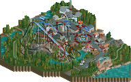
your coaster is too fast, I liked the idea for the barrel roll and I had an idea to do something like that in a future project, but you let the launch sacrifice the timing of the inversions. I mean, do you seriously think going 40PH on an immelmanm is correct? The second half could have been greatly improved and the turn going into the second corkscrew could have been better.
Another problem is how much the ride interacts with everything, like it should in a proper design. Ok, It does have some good interaction with the landscape and the queue, but how about any of the buildings? no. Any of the supporting rides? no.
The swinging ship felt out of placed and unneeded. It draws the focus out of the coaster, which is never good. If you were going to add a flat into a design, you should've interacted and intergrated it within the coaster but not so much that it cramps the coaster.
The queue IMO could've been stronger, but I thought that part was design worthy.
Coasters can't be to fast
I don't know, it didn't seem to fast in my eyes, but maybe the first Dive Loop is a little bit fast. (I actually don't have a Immelmann in the Layout)
BigB Offline
The design wasn't bad, but I wasn't a fan of the architecture. I realise that it was pirate themed but you overused the pirate walls in my opinion. You could easily have substituted with other walls such as brick or wood (the jurassic fence) in places. The coaster layout was pretty good overall, but I could see room for improvement. I agree that it could have used more interaction and the supports were mediocre. I liked the pirate ship poking out of the water though, that was a nice touch.
I thought this was quite okay, nothing spectacular. I liked the "cleanness" of the project, kind of. Every little aspect seemed to be taken care of which made me feel like you take passion in your game. That's nice.
What plans do you have for future projects?
but yeah, 40 MPH is too fast for any inversion.
I will launch another Design (maybe nothing pirate or medieval themed, but still NCSO) and there is a really big project coming up
The immelman turn starts at the bottom and does a half loop up and does a 180 roll out.
The dive loop starts at the top and does a 180 degree roll into a "diving" half loop. (essentially going through the immleman diagram from the top.
Ispeed begs to differ.
I mean that it kills flow ingame.
Well, no better time to post this then now.
BigB Offline
That's my rant, had to get it out of me.