Park / The Trial
-
 26-July 12
- Views 3,738
- Downloads 592
- Fans 0
- Comments 38
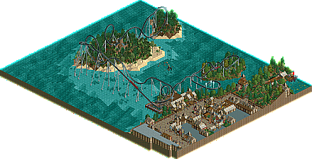
-
 33.08%(required: 65%)
 Design Submission

Camcorder22 45% Fizzix 45% In:Cities 45% Jonny93 40% posix 40% chorkiel 35% Phatage 35% robbie92 35% CedarPoint6 30% Maverix 30% Pacificoaster 25% tyandor 25% wheres_walto 25% 5dave 20% pierrot 20% 33.08% -
 No fans of this park
-
 Download Park
592
-
 Objects
177
-
 Tags
Tags
![park_2420 [H2H6] R4 - Reservoir Dogs - Atlantis Resort](https://www.nedesigns.com/uploads/parks/2420/aerialt2160.png)

You bring other people down ,by telling them that there work is shit and then i see this.
Needs work, that's all folks.
I never said, that Castello dal Mare was shit, but the architecture of the buildings in the park is. And quite frankly, I still think that the architecture shown in this park is better.
the layout isnt to bad.
You wanted it, so here it is. This submission stinks. There's no originality, no excitement, no themes. The ride layout stinks, the architecture stinks, the foliage is atrocious, and the ride supports are amateur. It's BORING.
The reason a NCSO park like Castello dal Mare can win an accolade and this gets placed in the shitter is interaction and detail.
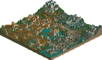
Notice how the coaster interacts not only with the architecture, but the foliage. It just fits the surroundings perfectly. I can imagine myself walking through that maze with the coaster flying overhead. It just gives off a great atmosphere. Not only that but look at the color scheme. A good mix of greens in the foliage with base land showing only in appropriate areas. Many different shades of brown in both the coaster and the surrounding buildings, and finally blacks and grays in the rocks and remaining buildings. There's no wasted space. Every element of that screen is contributing something, unlike your work which appears to be built with the main purpose of filling the map space.
Child please. Boring flat facades with the same roof relentlessly thrown on top of all of them? No thanks.
Maybe. I won't be the judge of that, what bothered me a little was that if somebody can complain, then they must now a lot about the game, wich probably wasn't the case.
I personally don't complain much about someone else's work ,since i don't know that much about the game yet.
People put a lot of time and effort in their work, that should be respected and treated in a subtile way.
For a NCSO-Park this has nice architecture. People say thats shit but I think themself they cant make such a good NCSO-work.
That isnt a design i agree, but its hard work to make a good NCSO-work. People must be blind not to see that that is a nice layout with lovely buildings. Not the best, but guys, that isnt sucks.
If that's your opinion I don't have anything to say about it.
Okay, I have to say, that the interaction isn't very good, but honest, I didn't have a concept or anything else for the park. I build it in a short time and when it was done I had to make the decision of sending it in or redo the whole thing. I decided to send it in and focus on a new project.
Have you ever build NCSO? There are just 4 good looking roofs, and 2 of them don't make sense in a pirate themed area.
Maybe not design worthy, but a high 40/low 50 imo.
Main problem with this was the architecture and the fact that there was zero interaction between things. The coaster and the queue almost had their moment but you fenced the queue out there which is a shame..
Well this explains everything. You are clearly in no position to put other builders down.
it just doesnt make sense
Download the park and read the readme...
@ In:cities: Yeah I am, like everyone is. I can say whatever I like about everything, that's how critique works.
Then you might be ignored in the future.
BigB Offline
I think the layout was pretty nice and critic on the architecture and foliage I gave you before..
Mr Buckeye, The Trial and the coaster-soundtrack are from "Monkey Islands" , the ship is also part of the game...
Well, the architecture was quite the same all over the map, as it is in most pirate themes...
sometimes color combinations were not that good , but like allready said, I allready told you the things I didn't like that much.
I would have rated 40-45 % on this.
There's a lot to improve as you may know, so I'm looking forward to your next project.
B'B
And don't make the same mistake again as we both did (starting without a concept).