Park / World of Creations
-
 25-July 12
- Views 12,312
- Downloads 958
- Fans 0
- Comments 46
-

-
 55.00%(required: 50%)
 Bronze

In:Cities 85% Loopy 70% Camcorder22 60% Fizzix 60% 5dave 55% CedarPoint6 55% Coupon 55% disneylhand 55% Pacificoaster 55% pierrot 55% Jonny93 50% Phatage 50% wheres_walto 50% Maverix 45% posix 45% 55.00% -
 No fans of this park
-
 Full-Size Map
-
 Download Park
958
-
 Objects
532
-
 Tags
Tags
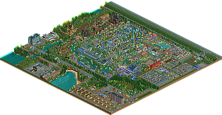
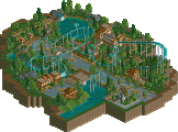
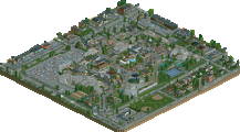
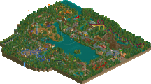
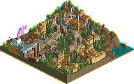
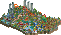
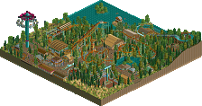
That useless track piece on the b&m can be deleted, i did that yesterday.
I still feel bad about that.
Thanks dr dirt, i know that one is awesome, i was very inspired when i was building that.
I know Shotguns?. Like i said before, i started this project without a concept, wich was stupid. My next park started with a concept and i have a lot of cool ideas for it, and i'll probably do some research to work on my flaws.
Thanks for your reply as well.
Yeah ,i know i had some nice touches in there, thanks Cocoa.
Thanks trav and yeah ,the slc was probably the best creation in there.
Thanks for all the reply's everybody, it really makes me happy to see so much interest in my work. It also gave me a boost of motivation for my next project.
Only one thing made me a little sad ,wich is ,the complaints about everything being underdetailed. I know there was underdetailednes ,but some buildings where detailed as in reality. Maybe i don't like overdetailing as well, but nonetheless ,i'm taking these critics seriously as well and i will think about how to tackle this.
The layout's are good as well, but I think you slightly overused inversions (for example the zero-G in front of the Dive Loop). The LIM-Coaster (or whatever it's called in english) is a little bit stranger (I don't like the coaster type at all). The placement of the shuttle loop is a little bit off. I always think it isn't perfect, I would have switched the path and the coaster.
Overall, I think this is a good park, but I'm sure you can do even better.
I know i can do better, and i will next time.
I dont why but i really liked the tunnel of the S&S compressed air coaster. Also the vekoma inverter was good.
Work a bit on your details and the foilage and your next park could be much better and make a plan before building.
I hope to see more of your work.
You will definately see more from me, i'm allready working on the next.
I never said it was bad lol. I said it wasn't my taste. I am very glad that it got an accolade actually.
Pros:
- Pretty cool interaction on El Espana Mosca with the trenches, and the support work is quite detailed.
- Some nice bits of architecture in the spanish section, the castles in the back of the park show some promise if further refined, and the architecture outside the park seem to be twice as nice as the architecture within the actual park itself!
- Supports on the wild mouse is a bit too thick, but the execution isn't bad. Perhaps if you use thinner scenery supports it would be very good, but atm it's too thick.
- Love the tankers and how simple the execution was but how legible it was!
- Some interesting water sculptures throughout the park!
Cons:
- Lacking in details, which then results in lackluster themes. For example, the Spanish area had very little spanish vibe at all. In fact, the white/black buildings in the Spanish area seem to be quite contemporary and 'modern'. Some of the architecture in the "middle ages" section is way too contemporary to be considered part of the 'middle ages'.
- Little things (sign that says sign in parking lot, glitching in apartment complex near the back of the park, etc.)
- A lot of ugly scenery used: flowers, cars, planters, etc. Pick better looking scenery items!!
- Layouts weren't very good at all.
- Two scramblers?
- Repetitive foliage shows laziness, should take more time/care.
- Park layout is confusing, and there is way too much paving vs. architecture/landscaping.
Overall: 45/100
Overall for me I was not a fan of the park; the aesthetic was too simplistic and overall was not very cohesive or well planned. I think the size of it was impressive and was the main selling point of the park; IMO if the park was smaller, many wouldn't have voted so highly. Anyway, the best thing about this park is that you FINISHED it! So congratulations on having that patience and dedication to finish something, especially of this size, and congrats on the bronze!
I'll put more thought ,love and dedication in my next park.
I'm allready reading some stuff about how a rollercoaster actually works.
Also ,i'm breaking my head trying to get ride/building and pathplacement in order.
I'll probably read a lot more stuff about everything i can find or need to make the next park more succesfull.
So, if you are planning for a big park, maybe you need my help! I'm not the only Asian at NE designs, but I am the FIRST FILIPINO OF NE DESIGNS!
So, like me?
I don't need your help.
No offense, you don't want to get your end bad.
If you didn't have offense, everyone in the world will happily tap your back, accepting you.
I don't know you.
I don't want your help, since you've got nothing to show for, thus i'm not convinced about your abilities. You didn't feel like downloading my park and simply judge from the overview.
That doesn't show much interest. You're a designer, well.. i'm happy for you.
The way you approached me ,shows a lot of ego, wich doesn't impress me.
Make a park of your own, first prove yourself, maybe then people will take you more serious.
If i need help ,then i know who i will ask for, and that's not you.
Don't bother me anymore.
Case closed.