Park / Raging Waters
-
 21-July 12
- Views 2,107
- Downloads 461
- Fans 0
- Comments 4
-
 22.31%(required: 65%)
 Design Submission

In:Cities 50% Jonny93 35% posix 30% chorkiel 25% Coupon 25% Phatage 25% tyandor 25% wheres_walto 25% Camcorder22 20% CedarPoint6 20% 5dave 15% Maverix 15% Pacificoaster 15% pierrot 15% Fizzix 10% 22.31% -
 No fans of this park
-
 Download Park
461
-
 Objects
167
-
 Tags
Tags
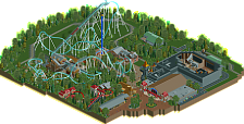
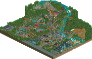
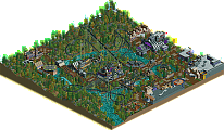

The layout was generally well-paced, although the corkscrews were too fast, usually it seems to be the other way around with that element so good job at least keeping the pace up through there. The elements are placed WAY too closely together though, look at some real coasters and you'll see that a dive loop will never be that close to the loop, there will be a bigger lead into the cobra roll, etc.
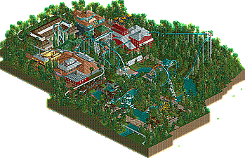
The architecture here is generally very blocky, but this is a stage all builders go through and all I can about that is keep building, keep experimenting, and keep learning from other parks. One of the ideas I enjoyed was the entrance bridge over the cobra roll entrance/exit, though the execution could've been better. You seemed to be trying to create interaction between the paths with the ride, but overall the pathing seemed kind of meandering and unnecessary. You should add some restaurants or shops over by the far corner by the ferris wheel to give guests a real reason to go over there (in RCT, they'll obviously be content wandering around aimlessly). The ferris wheel was also decently placed, I could see that being a pleasant experience up in the trees and next to the water. Generally though, the landscaping was lazily done without any thought in terms of tree/brush placement. It might be easy to look at parks from experienced parkmakers and assume their foliage is random too, but upon closer observation its placed with great care.
There are a few quick fixes that would've improved this, but in general, just keep practicing and you will improve with time. There's some potential here but you just need to take the time to refine your work.
(20%)
But don't feel discouraged Mr. Buckeye.
Listen to these advices and work on it.
Practice makes perfect.
The architecture felt VERY uninspired and sometimes built only for the sake of having a building on there. I didn't also get those little huts next to pathing or on the wooden pathway. I mean there were benches in it but it was unreachable for the peeps..
The foliage was a bit random and felt unsubstantial.
The river was weird because it had two lowest points but it didn't flow from there nor did it end in a pond/lake and because of the pretty heavy stream it definitely would have done that.
It also felt lazy that you didn't blacktile the map out but that was only a small complaint of mine.
The thing that I did like a bit was the park layout it was very obvious where the paths were leading to and the location of the rides and their intereaction were quite good.
and actually about everything camcorder said.