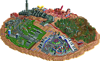
Unfortunately this is going to be one sided. Flying Germans, it must be tough your way, having Magnus gone and all. Though i respect the effort that has been put in by all of you. Reservoir Dogs, your park was very good. Some of the hacks were very well done, like the Robo Coaster and Test Seat both being operational. Overall it was a very pleasing and fun park to view. So again, its a shame this was so one sided, and my vote has to go to the Dogs.
Dude, EVERY time you vote, you're doing it wrong. Your vote was never counted and I feel like people have said you should copy the vote in the opening post a thousand times already...
Ive fixed it I guess I wasnt copying the whole text line sorry about that.
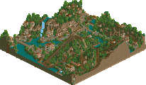
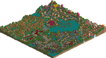
Hard Rock Park: I really liked the entrance area. The parking garages, the conveyor belts, the booths and the gates were really spot on for this kinda park. Also the mainstreet-ish area was really nice. The Abbey road cafe and the gas station are really well crafted. Also the custom ride with that truck coming out the building was a great idea. The fish and chips stall was great too. And I really liked what was there of the industrial area. Could have been nice. The old framework/castle area seemed kinda out of place and I don't know what it was about. The station for the Led Zeppelin coaster didn't really do the band justice. It was kinda strange to have the Zeppelin sit half on top of a building. Didn't know what to think of that. The concert area idea itself was nice, but it was so close to the park, there was this strange circle pit and no other people in this area. Really strange somehow. The layouts of the coasters weren't great either. One exception may be the motorbike coaster, the layout itself was kinda nice. All in all it could have been a nice park (again) from the Flying Germans. I'm sorry for your team situation, and hope that you didn't lose your fun with the game through all this. The ideas were there, but it lacked organization it seems. Hang in there guys!
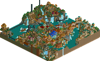
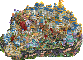
Galaxy Geeland: Wow - what stood out most in this park were definately its coasters. Great work on all of those! The park seemed were Asian inspired to me - which I really like. Unusual coasters and unique layouts within quirky themes. Great work! The entrance was a bit crammed but I really liked that windmill building and the viewing plattform idea. The Warcraft area didn't really seem very authentic to me, but maybe it was the plan as Asian parks try to copy big brand names without having the rights. The Gerstlauer had a nice layout and the pre-lift section was cool. But it went pretty fast through the course. Didn't really like that so much. The rapid ride was solid - not much to comment on here. The diagonal bridge into the next area was really nice and I loved that Intamin invert. Being on the real Tornado several times it brought back nice memories. You even included that wacky loop support structure, haha. Maybe some parts were a bit too glitchy but I have no idea how you could've avoid those. The castle within that last helix didn't make any sense to me. It would have been great if you could have give it some kind of purpose - maybe even a SBNO ride from past times? The station of it was great - although a bit too large and fancy for a witch house maybe - speaking of witches: how does the name Tornado connect to the theme? Also why did you hide the queue underground? Give the peeps something to see - let it interact with the ride! Spellbinder was perfectly executed being on that peninsular there - great work! Hurricane was out of place. Had nothing to do with the theme really, or am I missing something here? Looked like an afterthought to me. The last area wasn't on par with the other areas architecture and theming-wise. Only exception was the motion cinema - it was a great take on trashy science fiction from the 80ies or something. Also the space ship detail on one of the walls in that area was nice. The layout of the flyer was awesome. Would be a blast to ride this in RL. Oh and that robo coaster was great!! The area didn't really felt very starcraft-ish to me. All in all a great park but it showed too much were one builder started and were one picked it up again IMO. The RDs are continuing to deliver again!
Just as an aside. For those who don't know The Inspiration for this RD park was the new World Joyland in China.
I took some pics there earlier this year. (scroll down a bit)
well, even if not, this parks seems to be flying germans throwing in the towel. A handful of wonderful ideas, but nothing put together
I really enjoyed the RD's park. This somehow feels nostolgic, abit last H2H and def H2H4 the strategy was usually build awesome coasters, theme area, repeat. This park had that feel, three awesome (well, two + a weird cool thing) coasters, surrounded by wonderful themeing. You fell abit into the old problem of "well, what is this coasters theme?" u had a coaster themed to...star shredding? a coaster called Tornado that winds through a jungle and has a haunted house station (one of the best haunted house-styled facades i've seen, btw), and a semi-magical dragon based coaster...I mean, maybe these are based off real themes, but they seem to be odd when placed in this game. beautifully done, very enjoyable to watch, but odd. Really, this park was not the most exciting conceptually (though wonderfully nostalgic) but very exciting when put in action. Congrats
FK
Like roomie already said, it's inspired by that chinese theme park. So 'odd' is perfect. I think the theme is actually very exciting and it's something that we really haven't seen before in rct. They did a great job of translating that 'chinese engrish awkwardness' into rct and it shows. Your reaction is probably the same one you would have if you went to those parks in real life too, heh.
Why? Well, clearly because it's finished. Overall I've gotta say this park did not impress me. All just felt very mediocre, of course, I'm not interested in coaster layouts like you guys are, but still. There were some nice bits, like the robo arm custom flat and the way you made the cinema semi-peepable. So yeah, it was good and everything, just not really interesting in terms of theming nor theme.
Germans. I understand that the way H2H6 has been for you so far brings you down. However, I think it's a real shame you haven't finished the park. What wás there was some of the best stuff I've ever seen in terms of detail and atmosphere. This park in a finished state would've probably blown the Dogs' park away. For the builders (btw. not only of this park, but those of several other rounds as well): Don't let this get you down and pléáse finish your stuff after H2H. A lot of what you guys have shown shows so much potential to become awesome parks. Please turn that potential into something you guys could be véry proud of, even if H2H6 didn't go the way you hoped it to...
I vote Reservoir Dogs I loved this park. So many awesome ideas and some excellent coaster layouts. I loved the haunted house and the Robo Coaster was an amazing idea. FG, I really enjoyed what was there and the crazy taxi ride was brilliant. Sad to see it go unfinished.
I really liked Star Shredder's Layout, but felt it was a bit slow in the middle. The details like the test seat, Eurofighter, and robo arm were brilliant though, and I loved the stations for Wild River Run and Tornado. I liked the duality of bright vs dull colors in the park (intentional or not), and I think the red land texture actually worked well, which is rare. Germans... well, the car park was nice.
Great work RD, your best park this season. LOVE all the layouts, they are exceptional. Also love the references to gee and nokia in this, made me laugh quite a bit
I'm sooooo disappointed in all of FG... Nothing more to say..
Your best park so far RD, really nice work. All of your parks have been very high quality though, really impressive season for you guys so far. KONG's done a very good job. You all have.
Flying Germans, I know it's hard to finish a park when you're already 0-4 and without many team members, pity. Could have been a nice park.
Please finish this. For me. Everything that's in this park is brilliant- great architecture, rides, themes, etc. Obviously its unfinished, which is a shame, but good work anyway.
Dogs:
Very good park againk, dogs. I've been pleasently surprised that you've managed to make such a strong showing this competetition (not because you don't have skill, but because I didn't think you could get organized enough). I didn't really understand the theme of the park (warcraft?) but it was nice and atmospheric anyway. Some of the architecture was incredible, like the entrance area and around the green coaster (fucking brilliant detailing work there guys), but in other parks it felt a bit too 'filler' and theme-less, especially around the eurofighter. That said, the landscaping all over was very nice and the park was full of pleasent details. Not the best dogs park yet, but certainly a very enjoyable one.
I enjoyed Galaxy Geeland even though there are still some things that could've been improved in my opinion. The strongest point are easily the layouts which are all great. I loved the little details that you had here and there but I think you could've changed your composition a bit to make those details stick out more. The archy was well done but could've been better I felt and I really liked the hacks. Overall a very solid park. Not as incredible as I first thought from the overview but still very good and would've probably won this matchup for me anyway.
Flying Germans, I thought what was there looked promising but I didn't think it came together very well at all. Obviously the fact that it's not finished harms the overall picture but I felt even if finished the styles of the builders just wouldn't have matched well enough. There's hardly anything to comment on but I think had the coasters just been better this could've been closer. I hope your whole team can still find the motivation to keep playing this game after the contest. Good luck for the future guys!
51 Comments
J K Offline
Mr. Coaster Offline
I vote Reservoir Dogs
olddtfan51 Offline
Ive fixed it I guess I wasnt copying the whole text line sorry about that.
wheres_walto Offline
pierrot Offline
JJ Offline
SSSammy Offline
5dave Offline
I really liked the entrance area. The parking garages, the conveyor belts, the booths and the gates were really spot on for this kinda park. Also the mainstreet-ish area was really nice. The Abbey road cafe and the gas station are really well crafted. Also the custom ride with that truck coming out the building was a great idea. The fish and chips stall was great too. And I really liked what was there of the industrial area. Could have been nice. The old framework/castle area seemed kinda out of place and I don't know what it was about. The station for the Led Zeppelin coaster didn't really do the band justice. It was kinda strange to have the Zeppelin sit half on top of a building. Didn't know what to think of that. The concert area idea itself was nice, but it was so close to the park, there was this strange circle pit and no other people in this area. Really strange somehow. The layouts of the coasters weren't great either. One exception may be the motorbike coaster, the layout itself was kinda nice. All in all it could have been a nice park (again) from the Flying Germans. I'm sorry for your team situation, and hope that you didn't lose your fun with the game through all this. The ideas were there, but it lacked organization it seems. Hang in there guys!
Galaxy Geeland:
Wow - what stood out most in this park were definately its coasters. Great work on all of those! The park seemed were Asian inspired to me - which I really like. Unusual coasters and unique layouts within quirky themes. Great work! The entrance was a bit crammed but I really liked that windmill building and the viewing plattform idea. The Warcraft area didn't really seem very authentic to me, but maybe it was the plan as Asian parks try to copy big brand names without having the rights. The Gerstlauer had a nice layout and the pre-lift section was cool. But it went pretty fast through the course. Didn't really like that so much. The rapid ride was solid - not much to comment on here. The diagonal bridge into the next area was really nice and I loved that Intamin invert. Being on the real Tornado several times it brought back nice memories. You even included that wacky loop support structure, haha. Maybe some parts were a bit too glitchy but I have no idea how you could've avoid those. The castle within that last helix didn't make any sense to me. It would have been great if you could have give it some kind of purpose - maybe even a SBNO ride from past times? The station of it was great - although a bit too large and fancy for a witch house maybe - speaking of witches: how does the name Tornado connect to the theme? Also why did you hide the queue underground? Give the peeps something to see - let it interact with the ride! Spellbinder was perfectly executed being on that peninsular there - great work! Hurricane was out of place. Had nothing to do with the theme really, or am I missing something here? Looked like an afterthought to me. The last area wasn't on par with the other areas architecture and theming-wise. Only exception was the motion cinema - it was a great take on trashy science fiction from the 80ies or something. Also the space ship detail on one of the walls in that area was nice. The layout of the flyer was awesome. Would be a blast to ride this in RL. Oh and that robo coaster was great!! The area didn't really felt very starcraft-ish to me. All in all a great park but it showed too much were one builder started and were one picked it up again IMO. The RDs are continuing to deliver again!
I vote Reservoir Dogs
"MFG"
Roomie Offline
I took some pics there earlier this year. (scroll down a bit)
http://www.coasterfo...=33185&start=14
Xeccah Offline
FK+Coastermind Offline
well, even if not, this parks seems to be flying germans throwing in the towel. A handful of wonderful ideas, but nothing put together
I really enjoyed the RD's park. This somehow feels nostolgic, abit last H2H and def H2H4 the strategy was usually build awesome coasters, theme area, repeat. This park had that feel, three awesome (well, two + a weird cool thing) coasters, surrounded by wonderful themeing. You fell abit into the old problem of "well, what is this coasters theme?" u had a coaster themed to...star shredding? a coaster called Tornado that winds through a jungle and has a haunted house station (one of the best haunted house-styled facades i've seen, btw), and a semi-magical dragon based coaster...I mean, maybe these are based off real themes, but they seem to be odd when placed in this game. beautifully done, very enjoyable to watch, but odd. Really, this park was not the most exciting conceptually (though wonderfully nostalgic) but very exciting when put in action. Congrats
FK
AvanineCommuter Offline
Like roomie already said, it's inspired by that chinese theme park. So 'odd' is perfect. I think the theme is actually very exciting and it's something that we really haven't seen before in rct. They did a great job of translating that 'chinese engrish awkwardness' into rct and it shows. Your reaction is probably the same one you would have if you went to those parks in real life too, heh.
Ruben Offline
Why? Well, clearly because it's finished. Overall I've gotta say this park did not impress me. All just felt very mediocre, of course, I'm not interested in coaster layouts like you guys are, but still. There were some nice bits, like the robo arm custom flat and the way you made the cinema semi-peepable. So yeah, it was good and everything, just not really interesting in terms of theming nor theme.
Germans. I understand that the way H2H6 has been for you so far brings you down. However, I think it's a real shame you haven't finished the park. What wás there was some of the best stuff I've ever seen in terms of detail and atmosphere. This park in a finished state would've probably blown the Dogs' park away. For the builders (btw. not only of this park, but those of several other rounds as well): Don't let this get you down and pléáse finish your stuff after H2H. A lot of what you guys have shown shows so much potential to become awesome parks. Please turn that potential into something you guys could be véry proud of, even if H2H6 didn't go the way you hoped it to...
Xtreme97 Offline
I loved this park. So many awesome ideas and some excellent coaster layouts. I loved the haunted house and the Robo Coaster was an amazing idea.
FG, I really enjoyed what was there and the crazy taxi ride was brilliant. Sad to see it go unfinished.
Ling Offline
I vote Reservoir Dogs
Six Frags Offline
Also love the references to gee and nokia in this, made me laugh quite a bit
I'm sooooo disappointed in all of FG... Nothing more to say..
I vote Reservoir Dogs
Turtle Offline
Your best park so far RD, really nice work. All of your parks have been very high quality though, really impressive season for you guys so far. KONG's done a very good job. You all have.
Flying Germans, I know it's hard to finish a park when you're already 0-4 and without many team members, pity. Could have been a nice park.
Arjan v l Offline
Cocoa Offline
Please finish this. For me. Everything that's in this park is brilliant- great architecture, rides, themes, etc. Obviously its unfinished, which is a shame, but good work anyway.
Dogs:
Very good park againk, dogs. I've been pleasently surprised that you've managed to make such a strong showing this competetition (not because you don't have skill, but because I didn't think you could get organized enough). I didn't really understand the theme of the park (warcraft?) but it was nice and atmospheric anyway. Some of the architecture was incredible, like the entrance area and around the green coaster (fucking brilliant detailing work there guys), but in other parks it felt a bit too 'filler' and theme-less, especially around the eurofighter. That said, the landscaping all over was very nice and the park was full of pleasent details. Not the best dogs park yet, but certainly a very enjoyable one.
I vote Reservoir Dogs
Fisch Offline
I enjoyed Galaxy Geeland even though there are still some things that could've been improved in my opinion. The strongest point are easily the layouts which are all great. I loved the little details that you had here and there but I think you could've changed your composition a bit to make those details stick out more. The archy was well done but could've been better I felt and I really liked the hacks.
Overall a very solid park. Not as incredible as I first thought from the overview but still very good and would've probably won this matchup for me anyway.
Flying Germans, I thought what was there looked promising but I didn't think it came together very well at all. Obviously the fact that it's not finished harms the overall picture but I felt even if finished the styles of the builders just wouldn't have matched well enough. There's hardly anything to comment on but I think had the coasters just been better this could've been closer. I hope your whole team can still find the motivation to keep playing this game after the contest. Good luck for the future guys!