Park / [H2H6] R5 - Hurricanes - Busch Gardens: The New World
-
 14-July 12
- Views 24,092
- Downloads 1,024
- Fans 1
- Comments 115
-
1 fan
 Fans of this park
-
 Full-Size Map
-
 Download Park
1,024
-
 Objects
378
-
 Tags
Tags
![Park_2433 [H2H6] R5 - Hurricanes - Busch Gardens: The New World](https://www.nedesigns.com/uploads/parks/2433/aerialm2180.png)
![park_2434 [H2H6] R5 - The Replacements - New Fantasyland](https://www.nedesigns.com/uploads/parks/2434/aerialt2181.png)
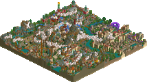
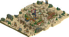
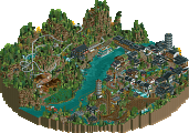
First off, what was there in ur park, i highly enjoyed. I think this finished would have blown us away. unfortunately, you were a victim of my vicious plan. The ideas and layout, though crammed, were wonderful. I Agree a more exciting coaster would have helped, but i think this park just didn't make it due to unfinishedness.
As has been noticed, This park was made %100 percent inside our deadline extension. With only 3 days to complete it, i had to choose between 2 different approaches. I knew i couldn't make anything detailed or well-though out at my normal pace in 3 days, so i decided to not attempt anything real. Rather, i aimed for an appearance of finishedness, hoping to weird people out rather than wow them, and at least avoiding the axe for unfinishedness. Thus, this park was a mash of "u thought it, u build it". every idea and concept i thought of i just built as fast and carefree as i could. I'm actually really happy with the outcome, and glad some of you enjoyed it, as i actually immensely enjoyed constructing it.
I must apologize to Steve; however, as i loved this coaster design. Smooth and fast and beautiful. I do believe i ruined it, but all in the name of H2H. and i agree with everyone, this is a realistic coaster in a fantasy setting. That being said, i like the balance.
FK
Our park was built in 3 days, by FK. Only the layout was done by Steve, but it is a bloody nice layout to be fair. I have to totally commend FK on getting this thing finished.
After deciding to move our week 5 park to the semis, since it was so ridiculously good, we knew we were basically forfeiting this round. However, with the week 5 park being completely finished anyway, and being quite confident of finishing our final park in time without using the deadline extension, we decided to use these three days to get something in. This was primarily to ensure that the Hurricanes had something to go up against - no one likes winning by forfeit.
Now it takes a certain kind of person to put their name to a park that they can only build in three days, and that they know is basically a forfeit anyway, and FK stepped up massively. This ended up being actually really interesting, and looking finished. Obviously more could have been added, but what was there was done.
I still think that the Hurricanes park here was the better park. It had some really nice ideas, like the parade, the cage, and the Christ statue, which I think were enough to win this match up despite the rest of the park not being finished. But unfortunately the unfinishedness killed any atmosphere you had going, and the architecture was largely too simple. I know you might say that is indicative of the region you based it off, but if you're going to go with that approach then you need to add a lot more theming around the buildings to give atmosphere. You guys obviously didn't care too much about this park being unfinished anyway, you'd already made the semis.
I just want to say, that Pacificoaster's Disney park was totally finished before this week 5 deadline. Imagine that for a run of three parks... Lijiang, Parapluie, DAW. Strong end to the regular season!
Colorflood really is a unique ride. In order to really "get" it you have to think about it from an abstract perspective. Seeing as most people in these forums are used to seeing parks "grounded" in reality that they can give their brutal criticisms to, when something like this comes along, people have no idea how to respond. this is because they're not used to seeing anything like it and are often quick to judge. Glad to see that it still won.
Who cares if it may have been thrown together in three days, it immediately grabbed my attention far more than the Hurricanes' park did.
what was going to be the semifinal/final park if you'd released DAW here? just curious.
The park concept is still really really good I think, there's enough ideas to fill a larger map with it actually. I hope it'll see the light of day sometime, so I won't spoil it here.
Still, I loved colorflood haha, best park of h2h6
I'd prefer mickey's not-so-scary modern art exhibit to colorflood.
I would like to see that liam, pics or gtfo
so was steve originally on DAW (meant to be w5) and corsair (finals), while you'd be on whatever the playoff park is?
you were trynna to go for that red river delta v2 huh? pac showed me some of steve's daw work and i was super impressed by what he built, though it was barely anything.
Nah it was the same concept really. Giant trees and ships and shit. Ended up being more urban thanks to me I guess.
i meant more of the atmosphere, given that turtle and chapelz made red river delta and steve goes along with that perfectly.
No one builds in a vacuum, and Colorflood is proof of that. Did FK arguably do this abstract concept better in swoon, white lightning, or a few of those screens he's posted? Yes, but this started something here. I appreciate this work's ability to transcend the order and form that seemingly an object-heavy art form as RCT demands. My one gripe is how the layout doesn't emulate this approach to the game, which is why only gave it a 75.
You can bump port of entry if you want, Josh.