My point is that you can't objectively determine the amount of content in a park. Finding the winner of these contests would become a lot easier if that was the case.
Hurricanes park was boring. Subpar archy+boring ride+unfinishedness. Only part I liked was the corner with the carnival.
HK, you never fail to surprise me. It is a genius move to keep your former r5 park and send this in . And I must say: I love colorflood. It's well thought out, has a good coaster and I just love the curvey style.
It was a real hard decision, since i actually didn't like both parks. An unfinished park is always sad to see, and there was a great lack of atmosphere in Busch Gardens, i also didn't like the coaster.
Colorflood didn't make sense to me and i've tried to let it sink in. I opened the file and coastercarts started flying around my ears . Personally ,i love fantasy ,but this was too much.
Colourflood: First, off - that Readme was the best readme ever. LOL! What a strange park this was. It looked like the design contest were you had a realistic layout and put it in your own context. I don't really understand why you had this realistic woody layout and this fantasy theme. I never was a fan of parks like this. I know the theme are the colors but why not do a more organized approach and theme it after a color wheel from Goethe, Itten or something along those lines? Right now it just seemed to random for me.
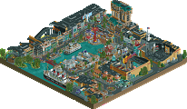
Busch Gardens: Upon opening I thought I have seen it all already. Inti was the first that caught my eye. I liked the imposing, towering look it has - reminded me of SheiKra which is a good thing I suppose. The layout was solid but also a bit boring. The water ride next to it was just ugly. I don't like crammed splash boats like that. Also the fact that it was so pinned into the corner didn't help at all. The terraces were a nice idea but somehow they just didn't work. Everything felt much too sterile and boring. The river rapids ride was too hidden for me and also very boring. If Toucan was supposed to be a Topple tower ride, then it was much to high! If not, just ignore the comment The animal exhibits themselves were nice, but the whole layout of the park made them so crammed in somehow you couldn't really concentrate on those. The parts I liked most were the Rio street carnival and the little Favela area behind the statue. Also some details like the animals in the exhibits, the bus near the entrance were quite nice. If the park would have been the quality of the back areas it would have been an easy winner. But the unfinishedness and the stale and boring look of some parts of the park make this a difficult decision. Pity everything was so unfinished. Somehow a strange, a little dissapointing matchup.
Hurricanes: Sadly unfinished, and for what was there I must say it felt rather messy/sloppy. I'll start this with what I liked: The animal exhibitions. The llama/jaguar/monkey exhibitions were real fun to watch and well executed. The bird cage was great too btw. The fact you've implemented all these H2H'ers as staff members was fun, there were some fun situations in it, but nothing special.
Why messy? There were a lot of seemingly purposeless structures, not because they were unfinished, but because there simply wasn't any logical use for them. Add this to the messy park layout and the overflow of custom games/stalls and you get a park that's just too much of a mess to my taste. Furthermore, the Sculpture was a bit too simple. Most of us will've gotten what it's supposed to be, but the execution could've been better.
Heaven's kitchen: Should I laugh or cry? I'm still not sure. I liked the crashing coasters, the toilet theming, the concept and the colors. However, I think it's a waste of a very nice realistic out&back layout to put it in a park like this. Furthermore I think you should've done something with the paths instead of just make them invisible. Having people walk through some tubelike structures or something would've been a lot more appropriate. The sloppyness makes it feel like you've decided to use your extension in order to create this from scratch, and use your RR park in the semi's or maybe even finals. However, even then, I enjoyed this and thought it was híghly creative. Not perfect in execution, not as delicately done as it could have been, but fun nonetheless.
Close call, but for its creativity: I vote Heaven's Kitchen
Maybe some of the blame should be on me for our park being unfinished. I told our guys that with us locked into a playoff spot we would not use the extension to finish this park even if it was needed. That extra 3 days would have meant we finished it. Oh well, hopefully we get a post-season park fully 100% with those 3 days we still have in our back pocket.
HK, neat park. It's more abstract art than RCT and you pulled it off well.
Our park had some really great spots in it that showed potential for a pretty awesome BG theme. Still yeah it's clearly unfinished, more than Pixar imo. I hope our guys can finish it up.
If I was on the outside looking in this would be a VERY hard vote to make. Polar opposite parks with extreme pros and cons.
I still can't get over how cool HK's park is to view in game. I keep opening it again and again just to see the explosion haha.
Kumba, you are definitely at no fault here as a captain. You've done a beyond fantastic job this season. For us to make it four rounds with completed parks is something to be proud of.
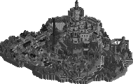
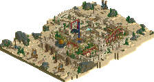
"Busch Gardens: The New World" by the Hurricanes [attachment=12490:120703-rct2-h2h6_camouflage-h2h6_r5_-_hurricanes_-_busch_gardens_the_new_world.zip](RCT2)
VS
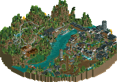
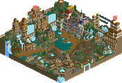
"Colorflood" by Heaven's Kitchen [attachment=12491:120706-rct2-h2h6_camouflage-h2h6_r5_-_heavens_kitchen_-_colorflood.zip] (RCT2)
How to vote - This season vote is by reply only. Only votes using the format as below will be counted. - Everyone but players belonging to either team in the match may vote. - We will check the topic frequently to update the vote counts. - Until your vote has been added to the count you may edit your post to change your vote.
If you want to vote for the Hurricanes, copy this code into a reply:
115 Comments
Wanted Offline
Camcorder22 Offline
Pacificoaster Offline
Turtle Offline
Tolsimir Offline
HK, you never fail to surprise me. It is a genius move to keep your former r5 park and send this in . And I must say: I love colorflood. It's well thought out, has a good coaster and I just love the curvey style.
I vote Heaven's Kitchen
Arjan v l Offline
It was a real hard decision, since i actually didn't like both parks.
An unfinished park is always sad to see, and there was a great lack of atmosphere in Busch Gardens, i also didn't like the coaster.
Colorflood didn't make sense to me and i've tried to let it sink in.
I opened the file and coastercarts started flying around my ears .
Personally ,i love fantasy ,but this was too much.
And Sulakke, dangerous place to rebel .
5dave Offline
First, off - that Readme was the best readme ever. LOL! What a strange park this was. It looked like the design contest were you had a realistic layout and put it in your own context. I don't really understand why you had this realistic woody layout and this fantasy theme. I never was a fan of parks like this. I know the theme are the colors but why not do a more organized approach and theme it after a color wheel from Goethe, Itten or something along those lines? Right now it just seemed to random for me.
Busch Gardens:
Upon opening I thought I have seen it all already. Inti was the first that caught my eye. I liked the imposing, towering look it has - reminded me of SheiKra which is a good thing I suppose. The layout was solid but also a bit boring. The water ride next to it was just ugly. I don't like crammed splash boats like that. Also the fact that it was so pinned into the corner didn't help at all. The terraces were a nice idea but somehow they just didn't work. Everything felt much too sterile and boring. The river rapids ride was too hidden for me and also very boring. If Toucan was supposed to be a Topple tower ride, then it was much to high! If not, just ignore the comment The animal exhibits themselves were nice, but the whole layout of the park made them so crammed in somehow you couldn't really concentrate on those. The parts I liked most were the Rio street carnival and the little Favela area behind the statue. Also some details like the animals in the exhibits, the bus near the entrance were quite nice. If the park would have been the quality of the back areas it would have been an easy winner. But the unfinishedness and the stale and boring look of some parts of the park make this a difficult decision. Pity everything was so unfinished. Somehow a strange, a little dissapointing matchup.
So despite all dissapointment I have to vote.
I vote Hurricanes
"MFG"
Ruben Offline
Sadly unfinished, and for what was there I must say it felt rather messy/sloppy. I'll start this with what I liked: The animal exhibitions. The llama/jaguar/monkey exhibitions were real fun to watch and well executed. The bird cage was great too btw. The fact you've implemented all these H2H'ers as staff members was fun, there were some fun situations in it, but nothing special.
Why messy? There were a lot of seemingly purposeless structures, not because they were unfinished, but because there simply wasn't any logical use for them. Add this to the messy park layout and the overflow of custom games/stalls and you get a park that's just too much of a mess to my taste. Furthermore, the Sculpture was a bit too simple. Most of us will've gotten what it's supposed to be, but the execution could've been better.
Heaven's kitchen:
Should I laugh or cry? I'm still not sure. I liked the crashing coasters, the toilet theming, the concept and the colors. However, I think it's a waste of a very nice realistic out&back layout to put it in a park like this. Furthermore I think you should've done something with the paths instead of just make them invisible. Having people walk through some tubelike structures or something would've been a lot more appropriate. The sloppyness makes it feel like you've decided to use your extension in order to create this from scratch, and use your RR park in the semi's or maybe even finals. However, even then, I enjoyed this and thought it was híghly creative. Not perfect in execution, not as delicately done as it could have been, but fun nonetheless.
Close call, but for its creativity: I vote Heaven's Kitchen
Kumba Offline
HK, neat park. It's more abstract art than RCT and you pulled it off well.
Our park had some really great spots in it that showed potential for a pretty awesome BG theme. Still yeah it's clearly unfinished, more than Pixar imo. I hope our guys can finish it up.
If I was on the outside looking in this would be a VERY hard vote to make. Polar opposite parks with extreme pros and cons.
Turtle Offline
rct2isboss Offline
Airtime Offline
I vote Hurricanes
K0NG Offline
Cane's park could have been pretty fucking good....could have.
HK's park looks like my cat coughed up a hairball after eating a bag of Skittles.
I vote Hurricanes
I'm baaaaaaaaack, bitches
3:06
In:Cities Offline
I still can't get over how cool HK's park is to view in game. I keep opening it again and again just to see the explosion haha.
Kumba, you are definitely at no fault here as a captain. You've done a beyond fantastic job this season. For us to make it four rounds with completed parks is something to be proud of.
Can't wait for the playoffs!
rozycoon Offline
Cocoa Offline
FredD Offline
Louis! Offline
Gwazi Offline
Ruben Offline
I agree... oh wait, errr.... yay captain Nin!