Park / [H2H6] R5 - Hurricanes - Busch Gardens: The New World
-
 14-July 12
- Views 26,587
- Downloads 1,128
- Fans 1
- Comments 115
-
1 fan
 Fans of this park
-
 Full-Size Map
-
 Download Park
1,128
-
 Objects
378
-
 Tags
Tags
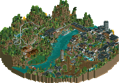
![Park_2433 [H2H6] R5 - Hurricanes - Busch Gardens: The New World](https://www.nedesigns.com/uploads/parks/2433/aerialm2180.png)

![park_2390 [H2H6] R2 - The Replacements - Tivoli Gardens](https://www.nedesigns.com/uploads/parks/2390/aerialt2133.png)


![park_2434 [H2H6] R5 - The Replacements - New Fantasyland](https://www.nedesigns.com/uploads/parks/2434/aerialt2181.png)

Clearly Liam showed genius like this a few years back
Why was the woodie layout so realistic in colorflood?
I don't think that slightly unfinishedness was an issue with the Pixar park of the RD, so why is it suddenly now?
Uhhh yeah... what Fisch said. I wanted to see a crazy woodie with that theme, not a mediocre realistic layout.
Hans, I like you, but stop talking down our park and talking up your own. Not cool.
And slight unfinishedness WAS an issue with the Pixar Park, as many people commented on it. Hence your park beating it.
Because Hurricanes produced a park that was boring and didn't hold my attention for long. It felt like i'd seen it all before, and the main coaster's layout wasn't anything special. I have nothing against the Hurricanes and everyone has had a park like this this season, but people have opinions, so respect them. I voted HK because it was fun, unique, I certainly havent seen anything like it before and the layout was phenominal. Possibly the best layout of the tournament so far. Why do people always have to bitch about the opposite team's park, you certainly didn't see my team doing it.
Didn't enjoy Colourflood one bit. Didn't think the coaster was that good either really, it was just a glorified out and back.
The canes park wasn't really impressive for me. The main coaster lacked a bit for me and the unfinishedness did the rest. The architecture was in the most places to bare and a bit boring. But i have to say that i enjoyed the brazil main street a lot. The parade is fantastic and worked very well for me. Also the small favela and the christus statue were some good ideas but the implementation was not so good.
The kitchens park was fun to watch. Everywhere this colorful objects made it for me. Also the coaster crash at the beginning was fantastic. Only thing is like others said the realistic layout. No question its really good but a more fantasy one would fit in there a bit better.
This is not really easy to decide which park gets my vote, but i think i want to honorize the creativity of heavens kitchen. You play a fantastic season.
Calm your titties guys, I didn't talk the HK park down, I merely stated facts:
Colorflood: 26212 map data structures
Busch Gardens: 36496 map data structures
So the fact is BGNW had more content, even if it's unfinished, that's what I was trying to say.
But I'm done defending the park our team made. Don't know why I was doing so in the first place though..