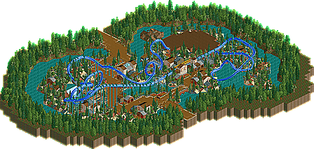
Park / =WildSurf=
-
 04-January 03
- Views 18,894
- Downloads 2,190
- Fans 0
- Comments 38
-

-
 73.13%(required: none)
 Design

5dave 80% Cocoa 75% G Force 75% posix 75% RWE 75% saxman1089 75% chorkiel 70% Jaguar 70% Liampie 70% Scoop 70% 73.13% -
 No fans of this park
-
 Download Park
2,190
-
 Tags
Tags
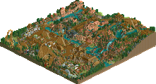
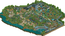
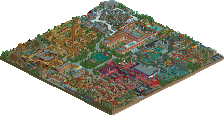
*Stargazer*
1. Coyote Runner. Great layout, great theming. Very Corkscrwed-ish.
2. Wild Surf. Altough it was a big ripp of in theming, the layout of the coaster surpised me.
3. Vesuvius. Great mine train. I didn't liked the thing with the water and pipes.
4. Nothing too special, the coaster was ok, and the theming/architecture wasn't that superb.
"I can tell that we're gonna be friends"
And come to Thorpe Park with us on opening day to ride it! The air fare can't be that expensive ^___^
I didn't much like Corky's woody, either. The bulk of the layout was very bland, and the helix's and the diving/rising turns looked like shit.
I've yet to download the RCT1 rides.
mantis - great ride, bit slow in sum places but had a lovely atmosphere
nick - never blew me away but it was okay. Nice hack but it seems the same as everything else you've done so far
Corkscrewed - Nice coaster, but nothing exceptional in terms of theming and architecture imo
RRP - The coaster wasn't as good but there were some great theming touches that made this the better of the two. I particularly like the water coming out of the angled poles and of course the bridge over the waterfall.
I'd like to comment on the custom scenery. I'm a big proponent of the use of custom scenery however the items you chose didn't add anything to the design so probably would have been better left out. I think it important that if you include custom scenery in a park you also include a document detailing the names of all the items in that park to make removal easier for those who don't want them. As far as RCT2 overwriting your existing files with custom scenery it won't (it will just add a # or letter to the end of the file name and create a new file) so peeps needn't worry about that.
Chauncey....just go into your objdat folder arrange by date and the most recent files will be the ones you want. Quit your bitchin'
Tiburon Island is mine. mantis' was TIOMAN Island. Silly fuck.
Adam - i know it's a bit slow, but I didn't want to change the layout.
coasterct Nick can do better, i know it
mantis' ride wasnt anything special, nice themeing even if it looked like fatha
sombody tell me what to do about rct2, am i gonna have to reinstall?
Corkscrewed Offline
(Good to everyone but Chauncey, of course)
Never mind.
- RRP's I liked very much It was a nicely Themed mine train
- Corky's coaster I Liked as well nice theming nice colour and an average layout but then again you were going for a realistic look.
- Nick's coaster was good as well. nice dark theming and the layout was ok just a bit over treed to me.
Yeah, that was an old coaster of mine. I don't need to proove it to you because you know whats good of mine.
And thanks X, I need to badger you for Outrage at some point to see how long you're going to finish it before I finish mine.
MGRYROCK.dat
PARKMAQ.dat
PICNIC1.dat
SMGRROCK.dat
SODAVENE.dat
COLROOF2.dat
Or you can simply sort them by date.
RRP: damn! that was nice! I like the vulnerable feeling by the falls, best part of the ride.
Corky: realistic, sums it up. the station was very fitting, but dwarfed the ride. I would guess you started with the helix idea and built, just a guess. Great ride, i would totally expect to see that ride in a park somewere.
PEACE
1)How can some custom scenery that i have not made myself,work completely fine on my PC but crash other peoples? (BTW:there are loads of people who have that scenery)
2)Why the hell is there people moaning about custom scenery?They are small files and they dont exactly cause any problems.......and dont give me this unorigianl crap.I dont see no other way to make a drinks stall or map without it.So stop moaning about it cos it comes in handy.
I dont see why i should keep a record of what custom scenery i have used becuase i have downloaded a lot and cant really remember.