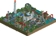
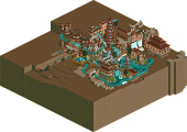
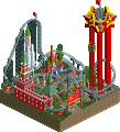
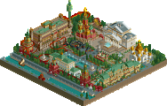
Just to add, these concepts were from members on our team, just never went anywhere on their own. This gave a great opportunity to actually finish them. Again using time to our advantage in an efficient manner. That said all three were started from scratch for h2h6 on a blank map. We just had a better understanding how to pull it off in a short time line by not having to go through many reworks even though we had to make significant changes on all three entries.
I vote the Reservoir Dogs Very nice park. Loved the water park, the hotel looked amazing, the coaster had an awesome layout and the casino was fun. Overall excellent work. Replacement's park was also very nice, and finished it could have been a close competition. I loved the idea of the park and lots of parts were executed very nicely. Great work both teams
...Even If the Replacements park were done, this would have still kick its ass.
Well that was uncalled for. How 'bout you first participate in H2H and put some 30+ hours into building a park before posting these cool little comments? No problem with you expressing your opinion, but a bit of respect for the builders that put serious effort in creating this so you can enjoy it would be in place.
Oh and dogs, no matter what some might say, I think creating those hotel objects is one of the smartest things ever. No use in endless/brainless clicking if it doesn't add anything to the creative process. Smart one.
Both teams had very good parks, though in my opinion the Reservoir Dogs pulled it out better. I had a good laugh looking at the staff situations and names in Atlantis Resort. Had The Replacements park been finished I might have thought differently, but unfinishedness combined with a strong entry on the Reservoir Dogs' part makes my vote go to them. Though none the less, very good parks from both teams.
I vote the Reservoir Dogs
Oh and by the way, I found The Replacements' park readme extremely funny for some reason. I approve!
Reservoir Dogs: Having been to the Atlantis resort in real life, you did a fairly good job at depicting the atmosphere. However, the hotel itself lacked a lot of details (Top floors should have larger windows, towers should have different balconies and composition, the arch was really boring, detailing should be more intricate around the upper floors, etc.) and overall wasn't very interesting; it blocked off half of the map, it's way too thick for it's height (I know there's probably not much that could be done about that though, based on RCT-limitations), and didn't do much for the park while being so imposing. Overall it lacked variation in the facade.
On the other hand, the park itself had great ideas and was well executed! I really enjoyed the water slides and the temple along with the underwater walkways! So well done, it was very impressive! The hacks to make the water slides work were great and it was very CLEAN at the same time. I loved it.
The flyer was okay, nothing too spectacular but not bad at all. I really love the detailing along the beach (the sand gradient was perfectly done, the swimming peeps were great, and the beach atmosphere was spot on!), and the casino was lovely with the interior details! I felt as though the park had too much paths and not enough foliage; walking around that resort would be very tiring IMO, and the layout of the paths didn't vibe well with me. Also, the signage for Atlantis resort shouldn't be facing the beach, it should be facing the entrance under the arches of the hotel. Other things I loved were the storefront by the hotel (lovely composition and detailing!) and the beach bar (so well made!). Overall it was a great park!
The Replacements:
Oh how I wish you'd finish this one. This really would have given the RD's a run for their money! But unfortunately at this stage I can't really vote for this park.
There are so many good ideas going on here and I really spent a long time combing through the park. The enjoyment factor is extremely high and I had some chuckles along the way! Such creative work to come up with all of these concepts and then execute them in such a detailed manner. I love it!
Some details I really liked were the plants as the rocket exhaust (great use of an existing object!), the pipe as a tree trunk, all the custom signs throughout the park, and the bold fuck nin sign lol. Some of the buildings actually remind me of architecture I saw in Beijing (commie block style) and it worked really well here. This really could have been one of my favorites this season, but the unfinishedness just completely kills it.
the hotel itself lacked a lot of details (Top floors should have larger windows, towers should have different balconies and composition, the arch was really boring, detailing should be more intricate around the upper floors, etc.) and overall wasn't very interesting; it blocked off half of the map, it's way too thick for it's height (I know there's probably not much that could be done about that though, based on RCT-limitations), and didn't do much for the park while being so imposing. Overall it lacked variation in the facade.
See, that is exactly what I meant when I called those pre-made objects 'lazy'.. They just don't give any room what-so-ever for variation, details or any depth of aesthetic variation in architectural design..
Well I thought the objects were fine, it's just that they didn't need to use the object for the ENTIRE facade. I like the objects because they do save time and are very useful, so it's more a question of when to use the object and when to not use it.
Although I agree in a way, the reasoning was almost certainly because there were only 17 or 18 days to build this entire park. That as a team is obviously our fault. but considering how little time there was, the use of such objects would of saved a tremendous amount of time. And sacrificing that little bit of detail in order to have an actually finished park is a gamble that I think paid off.
I completely agree; given the time constraint you guy did a great job. I was just critiquing the work presented for what I think it did well and what it lacked.
Overall, I found it more compelling and composed. While not the most original idea in the world, it was executed extremely well. I think my favorite part might've been where the water slides wrapped the monorail station; the supports for the slides looked beautiful and I loved how layered that whole area looked. The hotel wasn't fantastic, and probably could've used a better entry area or something like that, but the rest more than makes up for it.
107 Comments
BelgianGuy Offline
Roomie Offline
tyandor Offline
The replacements would have won this vote if they atleast finished more.
Six Frags Offline
Screen reviews probably after this is all over with..
dr dirt Offline
or it's just that h2h gives the perfect opportunity to finally bring those ideas into fruition.
RCTNW Offline
Xtreme97 Offline
Very nice park. Loved the water park, the hotel looked amazing, the coaster had an awesome layout and the casino was fun. Overall excellent work.
Replacement's park was also very nice, and finished it could have been a close competition. I loved the idea of the park and lots of parts were executed very nicely.
Great work both teams
bennyboy17 Offline
Xeccah Offline
Vote correctly please. Even If the Replacements park were done, this would have still kick its ass.
Ruben Offline
Well that was uncalled for. How 'bout you first participate in H2H and put some 30+ hours into building a park before posting these cool little comments? No problem with you expressing your opinion, but a bit of respect for the builders that put serious effort in creating this so you can enjoy it would be in place.
Oh and dogs, no matter what some might say, I think creating those hotel objects is one of the smartest things ever. No use in endless/brainless clicking if it doesn't add anything to the creative process. Smart one.
Mr. Coaster Offline
Both teams had very good parks, though in my opinion the Reservoir Dogs pulled it out better. I had a good laugh looking at the staff situations and names in Atlantis Resort. Had The Replacements park been finished I might have thought differently, but unfinishedness combined with a strong entry on the Reservoir Dogs' part makes my vote go to them. Though none the less, very good parks from both teams.
I vote the Reservoir Dogs
Oh and by the way, I found The Replacements' park readme extremely funny for some reason. I approve!
AvanineCommuter Offline
Reservoir Dogs:
Having been to the Atlantis resort in real life, you did a fairly good job at depicting the atmosphere. However, the hotel itself lacked a lot of details (Top floors should have larger windows, towers should have different balconies and composition, the arch was really boring, detailing should be more intricate around the upper floors, etc.) and overall wasn't very interesting; it blocked off half of the map, it's way too thick for it's height (I know there's probably not much that could be done about that though, based on RCT-limitations), and didn't do much for the park while being so imposing. Overall it lacked variation in the facade.
On the other hand, the park itself had great ideas and was well executed! I really enjoyed the water slides and the temple along with the underwater walkways! So well done, it was very impressive! The hacks to make the water slides work were great and it was very CLEAN at the same time. I loved it.
The flyer was okay, nothing too spectacular but not bad at all. I really love the detailing along the beach (the sand gradient was perfectly done, the swimming peeps were great, and the beach atmosphere was spot on!), and the casino was lovely with the interior details! I felt as though the park had too much paths and not enough foliage; walking around that resort would be very tiring IMO, and the layout of the paths didn't vibe well with me. Also, the signage for Atlantis resort shouldn't be facing the beach, it should be facing the entrance under the arches of the hotel. Other things I loved were the storefront by the hotel (lovely composition and detailing!) and the beach bar (so well made!). Overall it was a great park!
The Replacements:
Oh how I wish you'd finish this one. This really would have given the RD's a run for their money! But unfortunately at this stage I can't really vote for this park.
There are so many good ideas going on here and I really spent a long time combing through the park. The enjoyment factor is extremely high and I had some chuckles along the way! Such creative work to come up with all of these concepts and then execute them in such a detailed manner. I love it!
Some details I really liked were the plants as the rocket exhaust (great use of an existing object!), the pipe as a tree trunk, all the custom signs throughout the park, and the bold fuck nin sign lol. Some of the buildings actually remind me of architecture I saw in Beijing (commie block style) and it worked really well here. This really could have been one of my favorites this season, but the unfinishedness just completely kills it.
I vote the Reservoir Dogs
Six Frags Offline
Turtle Offline
I'll elaborate soon. But let me say I enjoyed the Replacements park more than I thought I would.
AvanineCommuter Offline
Well I thought the objects were fine, it's just that they didn't need to use the object for the ENTIRE facade. I like the objects because they do save time and are very useful, so it's more a question of when to use the object and when to not use it.
Roomie Offline
AvanineCommuter Offline
I completely agree; given the time constraint you guy did a great job. I was just critiquing the work presented for what I think it did well and what it lacked.
trav Offline
For the sake of the parkmakers of both teams who I'm sure put in so much effort to create these parks, can we please get some real comments?
Scoop Offline
I'm pretty sure that they are real if you can see them.
robbie92 Offline
Overall, I found it more compelling and composed. While not the most original idea in the world, it was executed extremely well. I think my favorite part might've been where the water slides wrapped the monorail station; the supports for the slides looked beautiful and I loved how layered that whole area looked. The hotel wasn't fantastic, and probably could've used a better entry area or something like that, but the rest more than makes up for it.