Park / Terra Progressia
-
 22-June 12
- Views 13,957
- Downloads 1,042
- Fans 1
- Comments 51
-
 76.50%(required: 70%)
 Gold
Gold

RWE 90% Scoop 90% chorkiel 80% Liampie 80% bigshootergill 75% CedarPoint6 75% CoasterCreator9 75% G Force 75% Ling 75% Cocoa 70% posix 70% Xeccah 65% 76.50% -
1 fan
 Fans of this park
-
 Full-Size Map
-
 Download Park
1,042
-
 Objects
451
-
 Tags
Tags
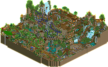
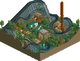
Hurricanes, you do it again. Seriously well done to you guys, this is a brilliant park. Reminds me of Mala, which I guess you were going for in places, and x-sector, which I guess you weren't. I'll give a proper review tomorrow.
Excellent work Hurricanes. It's a shame this couldn't have been a proper matchup, as what the Revollutionists have could've turned out very good if it was finished. Sadly, another easy win for the Hurricanes.
Granted, I haven't viewed them it yet, so I'll hold the vote/review off until then.
Shame that the LL park is so unfinished. The layout of wodan or the supports of the splash are really good but other than that is to unfinished.
So my vote goes to:
Well color-wise and in terms of layout and organization the park was a mess. But all the ideas were really awesome. The whole theme of the park wasn't really recognizable to me - was it just about nature itself? I liked all the original ideas in the park. The rapid ride was really nice, although I couldn't really figure out the layout - but the stuff around the ride itself interacted nicely. The broken custom ride with the service lift was awesome! The coaster layouts were solid too. I loved the trench parts at Spore, the overgrown ruins part at Gaia and the landscaping at Terra. The corner with Fera river wasn't appealing to me. Something there just felt wrong. Nice interaction on all those coasters. All in all I'm not much of a fan of this parkmaking style. It's nice when looking at all the details but there is no cohesion, no aesthetics - just details. But I can see the skill and time that went into it so kudos to that!
Europa:
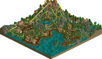
Finished this park could have totally won me over. It was realistic, organized and nice. So pretty much the complete opposite of Terra Progressia. Loved the Atlantica ride there. The Euromir was also nice. Shame it was all really unfinished and I wish there was just a bit more originality. You had those parts that were pretty much copied from the real Europapark and then you had those parts like the Emotion coaster which went in another direction. I think you could have developed the idea being another Europa Park rather than a copycat Europapark with 1 other ride. Would like to see this finished on a bigger scale!
All in all a bit dissapointing match but what was there was definately high quality - congrats to both teams!
"MFG"
I thought that many things were messy, but that's forgivable when the park is so clever. It would be very interesting to me to find out exactly how rushed this park was, as parts of it just don't look like they're done. Parts around the woodie, especially. And rides with default names, things like this really bug me because they take two minutes to rectify.
The rapids was really clever, great use of the whirlpool object, never seen that before. All through the park the theming with staff members and rides was excellent, something i've come to expect from the Hurricanes as a team. Especially loved the shop being destroyed by the plant, that was really well done. I could easily imagine it in motion. Loved the little homages to LL with the trackitecture, too.
The broken down ride was brilliant, something i've never seen before, although think it would have been better placed in a realistic park. It's a really nice idea though.
Overall, a really fun park to explore, kept my attention for quite a while. It was very sloppy in places, but I didn't really care as the whole picture was so fun. It's a real pity that you didn't get a match up for this.
fuck nin
The hurricanes park is phenomenal!
Soo much little details to find and great rides.
Well, I hope the revollutionist will finish this after h2h (as they said in ther readme^^), because this park has so much potential! The rides were great and I´m really looking forward to see this finished!
The stuff I liked:
*The ruins and the waterfall were both beautifully done.
*The gigantic leaf station was bold and sculptural. I love it.
*The rapids were well made and like Turtle said, clever!
*Broken ride - great idea, great execution. I agree with Turtle though, it does seem a little out of place in such a fantasy-style park.
*I LOVE the station for Terra. Great earthy and cozy feel, almost reminds me of some LL parks and that aesthetic back then.
*The monorail roots near the entrance... droolworthy.
The stuff I disliked:
*Layouts were weak... Spore wasn't too bad, but still a bit spread out without a good overall composition. Gaia was compact and short, so there wasn't much wrong with it (besides bad color choice). Terra... I don't understand why people liked the layout on this one. The pacing was fine, but the layout itself looked terribly awkward, and didn't really look pleasing at all. The second half of the ride was just a messy clump of track and didn't really have a good flow/look to the ride.
*Seeds of destruction sign looked out of place; it looked like death-metal instead of savage-nature.
*Funghi Flyer was not very interesting. The architecture was bland, and the ride itself was quite boring. Could've used the fungus theme a lot better with a more fitting ride choice (fungus + flying = why?).
*Atmosphere. For a park themed to NATURE overtaking civilization, it felt very sparse in foliage. For me there was too much exposed ground, not enough density in foliage. Also the overall look and feel of the park is very empty and not what I would envision for a plant-overtaking-the-world type scenario. The only parts where I felt the theme was captured well were in the ruins, but there was far too few of those.
I guess this type of parkmaking isn't my style; I really can't bring myself to like the park. I appreciate the skills shown and some of the clever ideas/details, but ultimately I feel like Dave5 summed it up: "no cohesion, no aesthetics, just details".
Pretty simple really, revollutionist had a nice start, but just that, only a start.
The hurricanes park was very good, a wonderful set of ideas. I wasn't too taken by the coasters, but i enjoyed the other rides and what they added to the park. The concept was cool, but my overall biggest criticism is that it the buildings looked too integrated with the nature. I mean, if that idea is that nature was turning hostile, the buildings seemed to be more that they were made with nature in mind, not that nature had invaded them, with the exception of the fun split flower-shop. the textures were also hard for me at times when trying to follow things, but that's the nature of H2H. overall some excellent work despite a weird concept. Congrats to Hurricanes.
FK
Not as drastic as two seasons in a row...
Was a pleasure working with Kumba and Comet. Although Darren and I were shooting for different things it kinda came together in the end.
Congrats Canes.