Park / Limousine
-
 06-July 12
- Views 1,924
- Downloads 438
- Fans 1
- Comments 11
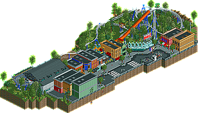
-
 59.62%(required: 65%)
 Design Submission

geewhzz 75% Liampie 70% prodigy 70% wheres_walto 70% BelgianGuy 65% Maverix 65% Casimir 60% turbin3 60% 5dave 55% Phatage 55% tyandor 55% CedarPoint6 50% chorkiel 50% Roomie 50% posix 40% 59.62% -
1 fan
 Fans of this park
-
 Download Park
438
-
 Objects
219
-
 Tags
Tags
the quality made this score 65% but it was a push though.
I say do the exact same quality wise but give some more contextwise, as in, don't cut off the map so close and you'll have a sure fire winner if you continue like this
I really like the style you play with and the overall ideas are great, just make sure you'll add enough little touches in to really make it stand out even more above the rest...
The buildings were nice and all but they didn't show there were entrances to rides in them. Everything was really close to each other as well
Again this was just too small.
Felipe// Offline
A point that I wasn't sure - although I saw no complains about - was the foilage, but probably it wasn't a problem here.
Well, there will be a next time... =)
I felt so close to it..
Even for a powered launch this is short for a design.
As already said, there wasn't enough quantity, but a lot of quality, which I enjoyed.
Airtime Offline
That doesn't matter. If the quality of design is here then the ride length, as long as the coaster is good, doesn't matter. I'm not saying it's a design worthy coaster layout though but it's not long enough.
Felipe, I dunno why but I fancied looking at some of your stuff all of a sudden again. Hope your still about and building. I'd love to see some new stuff!
I thought if this was a bit bigger with a slightly better layout I'd of voted high design.
I loved the tunnel, maybe using the dingy slide is a little small but I think you got away with it here. The detail was very nice.
The main thing I didn't like was the car object. I don't think objects that don't look like RCT should be in RCT.
Real good architecture and little details in the street. Loved this little design.
EDIT: Scrap that about the space ring. I've just lost an argument about that and you can have 1 ring which I've never realised