Park / Skyline
-
 16-July 12
- Views 12,871
- Downloads 728
- Fans 0
- Comments 72
-

-
 65.38%(required: 65%)
 Design

chorkiel 75% Casimir 70% Roomie 70% turbin3 70% wheres_walto 70% CedarPoint6 65% geewhzz 65% Liampie 65% Maverix 65% Pacificoaster 65% Phatage 65% tyandor 65% posix 60% 5dave 55% BelgianGuy 50% 65.38% -
 No fans of this park
-
 Full-Size Map
-
 Download Park
728
-
 Objects
240
-
 Tags
Tags
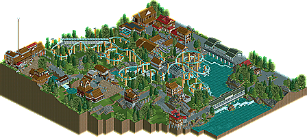
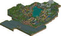
![park_4118 [H2H8 R4] Mount Haystack Ski Resort](https://www.nedesigns.com/uploads/parks/4118/aerialt3883.png)
_____________________________________________________
Anyway, great design win Ling!
I really liked the layout and the architecture was solid.
If the layouts in Castello dal Mare were as strong as this one I would have said it´s worth bronze, too.
Gruß
MCI
The coaster was aesthetically very pleasing but felt a bit fast paced sometimes, especially when going into the mcbr.
Foliage and landscaping were superb. Imo this is a wonderfull piece of work.
Great work, it's a shame this design's topic got ruined by all the bitching though.
I can't wait to see more of your work Ling, especially if you up your game!
I thought the layout and landscaping was great. What I didn't like was the buildings and the supports for the ride. Those concrete supports are just wrong'n'ugly to me.
The buildings looked mostly strange and followed the same formula making it look to samey and outdated somehow.
Congrats on the design nontheless!
"MFG"
Scott.S Offline
#Sarcasm
Ling, I really do enjoy this ride. It's a very solid layout, and the simplicity and serenity of it's habitat make this extraordinary. Well done, and I think you're the first to have back to back accolades(somebody check me on this?)?
Anyway, I really liked the coaster but I wasn't a fan of the thick concrete supports. The architecture was nice and the overall atmosphere was very relaxing, although I longed for peeps to add some life. The landscaping was the stand-out aspect of it, and I really hope you continue to use CS.
I think peeps were left out to promote the serenity of the piece, right?