- Views 36,847
- Downloads 1,926
- Fans 15
- Comments 111
-
 87.50%(required: 70%)
 Gold
Gold

Camcorder22 95% no Xeccah 95% no chorkiel 90% no Cocoa 90% no RWE 90% no saxman1089 90% no Steve 90% no CoasterCreator9 85% no G Force 85% no robbie92 80% no Scoop 80% no posix 70% no 87.50% 0.00% -
 Description
Head 2 Head 6, Round 3 winner
-
15 fans
 Fans of this park
-
 Full-Size Map
-
 Download Park
1,926
-
 Objects
428
-
 Tags
Tags
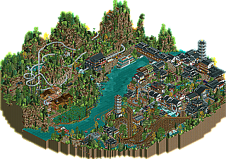
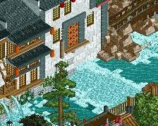
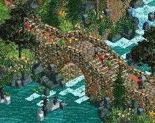
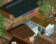
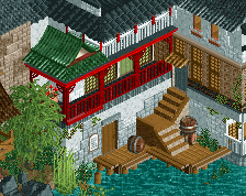
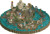
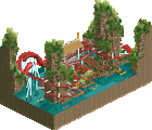
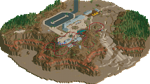
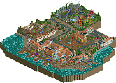

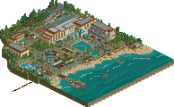
I really liked your park Replacements. I thought it was a very nice match-up! Trav, you've improved a lot this H2H it seems. And Cocoa's work is always great.
I loved working on our park. I think there is still a lot to discover for most of you. At first I had some trouble working on the high standard of today's RCT2, but Liam and Pacific pushed me to my building limits every week and I learned a lot from both. And I'm glad I finally finished a park!
Thanks for all the nice reactions and reviews!
On our end of things: Liampie and Sulakke were great players to work with. Something I really enjoy about that map Liam recently posted is that you can see how the project was a true collaboration and not just having one man do one section. As all projects, this one had a rocky start but once it left the groundbreaking phase it really started to come together. I would like to commend our team publicly because I believe the chemistry we share with one another could be inspirational to the other teams that seem to be having setbacks. Instead of pointing fingers at one member of a team, others need to step up to ensure that productivity isn't altered. Again, Lijiang was one hell of a park that I am glad to have worked on, but it would be nothing without Liam and Sulakke's vision and hard work. A true even split among shares, and I hope to work with you two again soon.
I only took the time to name the guests after I believed that we'd finished the park to the best of our abilities. To put it into perspective, the park was about 90% completed like 2 weeks before the deadline or something like that, so it's not as if we rushed it at any point.. I think if the park had been bigger, giving all the themes space to breathe, then it might not have been quite as difficult. But looking back, I honestly wouldn't change a thing, I love this park because it feels so...fun, something which I don't tend to find in many parks now. I'm incredibly proud of the work that we've done, and how many ideas we managed to cram into a small space.
But still, Lijiang was the better park and a well deserved win.
Worlds of fun is definitely an architecturally strong park and still feels modern despite being made 5 years ago. It lacks either the vision or the ambition to be better than something it could have been, but all of it is executed tastefully. Very great theming to frame and make what would be unmemorable rides memorable. Highlights for me are the Norse flume ride, the railroad, and the Golden Gate Bridge used for the launch section of the shuttle loop.
Oddly enough the replacements were a part of the 3 best matchups in H2H6. This v. Lijiang, Tivoli v. Park Edda, and NF v. Jerusalem were all great. 75%
Morrow World from H2H7 got this same score and is a far worse "park".
Well I guess the score relative to recent H2H scores is quite low. But in reality this is probably about where it should be.
Morow world should have been a silver. This was a mid-gold. I think now there's a lot less prestige in Golds than there was in the past. It's like a sub-80 gold is the new silver.
I think there's a bit of a selection bias there... most newer golds are built by long-time members that have scored more than one accolade already.
Other than that I agree, but you have to remember that silvers used to be the old bronzes, and many of the old silvers today are sub-bronze work. The overall quality of the gold has gone up, it's just that the community has evolved to a point that many of the NE regulars left are able to produce gold quality work.
You're wrong, Jaguar. The Silver category is full of Gold and Spotlight worthy stuff, because back in the day only the best park of the month got spot and the rest got Silver. And Gold was started, if I understood correctly, because at some point iris/whoever was starting to feel bad snubbing great submissions (t)he(y) felt were worthy of their own podium. It's bullshit how many parks are getting gold nowadays.
I'm still gonna say to make platinum an accolade.
I was talking more along the lines of RCT2 parks than LL, in which there are a lot of parks that if submitted today probably wouldn't have gotten an accolade or would've gotten a low bronze, e.g. Two Shades of Pink, Magnolia Gardens, Pike Creek. I don't think they're bad releases personally but they haven't aged well.
The overall quality of releases has also been higher than it ever has been... thus there are a lot of 'great' parks. H2H parks, being made by RCT's best exemplifies this. The overall standard has gone up from silver/bronze to almost gold.
If you think there are too many golds then why not raise the percentage bar for future releases? I personally think the percentage system needs to be adjusted, but that'll only be a temporary solution.
I would do a lot differently if we were doing this again. But, it was five years ago! There's still some work I've proud of in here, although it does turn into a bit of a mishmash. I think the european area is too overwhelming and really crowds the park in a bad way. Most of the American section I'm proud of though.
Looking back on this, I actually really like how dense it is and I think it works really well in this case. I'd change a few things about it, but I wouldn't change the density.