- Views 35,700
- Downloads 1,892
- Fans 15
- Comments 111
-
 87.50%(required: 70%)
 Gold
Gold

Camcorder22 95% no Xeccah 95% no chorkiel 90% no Cocoa 90% no RWE 90% no saxman1089 90% no Steve 90% no CoasterCreator9 85% no G Force 85% no robbie92 80% no Scoop 80% no posix 70% no 87.50% 0.00% -
 Description
Head 2 Head 6, Round 3 winner
-
15 fans
 Fans of this park
-
 Full-Size Map
-
 Download Park
1,892
-
 Objects
428
-
 Tags
Tags
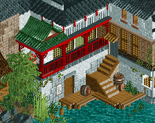
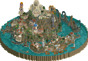

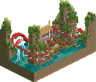
^Love it all
^Awesome building
^Imagine being on or in line for Yin, or being on Guangxi. Amazing interaction here
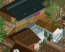
^Really sick idea for pathing
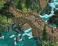
^Think it's beautiful. The black rocks really work for me because of the tan'ish' rock bridge
^Once again, imagine being in this park
^I repeat - IMAGINE being there
^I love everything in this screen
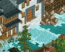
^I love this side of these building because of how cool it would look while on the rapids
^Dji Wis - killed it for me here. Miss you Gee, come back :/
Overall I loved Lijang. When I view parks in RCT, I like to imagine myself being there. Lijang and Sea of Sagas have won me over completely in this aspect. Well done builders.
inVersed Offline
I will say these are both my two favorite parks so far in the competition.
Extensive review later!
In the meantime:
Wow, so dense... Some really good theming in this. Don't think I've ever liked a Shuttler Looper more. Full of strong theme ideas executed with relatively clear detailing everywhere. I loved how you turned this into an actual park. It totally had that atmosphere and it made me happy. Kind of felt like a typical Replacements Park to me. I think you guys might as well win the season with this style. Anyhow, perhaps a bit less sometimes wouldn't have hurt to make your ideas stick out more. Unless you really look super closely you don't really take note of a lot of things and I don't think it should be like that.
Lijiang:
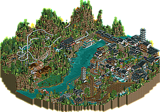
LOVED the rice field. Very cool idea. I get the fact that this is a rural, chinese, cliff, river theme, yet I felt the landscaping was overfocused and the actual park lacked in substance (e.g. random naming), especially in comparison to Worlds of Fun. The other side of the river was a bit chaotic and not very successfully dealing with the height variations. The rapids looked pretty well done to me but the rest was rather uninviting to explore.
Airtime Offline
This was a real tough one for me because I loved The replacements Park more when I first viewed it. It offers me more in terms of theme which is what I love but after a while some of the architecture was closely packed together so I felt like it was all overcrowding each other when I just wanted it to flow into the next area. With that said, the park was packed with little amazing details and awesome architecture, i wish there were a few more wow factors but the parks architecture was awesome and something I've come to expect from that parkmaker who I really love. Great park but I was just looking for a more distinct theme in every area rather than a few of the same textures that should have stayed in one sector. Mine train and the water ride were the highlight for me, the woodie was also quite nice.
Lijang was good, I actually enjoyed the architecture more in the other park because there was more visual stimulation where I felt this was too much white and black. I know this is a classic theme but another colour selection around the busy architecture section could have boosted that area. That's just a personal preference but the shapes and roof sections of the buildings were spot on and they were a pleasure to look at. The Cheetah hunt inspired coaster was lovely especially around such amazing architecture. I loved the people walking through the mountainsides, it made for a great viewing experience. I didn't think a jeep ride should have been applied to this park at all, it could have been something a lot more appropriate but I like a different ride in there and I could appreciate it from that sense. The rice paddies and the bridges across the river and the walk through across the boats is what tipped this park for me.
It came down to the fact that when I thought about both parks I just thought Lijang was a lot more memorable and whilst I thought both parks edged each other out on different things, this was the deciding factor for me as everything was far too close to call.
Lijang had amazing architecture, just mindblowing. The color scheme could've been a little varied, as JK said, but overall it was great. I loved Yang, but wasn't a fan of Yin. Not just the rides either, the sides. I understand what's behind the landscape, but it still kills it for me. My favorite parts were the large bridge in the back, the boat bridge, Yang's interaction, and the theater facade.
Great work to both teams, but I have to go with Heaven's Kitchen.
The quality of both parks is exceptional, but I'm gonna give it for Lijiang because it is more original.
Now Lijang was... well it might be my favorite park so far. I see a lot of people in the Ad topics ask why there's such a focus on critiquing landscaping... this is why. It's still a little rough around the edges, but I very much enjoyed the rock and ruins mixed together and stacked. The rockwork really ended up looking like one of Kong's extensive projects, just a little more pleasing to the eye.. and less brown with the plants. I think, though, that it was a lot of the little details that won this for me.. the rice paddy, the supports for the buildings overhanging the water, the water crossing through the boats (with benches on the boats!!!), all the little bridges in the mountains, and the big one over the water. The wooden coaster too, was wonderful.. the first half had a wonderful flowing layout. I think overall this park is just gorgeous. Though lacking in color (my biggest complaint-- you can have traditional Chinese spaces with color!), this was just such an atmospheric park and I hope there is more to come of this quality in this contest. This makes me what to build an Asian themed something... I just need to keep convincing myself that's less interesting than finishing SW(Help!).
Worlds of Fun
Overall I thought it was nice, but not as 'polished' as I would have preferred. I like all the ideas and a lot of the rides etc...
- the entrance area looked nice
-I liked the steamboat and the paddles were perfectly executed
-The patriot ride was cool, with the bridge incorporation
-The worlds of fun sign at the front looked good and caught my eye
x-overall I thought the architecture looked a little sloppy. I didn't like where the 1k corner polls were placed. A lot of the architecture looked the same (throughout the park and as so many previous releases) and nothing new there for me.
x-I didn't really care for the colors and thought there were too many in some places, and they didn't mesh well imo..
x- I also didn't really care for the wooden coaster. It was too short imo, and for the main attraction really felt cut off from everything else which I didn't like.
I Don't mean to sound negative, I thought it was a great park.
Lijiang
I gotta say I was really impressed with this park. I love the theme you chose and thought it was executed almost flawlessly. It was bold, and probably my favorite park of the contest for sure, so far. Some notes on what I liked specifically:
- Overall I loved the scale in which you built the park. The little areas were large enough for everything to be seen, but you have to rotate the angle and exlpore to see absolutely everything. Not sure if it was planned, but I thought it was cool.
-architecture: I loved it! I especially like the double arched bridge in the back, the pagodas were great too. The different textures you put on the roofs and walls of the buildings added a lot imo. I liked the stations for both coasters and thought they were well designed and built. The buildings around the edge of the map and the parts that the guests couldn't see were nicely detailed, realistic, and didn't feel under detailed unlike other parks, I liked that..
-Loved the landscape and foliage. The mountains looked like the real ones, although I would have liked to see more of them and a bit taller perhaps. The 1k foliage pieces were all placed very well and added a lot. I think the foliage should have been thicker throughout most of the park though imo. I didn't really care for all the dirt ground texture, may be more grass? also there were too many ruin objects imo, perhaps custom rocks would have looked better.
-Loved the Chinese symbols throughout the park, not sure if they actually meant anything though lol
-The coasters were sweet. I especially liked Yang and all the interaction it had in the town, going under and popping up around everything.
-Li river cruise ship was perfect imo
-The tuc tuc car was a great idea and executed perfectly!
-The Guangxi truck ride was great in how it traversed the landscape, and the bridges it went over looked nice.
I really enjoyed both parks. I opened WoF and instantly thought "We have a winner" loved all the little details and it was such a vibrant fun park. Patriot was superb and there were tons of moments where i looked at this and just smiled.
I then opened Lijiang and at first I wasn't sold... However as I began to look deeper the park sucked me in more and more. That rapids ride is just brilliantly done and the interaction between the coaster and the trucks on the hillside was amazing.... if I'd voted on first impressions WoF would have run away with it. but over more time Liajing stole it by the smallest of margins.
Both were really good work. Loved the woody by the replacements. Heaven's Kitchen were just overall more pleasing on the eye and held my interest longer