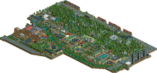
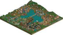
Park / [H2H6] R3 - The Replacements - Worlds Of Fun
-
 07-June 12
- Views 34,418
- Downloads 1,138
- Fans 2
- Comments 111
-
 73.75%(required: 70%)
 Gold
Gold

CoasterCreator9 80% chorkiel 75% Coasterbill 75% G Force 75% inthemanual 75% Jaguar 75% Xeccah 75% Liampie 70% Steve 70% ][ntamin22 70% 73.75% -
2 fans
 Fans of this park
-
 Full-Size Map
-
 Download Park
1,138
-
 Objects
445
-
 Tags
Tags
![Park_2399 [H2H6] R3 - The Replacements - Worlds Of Fun](https://www.nedesigns.com/uploads/parks/2399/aerialm2136.png)
![park_2390 [H2H6] R2 - The Replacements - Tivoli Gardens](https://www.nedesigns.com/uploads/parks/2390/aerialt2133.png)

![park_4097 [H2H8 R2] Mzima Springs](https://www.nedesigns.com/uploads/parks/4097/aerialt3837.png)

![park_4102 [H2H8 R3] Castles-n-Coasters](https://www.nedesigns.com/uploads/parks/4102/aerialt3848.png)
![park_4120 [H2H8 R4] Ruigrijk](https://www.nedesigns.com/uploads/parks/4120/aerialt3860.png)
Imagine riding the coasters.
Imagine going on the rapids ride.
Imagine standing in line in that BEAUTIFUL queue for Yin.
Seriously...AMAZING park.
Replacements: I'm afraid that concept isn't right for this battle. How much I may like it, it's just too much on a too little surface. Great archy and such, but the size doesn't make it shine like it could be. But apart from that, it's just great. I love that Schwarzkopf launch coaster going over a bridge with the statue of liberty next to it. I like the woodie and his station building with the fly-trough.
Heaven's kitchen: W-o-w. I can't find much words to describe the feeling I get when I see this park. Foliage and landscaping looks amazing, that must have taken so much work... Archy is very good and combined with foliage, landscaping etc it creates such an amazing atmosphere. And 2 great coasters. I also liked the monster truck ride next to/trough the Intamin coaster. Could imagine myself sitting in there.
I'm going to give it a few more days, but this is the closest match-up for sure!
Great work both teams.
In all seriousness this is what I think of both parks:
the replacements park: worlds of fun
As I began to gaze my eyes upon the park entrance I noticed the bright wooden architecture, the air balloon, the bright 'fuck nin' sign,and the bright title within the lake.
I turned right to the GCI wooden rollercoaster. While the layout was not truly that impressing, I really liked the interaction with the GCI and the railroad
The station and surrounding architecture looked beautiful and I loved how the coaster went through the top of the barn.
FUCK NIN.
I next explored an area that was themed somewhat american, even though to me it did not feel so.
The shuttle loop was great. The architecture, mainly the bridge made really added to the coaster. But sadly, that 'filler coaster' was my favorite coaster in the park.
The custom ride was OK, but I did feel like it was too tall in comparison to everything else. The steamboat and the plane, however, I really loved.
I looked over my shoulder. I really liked what I saw. The architecture , which was great, had two different styles that made me think of two countries in particular.
Some more fantastic architecture, i thought to myself. The car, which felt like chitty chitty bang bang, was something i really adored. the train bridge and the way it interacts with the paths is another thing I liked.
I travelled further down the road. I really like the vibrant colors. What i did not like, however, is how the carousel was themed totslly different from the rest of the area. It felt out of place to me.
As I trodden into this foreign part of the park, I felt the atmosphere shine off of the buildings. I watched the coaster go around a few times, and I felt quite disappointed because the ride was so short.
seeing how this part of the park, which felt totally different from the rest, transitioned from the adjecent section, it felt weird. I shrugged and contined down...
... to Detonator! The freefall was amazingly themed, except for the top which felt quite out of place. The wooden framework around the outside of the rides was something I really liked. I also loved the foliage around the area. It felt overgrown, which I thought was the desired effect here.
Lastly, I gazed upon Voyager, a quite unique water ride! Even though the transition between this overgrown area and the entrance seemed abrupt, It felt normal because of this scandinavian themed ride. I also loved the ship outside the station.
There is my summary for Worlds of Fun.
Lijang was really good. What I liked most about this park is its map shape! You created the park perfectly on the Ying-Yang symbol and that brought the park onto a higher level imo. The park had a lot of awesome and well executed details. The tuc-tuc, the passing over the river, the ricefield. What I also liked a lot were the signs with "chinese" letters on them. the dojo/school/"church" next to the woodie was also very cool. Also the small bridges in the Yin-side were cool and I love the queue of the coaster.
the city was very cool however I missed one or two supporting flat rides (on both sides). What I didn't like was the landscaping. Even though I'm in K0ng's team I actually don't like this type of landscaping. To me it became repetitive quickly. And the placement of some rocks was a bit unlucky. The mountain village on the Yin-side was really nice from one angle. However, from the other three ones you couldn't see it properly.
The rapid ride was ok.
Worlds of Fun appealed to me already from the overview. Immediately the colours jump into your eyes and the park screamed "fun" to me already from its overview. The entrance area was well done, the baloon was well executed. I went on to Voyager. And I must say: this is the best waterride up to this season for the moment. It looks so great. The queue line was perfect with the ship. And then the drop into the waterfall. Damn that was perfect!
The freefalls were nice, I liked the structure around it. The houses in this area were all very nice. The taxi ride in the French area was really cute. I liked it a lot, it gave an awesome atmosphere. I also found the quarter signs all over the park very cool, they fit well with the overall scale.
The woodie was good, although a station through a barn has been seen often.
Was really made me vote this park was the overall cuteness with its colours and small details. And parts of the train ride had awesome bits like the bridge near Timberwolf.
I didn't feel the indoor ride "European tour", as I couldn't actually follow whats indoor and what isn't. To difficult when I just want to relax while viewing a park
On note on the structural side: the path layout wasn't well fixed with underground path as some peeps couldn't get to their destinies. But that isn't a big lay-down.
tdub96 Offline
Lol i was laughing at the "legless beggar"