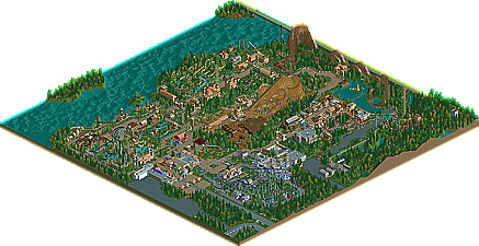
Park / SpreePark, Berlin
-
 10-July 12
- Views 4,644
- Downloads 844
- Fans 0
- Comments 14

-
 48.08%(required: 50%)
 Spotlight Submission

Casimir 65% wheres_walto 60% CedarPoint6 55% geewhzz 55% posix 55% 5dave 50% Liampie 50% tyandor 50% Phatage 45% turbin3 45% BelgianGuy 40% chorkiel 40% Maverix 40% Roomie 40% Pacificoaster 35% 48.08% -
 No fans of this park
-
 Download Park
844
-
 Objects
357
-
 Tags
Tags


![park_2387 [H2H6] R2 - Reservoir Dogs - Pixar Animation Studios](https://www.nedesigns.com/uploads/parks/2387/aerialt2130.png)

![park_2432 [H2H6] R5 - Reservoir Dogs - Galaxy Geeland](https://www.nedesigns.com/uploads/parks/2432/aerialt2182.png)
I thought the park was nice and had heart. It felt very "German" and I liked that
(1) Pre-made path layout, then "fill" in the park around it. This helps flow a lot but forces you to follow the available areas closely as changing the path is only possible until you've built a couple of main attractions that "lock" everything up. You will also need a lot of landscaping flexibility because you will find that some of your ride ideas actually need more space than your path allows. People thus quickly fall into a density-disbalance where some areas of the park are super tight and others are too loose and sparse.
(2) Interim path layout drawn on the map with land textures. Allows for more flexibility which you will likely make use of. This again can cause kinks or strong bends in your path layout at those spots, hurting your park flow. I also find it's harder to orient yourself on the map with just a line of ground texture intended to resemble path than using actual path. Latter is just a bit more precise.
On the other hand I liked the coaster layout's very much. As posix said, they are not very spectecular but very good and simple. I love the First Drop of the Wing Rider.
Overall it's not a perfect park, but I think it deserved bronze and I'm sad you missed your accolade by just 2 percent.
BigB Offline
In my opinion this has to win an accolade.
I can understand if you say here and there it lacks of details and his style is repetitive but nonetheless it is a VERY solid work there was spent a lot of time in it.
Also the layouts were strong and the atmosphere were nice I think.
Is it the NCSO some people don't lie that much? If yes, you should think more objective (like KONG, sad he's banned..)...
Also sad that new accolade panelists can ruin a submission that much, honestly Pacificoaster, 5 new submission and nearly everyone is voted lowest by you...
Maybe someone could give a statement to their votes, so that I can understand how this could be.....
Don't be such a retard. It's all about opinions.
I think it didn't win because the architecture (and atmosphere) was messy and fairly boring. The rides lacked interaction and everything was brown. It's by no means a bad park but it lacks inspiration, originality and composition. I don't care how long it took to make, although in this case it's a little sour for MCI.
I'm sure MCI can win an accolade, but only if he innovates.
FK
I may be a tough critic, but I stand firmly by my vote. For one, I don't see how I "ruined" the submission. There were four people that voted 40%, but you insist on calling out the guy who voted just 5% below that? It's not like the differential between my vote and the others were substantially large, it was a mere 5%. Not to mention the highest and lowest scores are dropped. Even if I voted 40%, this park would have obtained the same score.
Overall the park had some decent coaster layouts, but it seems that you built those first and then added the paths/landscape around them. This method created either too much forced guest interaction, or not enough. Maybe next time try laying out the park by coloring the map first so you don't end up with awkward paths around coasters like that of the wingrider. Also, look at some other NCSO parks that were released in the past, or those in development, to get some inspiration on how to go about creating some more interesting architecture.
@Posix: Thank you! Well, I cant show you any old overview, because all my SpreePark saves and screens were on a external floppy drive after the park was submitted. Unfortunalty my brother cleaned this floppy drive two weeks ago... Therefore I dont have any old SpreePark Screens or saves
But I did it exactly the way Pacificoaster said. Built the layouts first and added the rest later... Could have been the mistake
@Version1:
@BigB: Calm down
@Liampie: I´ll try to improve myself. hopefully
@wanted: obviously not for everyone
@FK: Well, yeah agreed, but... that has nothing to do with the park, right?
@Jaguarkid140: thanks
@Jonny93: Thanks
@Pacificoaster: Thanks for the tipps! Everytime I start to build a park I try to do it like you said. But in the end I´m throwing everything around and nothing is at the place I planned it to be
Gruß
MCI
I loved the layouts, specially "Sansabian" for me is the best layout of this park.
Your architecture is good on NCSO, the organisation of this park is good, your park has good atmosphere so I'm not understanding how this didn't get bronze...
I'm sure that your next park will get an accolade! Congrats MCI!
BTW, the road lines were a great idea, but I think I would've used the brick fence with white top sunk down 2 height, so the white stuck out.