Park / Al Marwa Cultural Park
-
 21-July 12
- Views 7,117
- Downloads 801
- Fans 0
- Comments 12
-

-
 55.38%(required: 50%)
 Bronze

Kumba 70% Casimir 65% Gwazi 65% 5dave 60% Loopy 60% Maverix 60% Dimi 55% Liampie 55% RMM 55% Airtime 50% Jonny93 50% pierrot 50% posix 50% geewhzz 45% Louis! 45% 55.38% -
 No fans of this park
-
 Full-Size Map
-
 Download Park
801
-
 Tags
Tags
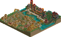
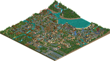
![park_4122 [H2H8 R4] Park Guell](https://www.nedesigns.com/uploads/parks/4122/aerialt3861.png)
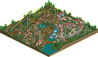
Centurion was pretty cool too; the helix going over the dining space was really cool. It would be really interesting to be a guest dining outside with friends/family as the coaster roars overhead (maybe a bit loud though haha).
Loved the bold red of the Virginia Reels and the contrast it created. I also loved when they were used as rooves, combined with the Roman column stations. Very neat effect there.
Overall there were some brilliant aspects to the park. Lots of cool little details. However, the park was also a bit generic in parts; it seemed as if the builder had cool ideas but didn't take them far enough, or didn't flesh out the park fully. For instance, some of the Roman architecture was awesome, but a short scroll away and there were simple 2x2 or 2x3 raised land pieces with paths/fencing slapped on and Ghost Train windows thrown in all over the place. I'm not all for an over-Codexed park but there's a difference between simplicity in aesthetics and oversimplification.
For me, the positives definitely outshined the negatives, and the park showed some aspects of skilled parkmaking with well-thought out construction. Good stuff overall.
As for the Arabian area. What catches my eyes first is a invert coaster. The usage of hacked corkscrew tracks are brilliant and the color makes it look like 'King cobra'. and that invert has a good flow with well executed landscaping but the location bothers me like what Gwazi said. and I can't feel the arabianish atmosphere in that area. The mixture of main buildings and dirt/grass land looks rather jungle themed for me and we've seen that more than thousand times.
Well..maybe It sounds bit harsh and negative, but this park became one of my favorite parks for sure.
This park was built essentially as a backup for the RD's during H2H. I put it together in the 2 weeks prior to week 1 so if the worst came to the worst we wouldn't forfeit a round whatever happened. When it became clear we would get a park out each week I decided to send it in. It is in places overly simple but I put that down mostly to time constraints to get this done for week 1 while still working on Copper Creek. I think Bronze is about right for what I expected so I'm happy there
King Cobra was designed with the peeps views in mind. I see what you mean about the comments about the location and lack of interaction but I wanted to make sure there were good views from the main paths around that area of the park especially around the corkscrews and the lower levels near the Cobra Roll. Centurion was heavily influenced by Revolution at SFMM. The pre loop hills and the shallow run into the inversions. Again the loops were positioned for peep viweing like they were on Double Loop at Kobe Portopialand. After the loop on Revolution the ride seems to meander a bit through some helixes and swooping turns which is what I wanted to emulate here while keeping them mostly hidden from peeps. (If there were any
As a side note the entrance area was heavily influenced by Ozones excellent Brighton Glen as was the waterfall arrangement. My main regret here though is not having the time to make it peepable as this really adds to a park in my opinion.
Despite all that I hope you guys enjoy the park and NE gets another LL release
Congrats on the accolade!
Congratulations, anyway. A well deserved bronze, and I like it better than most LL we've seen this H2H. Good job Xtreme97 and 5Dave on the writeup and logo too.
Don't have LL so can't really comment on it.
Congrats Roomie.
Anyway, I think both areas were done very well stylistically - no question what you were going for, and while there were no ridiculous hacks on display, the custom flat rides and little details like the cafe roofs and corkscrews on King Cobra were great. On the whole it just felt a little insubstantial. Definitely not your best work, but maybe fleshing these areas out into two sections of a full-scale park would work much better. The sections don't really have any composition to speak of, mainly just two medium-sized coasters in opposite corners. Layouts were good, but I agree that the interaction was a little weak.
I liked the tan theme, it was very aesthetically pleasing and some great classic LL work. I wasn't as fond on the dining experience, it seemed a bit blocky and repetetive. Also, stop using yellow coasters with black supports. Seriously. every time man. its just not pretty
the roman area is really good if you look at it out of context in the park. I think you should have changed the foliage around it and added more buildings to actually make it feel like a different city and not just a few stereotypical LL buildings in a field. If you just zoom in on the middle of the area though, it is perfect, as it feels very roman. You just needed more space to add things to the area and make it feel like a properly differentiated theme.
but good work, always looking forward to whatever you make. its good to see LL thriving still
As I said before I was never expecting this to do that well. But It was nice to do something a little different and more traditional.
BigB Offline
I'm always impressed if I see something like this in RCT1.
No idea how you guys do this ...